Editor’s note: This article is reprinted with permission from the LIVE Better by Minto blog.
Love yourself a rich, dark blue? You’re in luck (and you’re not alone)! The recently announced 2020 Pantone colour of the year is Classic Blue — “a timeless and enduring blue” that’s not quite navy and “suggestive of the sky at dusk,” according to Pantone’s website.
From walls to fabrics to housewares to everything in between, we have a feeling we’re going to see this traditional hue popping up all over the place. Let’s get a jump on it, shall we?
Try out these 5 tips for incorporating this gorgeous colour into your home this year.
First, a bit about Classic Blue
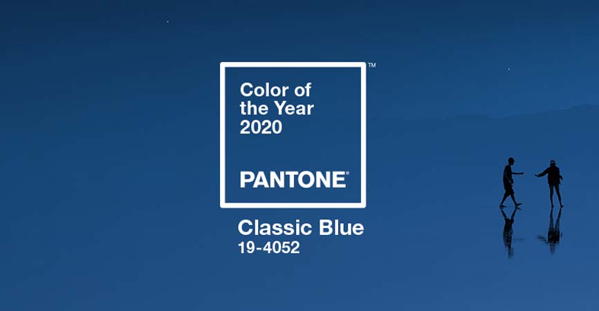
Classic Blue. Courtesy Pantone Color Institute
One of the wonderful things about Classic Blue (Pantone 19-4052) is its versatility. This comforting, deep blue is not only relatable and approachable, it plays nicely in pretty much any space — from modern to coastal to transitional — blending seamlessly with other colours and all types of furnishings.
If we had to sum it up, Time Magazine put it so perfectly by saying “the indigo hue brings to mind both the constant and the classic… an impeccably tailored suit, serene waters, or a bowl of perfectly ripe blueberries.”
Given the ushering in of a new decade and all of the uncertainty it brings, it’s no surprise Pantone chose this reassuring blue to bring calm, confidence and connection to our surroundings.
Now let’s take a look at 5 ways you can embrace Pantone’s colour of the year in your home, inspired by the 2019 Minto dream home.
No. 1: A statement piece
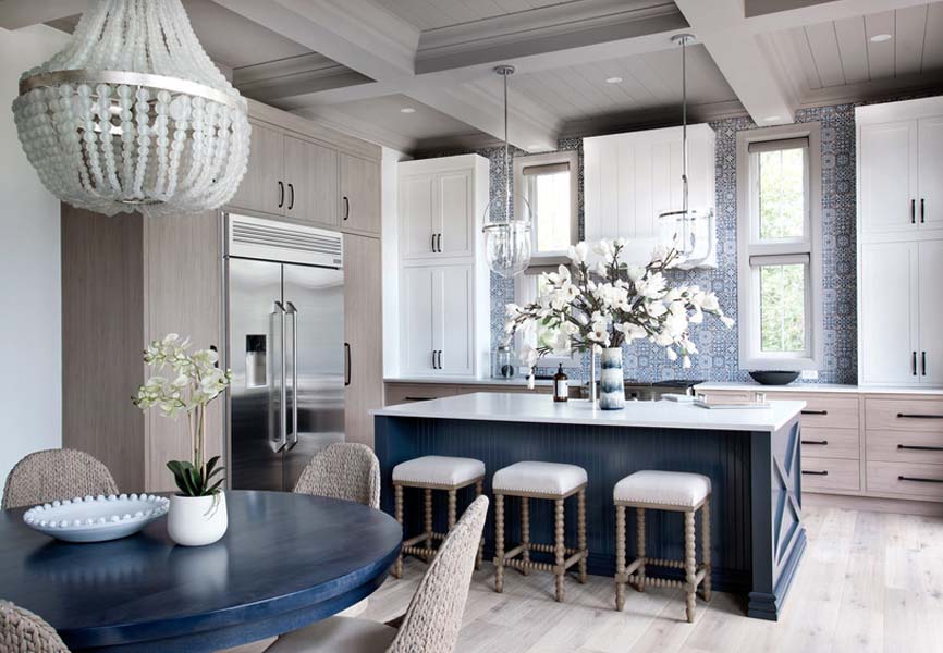
Kitchen of the 2019 Minto dream home — The Hampton. Photo: Gordon King
It’s difficult not to love blue — it’s reliable, comfortable and friendly, and a simple colour that doesn’t offend or cause friction. Because of these wonderful qualities, it’s easy to go big with a statement piece, like a sofa, an armoire or even the walls of an entire room.
Think plush, blue velvet on a can’t-wait-to-sink-into-it sofa, or media room walls that welcome and embrace family and friends with warmth and familiarity. Have a large, antique wardrobe or dated sideboard in need of modernizing? Paint it Classic Blue and give it new life.
Designing a new kitchen, bathroom or laundry room this year? Go big and choose cabinets in this handsome colour for depth and richness — especially for your island (try brass knobs and pulls here, too). We love these built-ins, too. So daring, and yet so safe.
No matter where or how you decide to incorporate it, Classic Blue can be the anchoring foundation of any room, giving you the ideal base to add layers upon layers of other colours, from jewel tones and tone-on-tone, to more subdued, neutral colours like light grey, cream and camel. That’s what makes it so special.
No. 2: As an accent colour
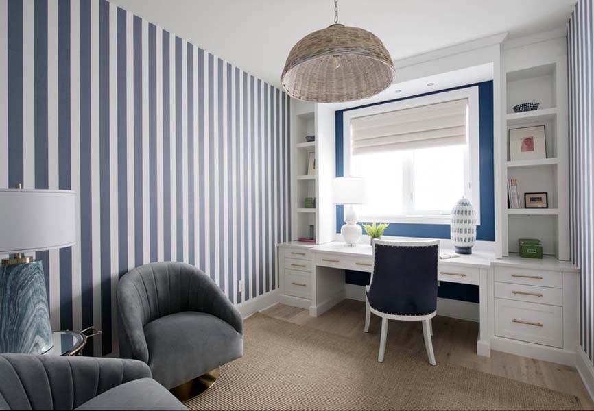
Office of the 2019 Minto dream home. Photo: Gordon King
If you’re not quite sure you’re ready to make a big statement with Pantone’s colour of the year, consider using Classic Blue as an accent colour. This is where you can experiment a bit with a small, eye-catching wall in a dining room, home office or living room without the full commitment. That way if it’s not your thing you can easily paint over it and move on (psst! we think you’ll love it).
Another idea is to try blue grasscloth or patterned wallpaper as a feature behind your bed in your master bedroom (blue can help the frazzled chill out) or as an accent behind the vanity and mirror in your powder room.
If you’re ready for a slightly bigger commitment, consider a blue backsplash tile in your kitchen or as a design element in your bathroom floor tile. Keep in mind a dark floor means more visible dirt, so we recommend using it as an accent tile only. Think nautical stripes, hand-painted ceramics or checkerboard!
Of course, curtains in this gorgeous hue and a large area rug will also add stunning impact — and change the look and feel of any room in an instant.
This great gallery from House & Home is sure to inspire you to try all sorts of ways to add Classic Blue as an accent in your home.
No. 3: In unexpected ways and places
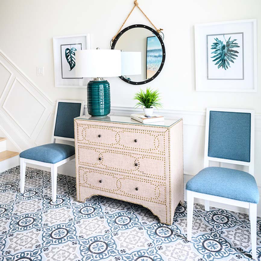
Foyer of the 2019 Minto dream home. Photo: Brittany Gawley Photography
Sometimes it’s fun to play with colour in surprising ways — and when it comes to a classic, traditional blue you really can’t go wrong. Here are a few decorating ideas that go against the grain:
- Paint the back panel of white or grey built-ins for a modern, yet timeless, look. You can try this even if your wall unit is from Ikea. The Classic Blue will really stand out and provide the perfect backdrop for your shelf accessories.
- Choose Classic Blue appliances, because, why not? And while you’re at it, a blue hood, too.
- Paint your interior doors Classic Blue (or just one door, like your powder room) and choose fun and eclectic doorknobs for each one.
- Even better, paint your front door. Now that’s making a statement!
- Paint your ceiling for a calming, “midnight sky” every time you look up. This is also a great trick to make large rooms with high ceilings feel cosy and intimate.
- Take it outside the home. Painting the exterior or choosing Classic Blue siding is just pure wow!
No. 4: A pop here and there
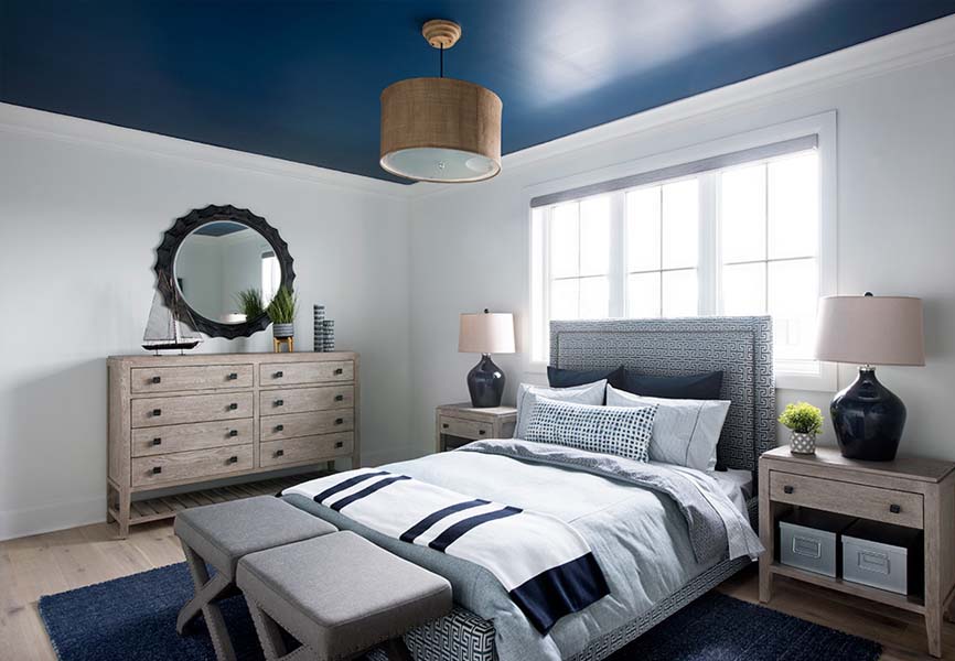
The boy’s bedroom of the 2019 Minto dream home. Photo: Gordon King
So, you love Classic Blue but you’re a not ready for a DIY project (or your budget is a little tight at the moment). No problem! There are lots of ways to incorporate the colour of the year without a ton of effort. Try these:
- Dining room or living room chairs. Rich, gorgeous and elegant, and you don’t have to spend a fortune either. If you’re lucky and you time it right, you may even find them at HomeSense — even if you only add one or two.
- Cushions. So easy, stylish and comfy! Add them to beds, sofas, window seats, mud rooms, kitchen chairs and anywhere that could use a little hit of blue.
- Lamps and/or lampshades. Another easy one to try on and swap out for just a hint of colour.
- Duvet cover. Have some fun and choose a floral pattern or keep it simple with a solid.
- Ottoman. Add a tufted ottoman like this one to any room — even your bathroom or closet.
- Art. Minted is a favourite for so many reasons, but one of them is affordable art. Give Classic Blue a try with an abstract acrylic to dress up any wall.
No. 5: Just a hint
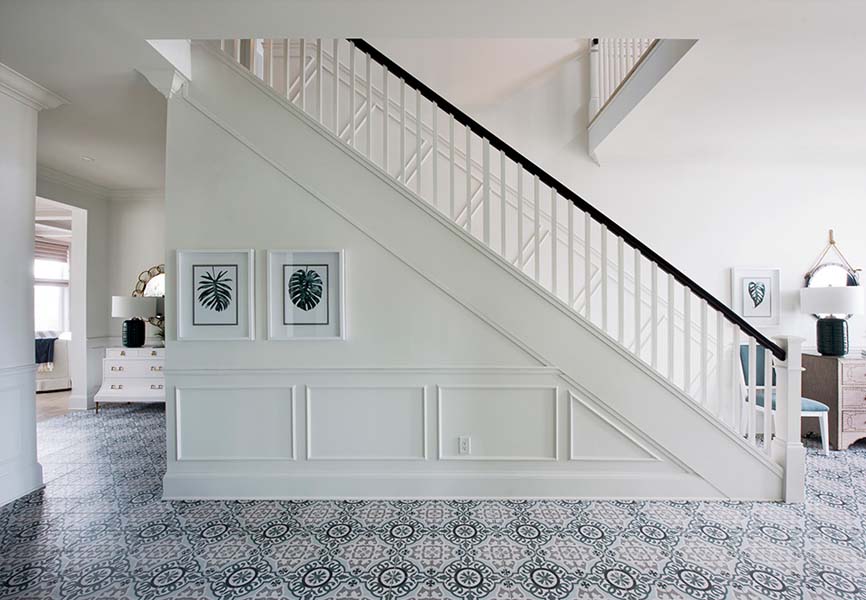
Main floor of the 2019 Minto dream home. Photo: Gordon King
If you’re loving your space just the way it is but want to infuse a hint of Classic Blue here and there, we’ve got you covered. Here’s how:
- Picture frames
- Vases
- Decorative plates on walls
- Accents like throws and candle holders
- Placemats, napkins and table runners
- Pots, pans and cast-iron cookware
- Glassware and cutlery
- Kitchen counter cannisters
- Towels in bathrooms and tea towels in the kitchen

Classic Blue has us swooning over all of the possibilities. As Time Magazine states, this eternal favourite is “thoughtful and thought-provoking, genderless and seasonless, heritage yet contemporary.” And given the 2000 colour of the year was Cerulean Blue, we think it’s more than apropos to start a new decade with another optimistic blue, don’t you?
Related
Where Minto Communities is building


