For the past six weeks, the public has been voting on the entries in the Housing Design Awards, choosing finalists for the 2021 All Things Home People’s Choice Award. Now it’s time to pick the winner.
The People’s Choice Award is a prestigious trophy given out at the annual awards gala — a much-anticipated celebration of the Ottawa housing industry’s finest in design that’s put on by the Greater Ottawa Home Builders’ Association.
All Things Home was honoured to take on sponsorship of the award this year, particularly since it’s the only trophy in the awards program that’s chosen by the public. The award was previously sponsored by the Ottawa Citizen.
Since Sept. 21, design enthusiasts have voted online for their favourite entries in several preliminary rounds to determine the 16 finalists among production and custom homes, condos, renovations, kitchens, bathrooms, green homes and design details.
The winner will be announced at the online awards gala Nov. 19.
How to vote
Voting is done online at gohbavote.ca and is open from 9 a.m. Tuesday, Nov. 2, to 11:59 p.m. Sunday, Nov. 7.
Here’s a look at the 2021 People’s Choice finalists:
Production homes
Entry: Coral Reef — Corvinelli Homes
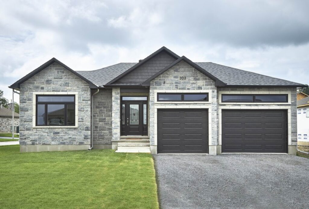
This three-bedroom bungalow is a popular model for Corvinelli Homes, which is building at Russell Trails in Russell. It features nine-foot ceilings, hardwood throughout, a custom kitchen and a three-car garage that has extra room for motorcycle storage.
Created for homeowners who like to entertain, the home features an open-concept layout and a handy covered deck accessed via a three-panel patio door for an inviting indoor/outdoor connection.
Having three bedrooms on the main level offers flexibility, easily allowing for a guest bedroom and a home office. And the layout leaves plenty of room for storage as well as handy utility space in the mudroom/laundry area off the garage, which includes a dog washing station. All of that is packed into just over 1,900 square feet on the main floor.
Entry: Cobble Beach Horizon Series — Urbandale Construction

The Cobble Beach is a larger two-storey single by Urbandale Construction that features 3,149 square feet and either four or five bedrooms. The model, which shows the four-bedroom with loft option, is found at Riverside South.
It’s designed for a 50-foot lot and is built to R-2000 standards for high energy efficiency.
“We decided to take advantage of the generous footprint and developed a fully customized kitchen featuring an oversized island, with an integrated handmade natural ash dining table, paired with matching floating shelves and sleek built-in appliances,” the builder says in its submission.
Urbandale aimed for modern, architectural and sophisticated and used a monochromatic palette that offers contrast and drama, “while demonstrating how to bring out the softer side of using the colour black.”
Custom homes
Entry: Understated elegance — Art & Stone Group
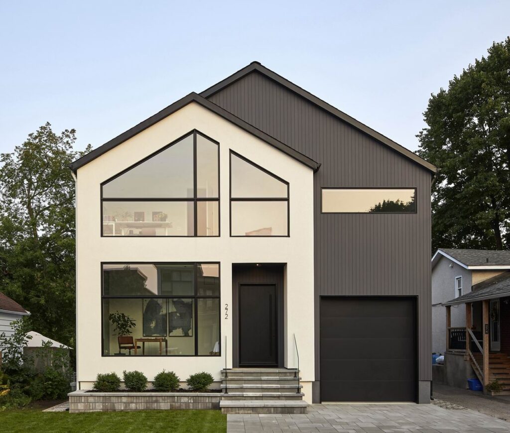
An entry in one of the contemporary custom urban home categories, this 2,850-square-foot two-storey boasts open, clean-lined spaces, lots of natural light and a sophisticated kitchen in off-white and walnut-coloured oak.
“We designed this home during COVID, which shifted our focus on making it feel like all the wonderful places we love travelling to. Since travelling was impossible, we brought the travels to us,” Art & Stone says in its submission.
Features include a wood-burning fireplace in the living room, handmade plumbing fixtures, 14-foot cathedral ceilings on the second floor and double walk-through closets in the master suite.
Entry: A twist on modern farmhouse — Gordon Weima Design Builder
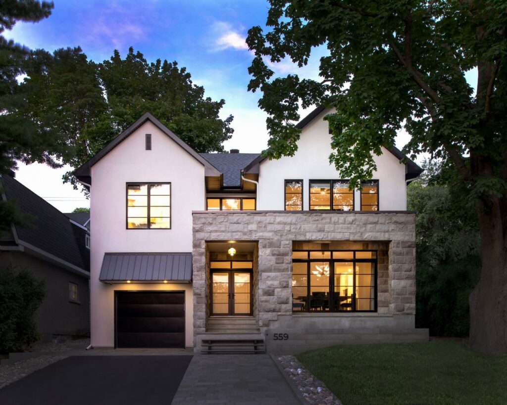
The owners of this two-storey home wanted “a unique twist on a modern farmhouse,” Gordon Weima Design Builder says in its submission. “To deliver their vision, the design added a modern stone element to a traditional look, all while blending into the streetscape. The result is a feeling of quiet luxury, which features comfortable and elegant spaces that travel well in time.”
The home features an unusual centre access, meaning the foyer leads to a small centrally located hallway connecting to the dining room at the front of the home and the kitchen, family room and office at the back. It creates a feeling of cosiness and connection.
Upstairs, the thoughtful layout provides separation between the master suite on one side and the secondary bedrooms on the other, offering a sense of privacy. Other thoughtful touches include space for a sitting area upstairs, a laundry chute from the bedroom level to the laundry room on the main floor, an efficient butler’s and walk-in pantry, convenient access to the office from the side entry/mudroom, and double sliding patio doors that connect the dining room to the front porch.
Condos
Entry: ICON — Claridge Homes
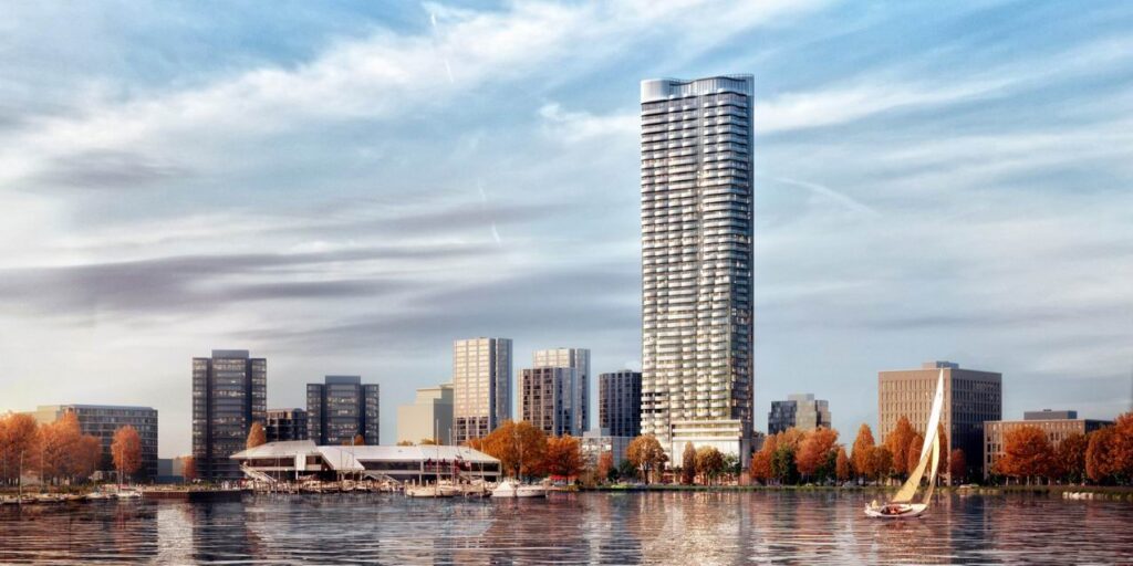
Construction is nearing completion on ICON, which can boast being Ottawa’s tallest residential tower, at least for the time being.
Built across the street from Dows Lake at the entrance to Little Italy, the 45-storey condo tower features a curvy façade “inspired by the swaying reeds on the banks of Dows Lake,” builder Claridge Homes says in its submission.
The street-level podium, meanwhile, “displays a subtle offset design, where cantilevered sections give the illusion of shifting and expanding, welcoming city life.”
The building offers the usual condo amenities, great views of Dows Lake, the Rideau Canal, the Dominion Arboretum, Commissioners Park, and Little Italy, and spaces inspired by Ottawa’s natural beauty.
“Granite, travertine, aluminum and wood are used throughout giving a sense of organic flow,” Claridge says. “And in an homage to the iconic Parliament Buildings and Château Laurier, copper accents are integrated throughout.”
Entry: Rideau Canal custom condos — Roca Homes & Hobin Architecture
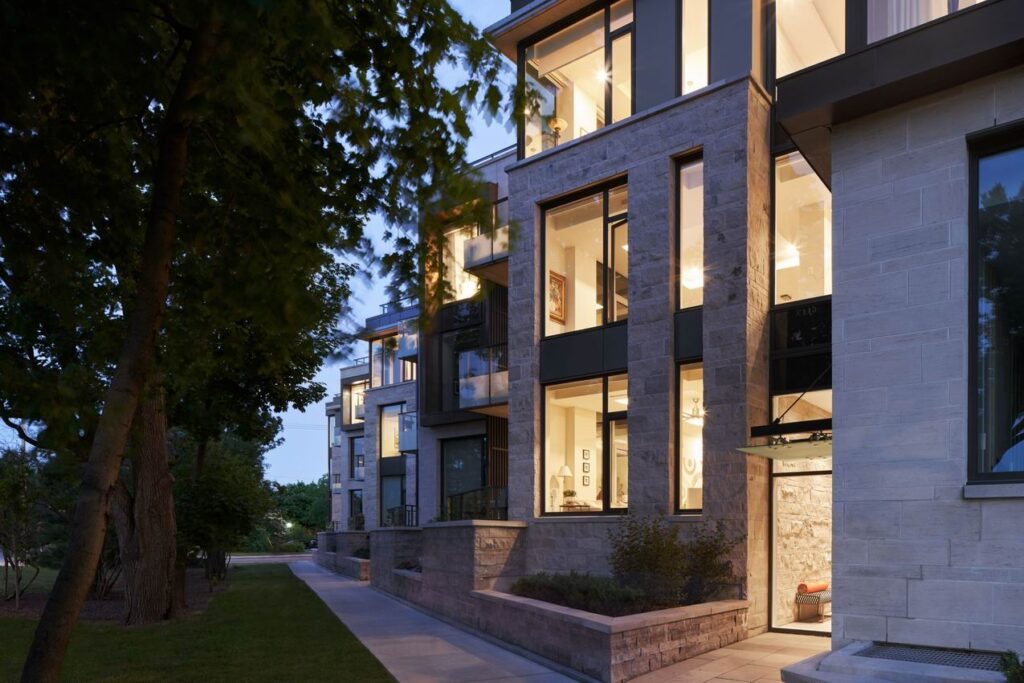
Roca Homes & Hobin Architecture add a custom touch to these 18 low-rise condos along the Rideau Canal in the Glebe.
The building is laid out as stacked apartment flats, but “is expressed as more of a townhouse block to the street, in a rhythm of vertical volumes and recesses,” reflecting the stepped footprint of the former homes on the site, the companies say in their submission.
Units range from about 1,500 to over 4,000 square feet, with balconies and terraces that take advantage of the canal views.
Renovations
Entry: Balmoral reno — RND Construction
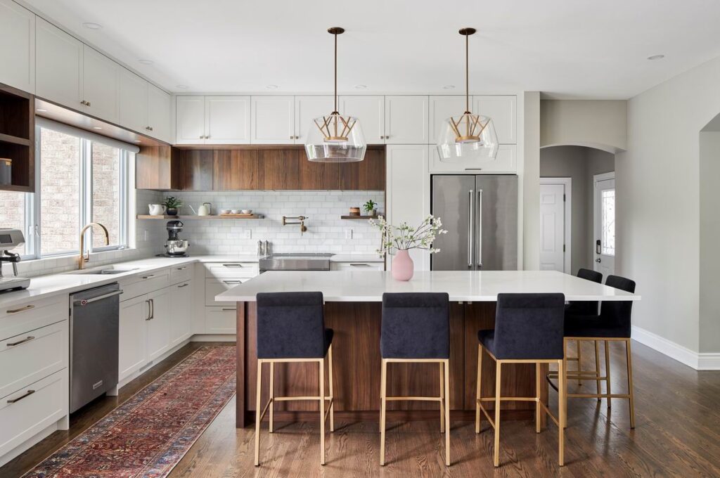
The goal of this renovation was to modernize the client’s kitchen, breakfast area and family room. “Built in 2005, the homeowner had a vision to update the home’s look, feel and function,” RND Construction says in its submission.
Warm brown walnut and bright white make an elegant contrast for the upper and lower cabinets. To gain maximum storage, the upper cabinets were replaced with full-height cabinets and open shelves were added below. The large kitchen island, with space for at least five people, is the central focus of the space and forms a hub for family living.
In the family room (not shown), the fireplace was updated and clad in large porcelain tiles. Built-in walnut shelving that ties in with the kitchen cabinetry in the open-concept space flanks either side of the fireplace.
Entry: The blank canvas — ARTium Design Build
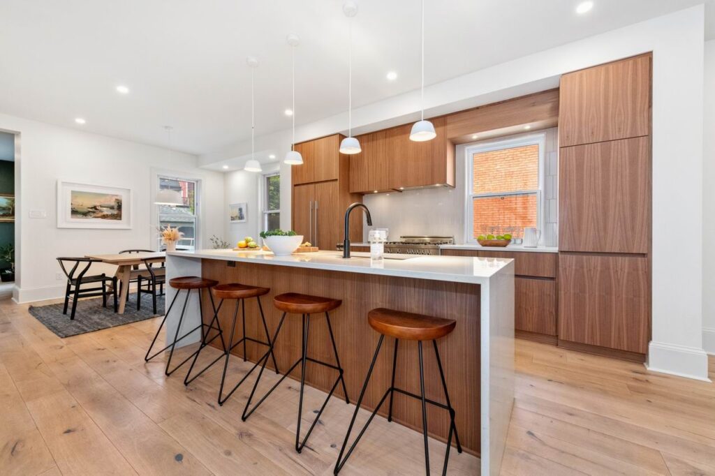
This whole-home remodel saw significant structural alterations, a complete kitchen redo and renovations to every other room. Several walls were removed, “taking a painfully chopped-up floor plan of a century-old home and reshaping it into something more,” ARTium Design Build says in its submission.
Finishes are eclectic, ranging from charred wood panelling to leopard print wallpaper, “to capture the true personality of our homeowners.”
The home is also part of this year’s virtual Reno Tour.
Kitchens
Entry: Festive zest — Deslaurier Custom Cabinets & Urban Quarry
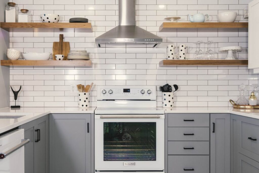
Small but mighty, this 106-square-foot kitchen packs a design punch.
“This kitchen design is clean, contemporary and just a tad quirky,” Deslaurier & Urban Quarry say in their submission. “The colour scheme is neutral in colour, yet bold in effect.”
Soft grey lower cabinets anchor the space, while white uppers, counter-to-ceiling white subway tile backsplash and chunky natural wood floating shelves create a visual airiness.
The polished quartz countertop and small black accents (love the polka dots) complete the look.
Entry: Bennies Corners kitchen — Bex Interiors & Urban Quarry
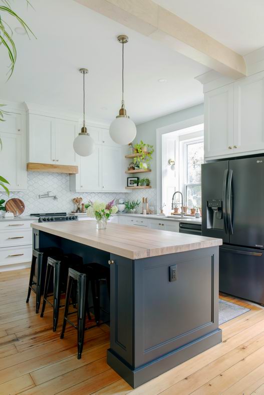
Soft and welcoming, this renovated kitchen has the feel of modern country, which is appropriate given the home is a rural one built in 1856.
It features original pine floors, 21-inch-thick stone walls and a 10-foot-high ceiling in the kitchen.
“A contrast of blues, whites, and natural wood tones modernize the kitchen while keeping in character with the stone house,” Bex Interiors and Urban Quarry say in their submission. “With a touch of mixed metals and greenery throughout, this kitchen is an oasis of natural colours and textures.”
Bathrooms
Entry: Bennies Corners powder room — Bex Interiors
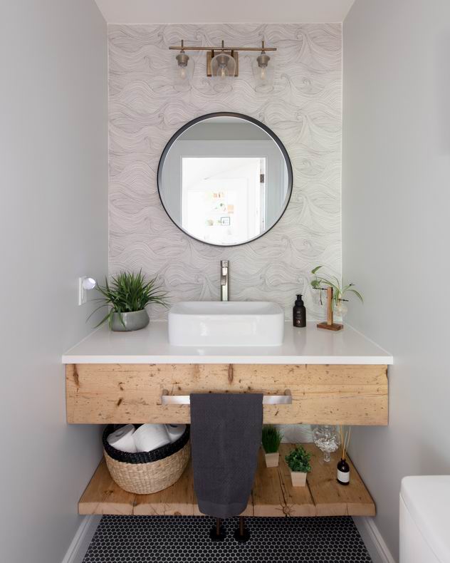
Part of the same project as the previous finalist, this powder room “is the perfect mix of rustic and modern,” the entrants say. It features contemporary mixed metals paired with rustic wood and trim.
“Though small in size, this powder room is packed with custom design features and high-end finishes.”
For instance, the wood from the vanity was salvaged and restored from the original building shell, the wallpaper behind the vanity “adds a unique touch through its fun and sophisticated pattern,” and the detailed flooring creates a colour contrast with the walls and adds texture to the space.
Entry: The neo graphic bathroom — Neoteric Developments
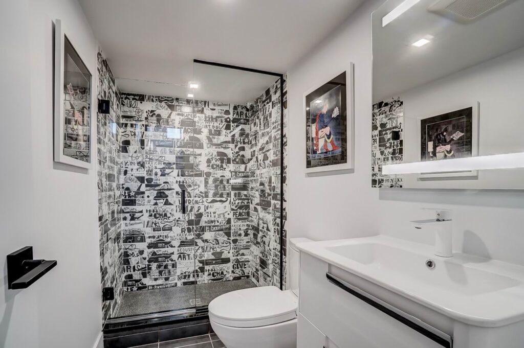
The second bathroom finalist is a sharp contrast to the previous entry. Graphic black-and-white tiles offer an arresting sense of whimsy in this basement bathroom while continuing the home’s monochromatic colour palette.
“The tiles are the developer’s imagination come to life, with each one having been selected and placed. They cry ‘Paris’ and ‘peace’ and ‘give’ and ‘sapiens’ and feature everything from a man’s visage to a moustache,” Neoteric says in its submission. “The tiles mimic the bathroom’s effect: creating a harmony between juxtaposing elements.”
Next to the focal point of the shower tiles, the rest of the bathroom fades to the background. Other fixtures and walls are stark white, while the floor and hardware are black.
“This bathroom is featured at the foot of the basement stairs. As such, it is more than a bathroom — it is a focal point,” Neoteric says. “This bathroom plays an important role in upholding the home’s design scheme and elevating it beyond the expected.”
Design details
Entry: Douglas custom home — The Lake Partnership & Flynn Architect
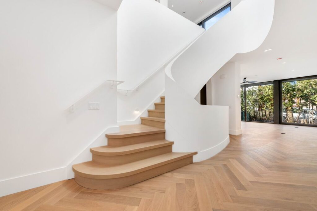
This curvy staircase is a finalist for housing details in a home that is also a finalist for green custom home of the year (see below). The stairs are the element around which the floor plan is centered, The Lake and Flynn Architect say in their submission.
“As a focal point to the home, their curved monolithic, unadorned form is designed to soften the otherwise structured, orthogonal nature of the rest of the house.” Yet the curved form is also echoed throughout the home.
“They are designed to capture the ever-changing light from the oversized skylight above. At times in full view and partial in others, the stairs are always visible.”
Entry: You’re on mute — Laurysen Kitchens
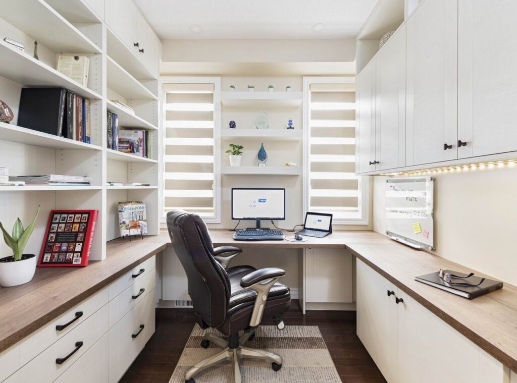
A cosy and efficient work space is a finalist for best home office.
“In this office we did not compromise style for storage — we managed to provide both,” Laurysen says in its submission.
The design took advantage of the windows to allow bright light in (very helpful for virtual meetings). Bookshelves and cabinets were placed on the sides of the room to enlarge the space and extended to the ceiling for plenty of storage.
And decorative shelves were placed so that the homeowner can display accomplishments and grab attention, but not interfere with the flow of the room.
Green Innovation
Entry: Farmside Green, the Walnut — RND Construction & Hobin Architecture
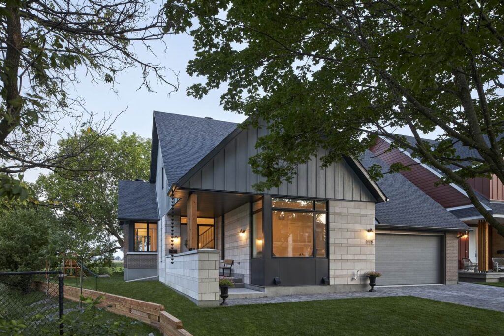
A finalist for green production home of the year, this bungalow by RND Construction and Hobin Architecture is one of nine homes overlooking the Central Experimental Farm in what RND refers to as Ottawa’s first Net Zero ready development.
“This home is designed to heighten the experience of the green space that encircles it,” RND and Hobin say in their submission.
The home expands surprisingly into a soaring two-storey foyer concealed by the deceptively low-profile front façade, they say. “From here, a glimpse of the green vista to the rear of the property draws you inward to the light-filled rear great room,” where windows on three sides capture the surrounding views.
Entry: Douglas custom home — The Lake Partnership & Flynn Architect
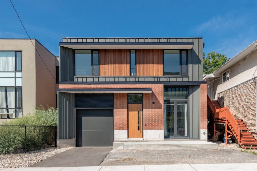
This home is located on a small infill lot in an older part of Ottawa. The design challenge, say The Lake and Flynn Architect in their submission, was to meet the client’s requirements for a home that would fit into an established neighbourhood, was livable and functioned well, while meeting durability and high-performance goals. It’s a finalist for green custom home of the year.
“The plan has roots in a traditional layout and was developed around a central skylight and curved stairs,” they say (see entry above).
“Massing is a simple box form punctuated with sheltering canopies and a balanced arrangement of materials and windows. The second floor is set back to further soften the scale and provide visual interest.”
