Curves have become trendy lately. They’re not new — they’ve always been an element of design, but they are definitely having a moment in Ottawa homes.
“As trends change, people tend to stray away from what used to be popular,” says designer Leonhard Vogt. “In the past five to 10 years, straight lines and right angles have been all over design and architecture. So, the obvious response against that is curves and organic shapes.”
They are a simple and timeless way to add movement to a space, adds Sascha Lafleur of West of Main, which is Ottawa’s current designer of the year. “They draw the eye and create a sense of flow. You can incorporate them in so many different ways, too — architecturally, in lighting, furniture and other accents.”
Designer Tanya Collins agrees. “Curves inject a sense of history and character when used in an architectural context. They also add softness to otherwise angular spaces, finishes and furnishings.”
We are naturally attracted to these forms because nature is organic, adds architect Jay Lim of 25:8 Architecture + Urban Design. “When they are juxtaposed against the rectilinear forms of contemporary architecture, it becomes a playful moment of design. When curves are used thoughtfully, they can draw attention to key details we would never have seen.”
Creating curves
Adding curves to a space can be as simple as hanging a rounded mirror on the wall or as elaborate as a major architectural element.
Here are 10 Ottawa-area projects that show their curves.

Project: West of Main with Art & Stone Group
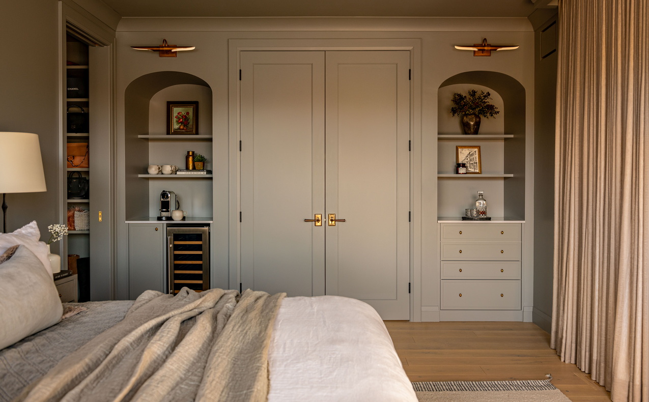
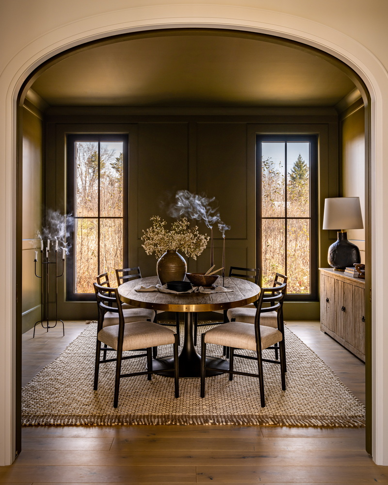
The details: The award-winning custom home was designed to blend modern and traditional elements for an overall transitional style. “We used three-point arches throughout the home as a nod to traditional architecture over completely circular arches, which are more popular in modern design,” says West of Main founder Sascha Lafleur.
Examples of those arches include the elegant entrance to the dining room, which includes pocket doors (not shown), and the double recessed built-ins in the primary suite, one of which is a coffee bar.
The home has won housing awards at both the local and provincial level and is a finalist for this spring’s national housing awards.
MORE: Read about this multi-award-winner
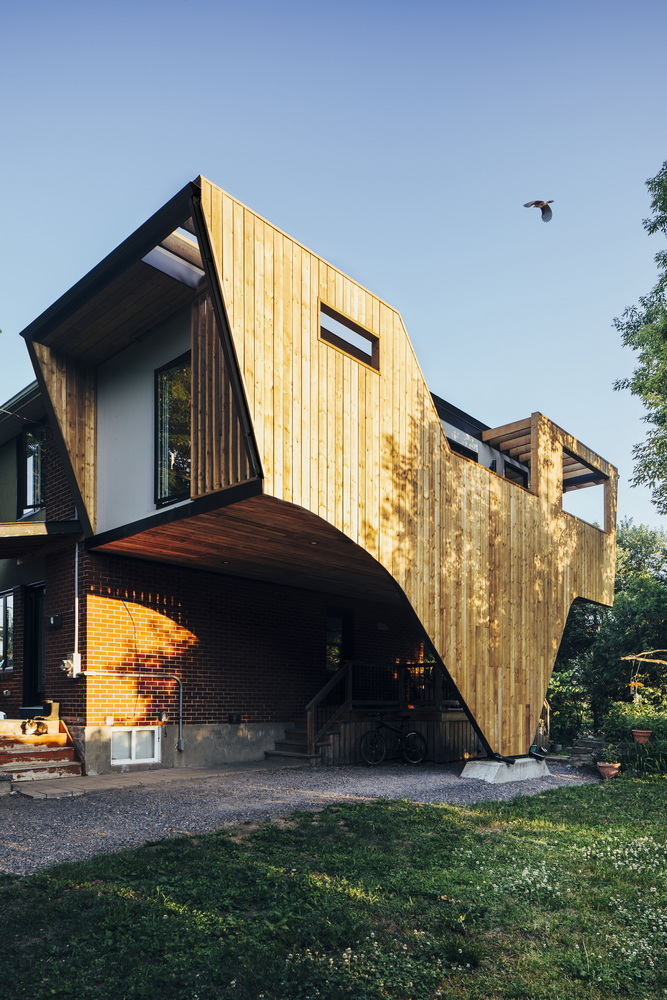
Project: 25:8 Architecture + Urban Design
The details: This unusual renovation integrates curves into the façade to evoke a sense of fluid motion, says Lim. “The most striking aspect … is the ‘wing,’ which gently sweeps to the ground. The project was designed for bird watchers and the architecture is inspired by a blue jay in flight.”
The project was a winner at last fall’s Housing Design Awards put on by the Greater Ottawa Home Builders’ Association.
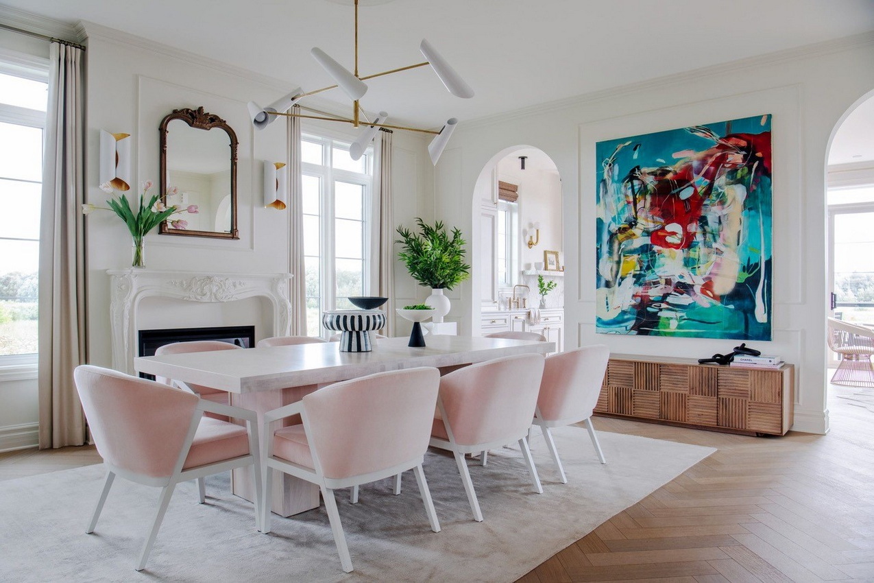
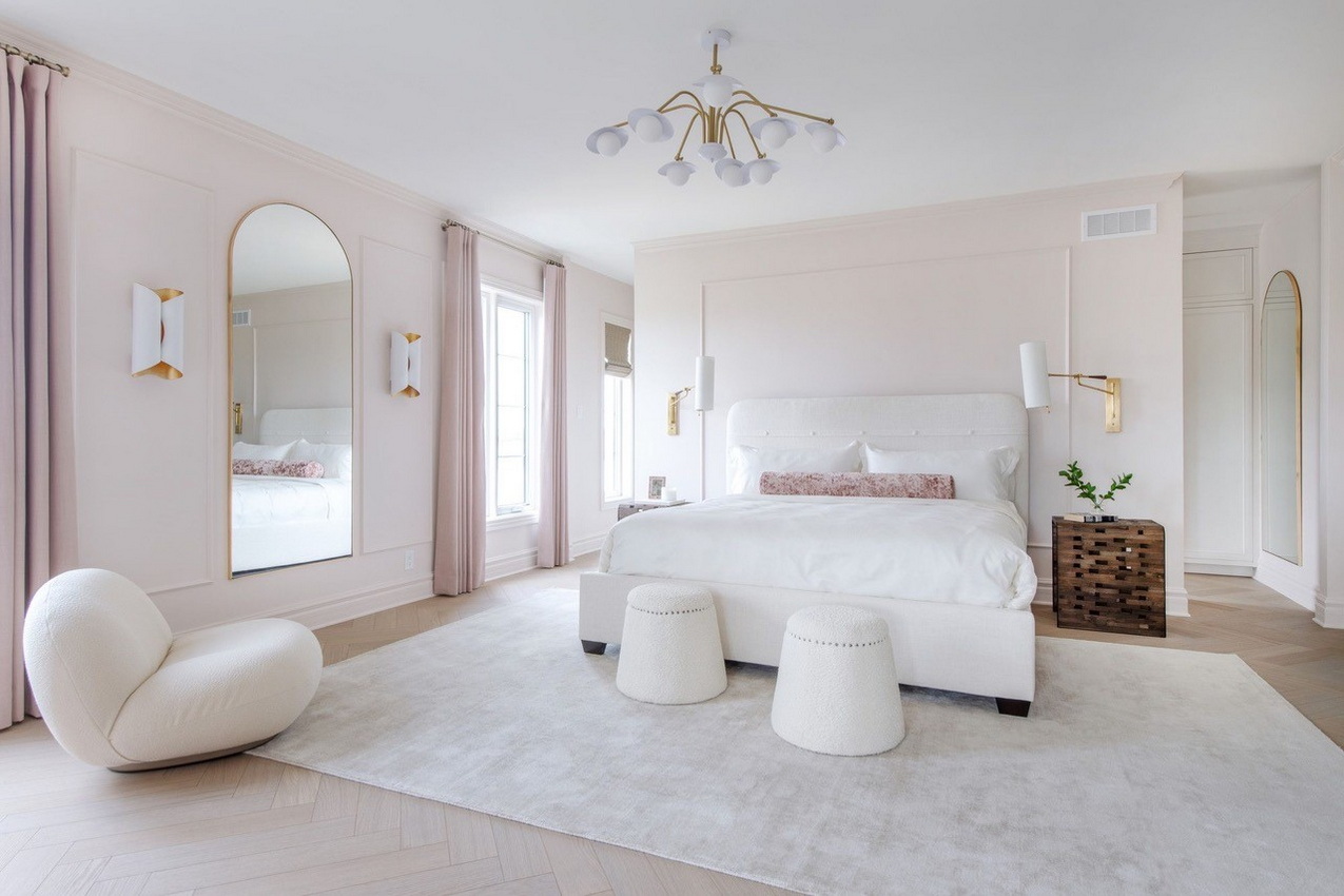
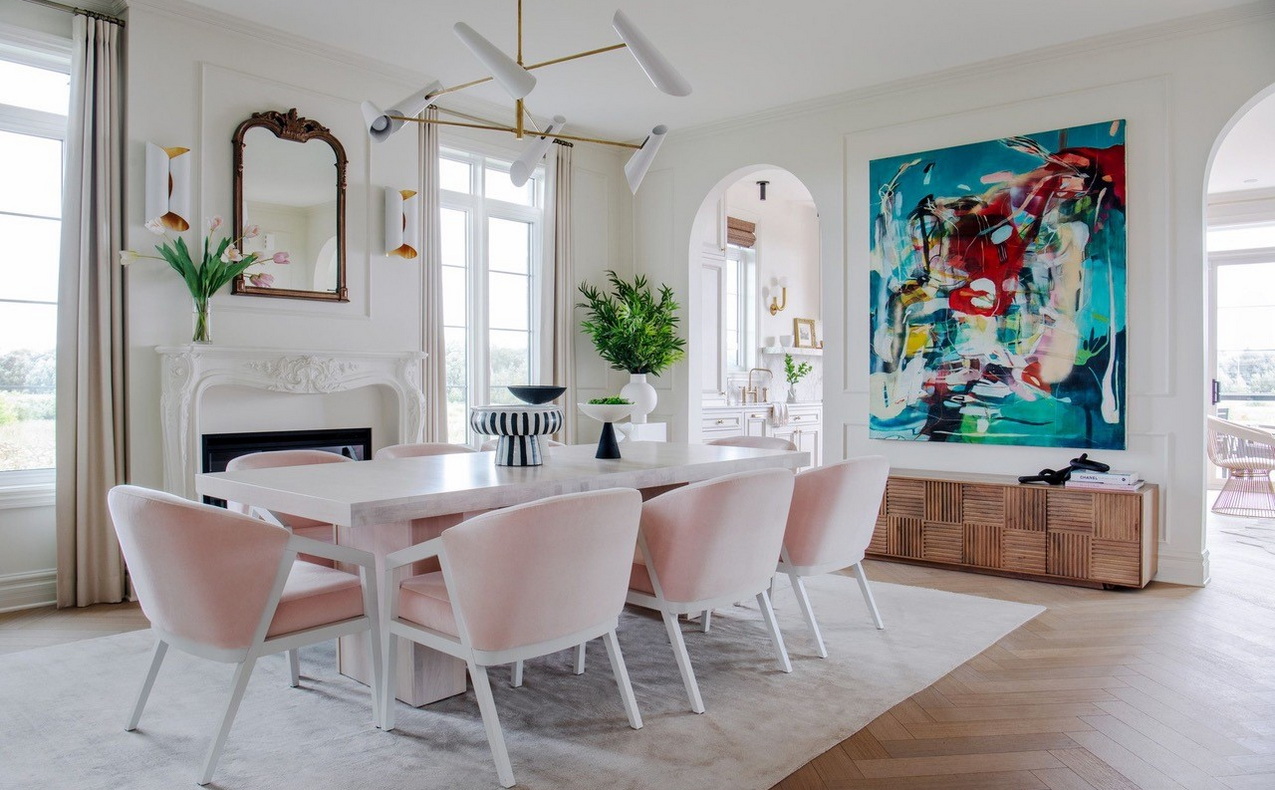
Project: Le Rêve, the 2022 Minto Dream Home by Tanya Collins Design and Minto Communities
The details: Arches were used for the interior architecture and through the choice of decor shapes in the home to reference a Parisian Haussmann-style apartment and an Art Deco esthetic, says Collins. “The oversized archways add drama and emphasize the tall ceilings when transitioning from the front to the back of the home; the neoclassical mantel adds Parisian flare; while the tub-style dining chairs, arched mirrors, headboard and Pacha chair add femininity and softness.”
The home, which was part of the grand prize in the CHEO Dream of a Lifetime lottery, won five awards at the Housing Design Awards and was a finalist in last year’s national awards.
MORE: Take a tour of the 2022 dream home
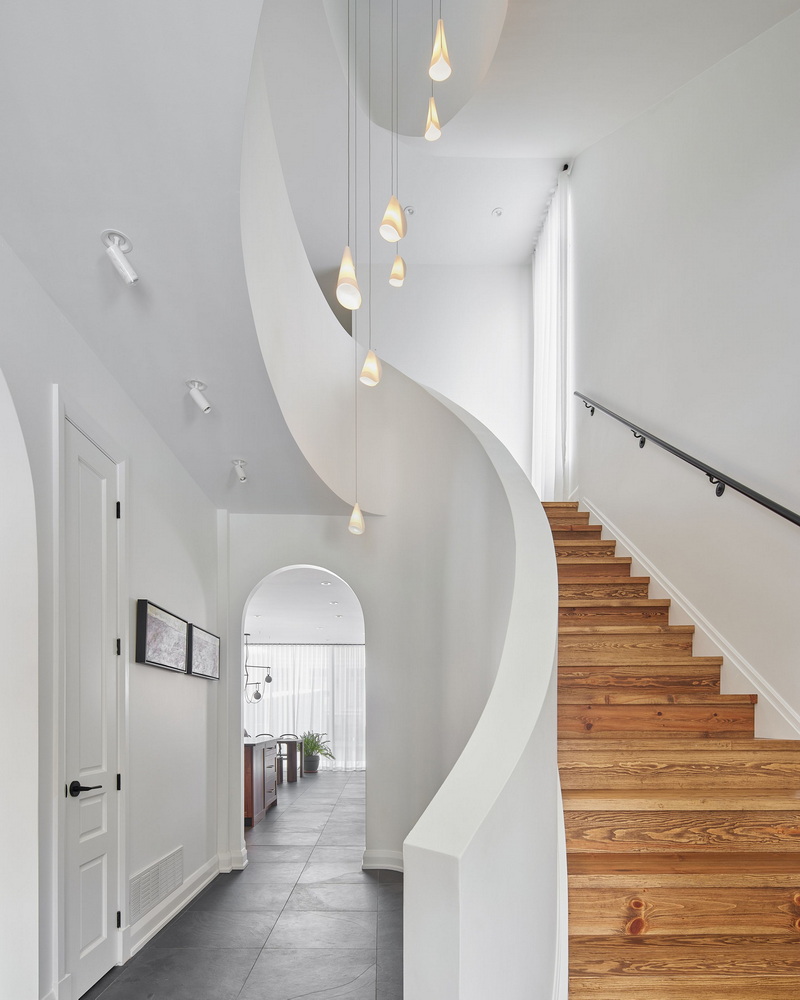
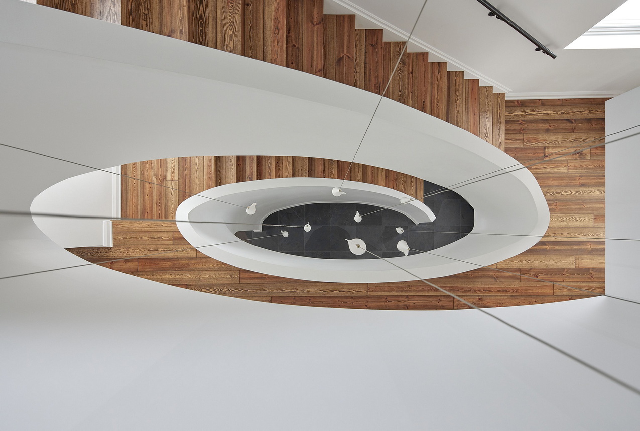
Project: Shean Architects
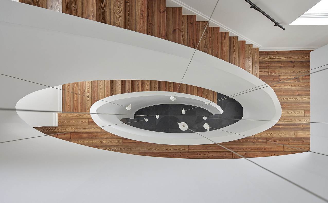
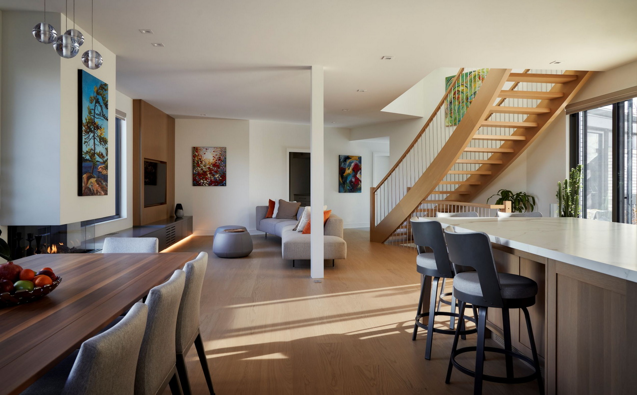
The details: A sweeping sculptural staircase was added in the renovation of a Glebe home to provide “a gestural, contemporary response in harmony with the history and existing character of the home,” the company says in its submission to last fall’s Housing Design Awards, where it won the housing details category.
“The curving nature of the staircase finds kinship with the mouldings and with the folded raw porcelain pendants that cascade down from the third floor to the ground level.”
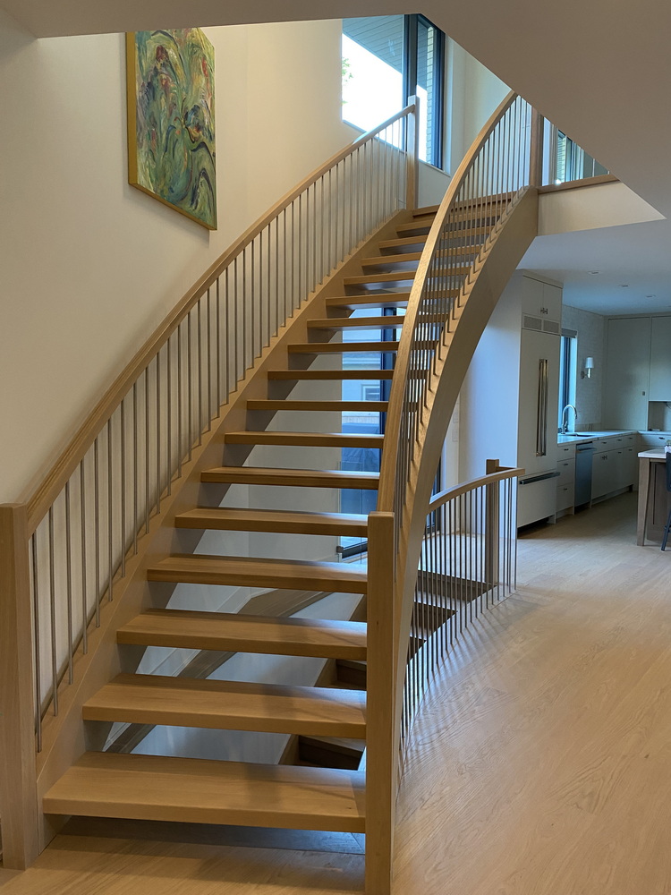
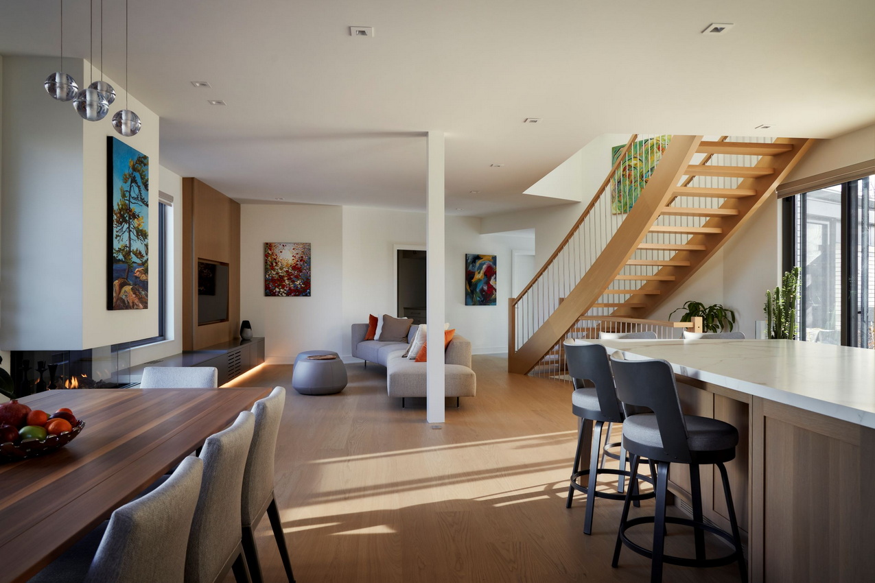
Project: RND Construction
The details: RND owner Roy Nandram recently built this custom home for himself and added the hint of a curve to the open staircase as a way to naturally link the two different angles in his home. “It offers a more dynamic and visually pleasing environment,” he says, adding that curves “create a more inviting atmosphere compared to sharp angles, (which) can contribute to a sense of comfort and relaxation.”
The home was a stop on last fall’s Reno Tour and can still be seen virtually, and it’s a finalist for this spring’s national housing awards.
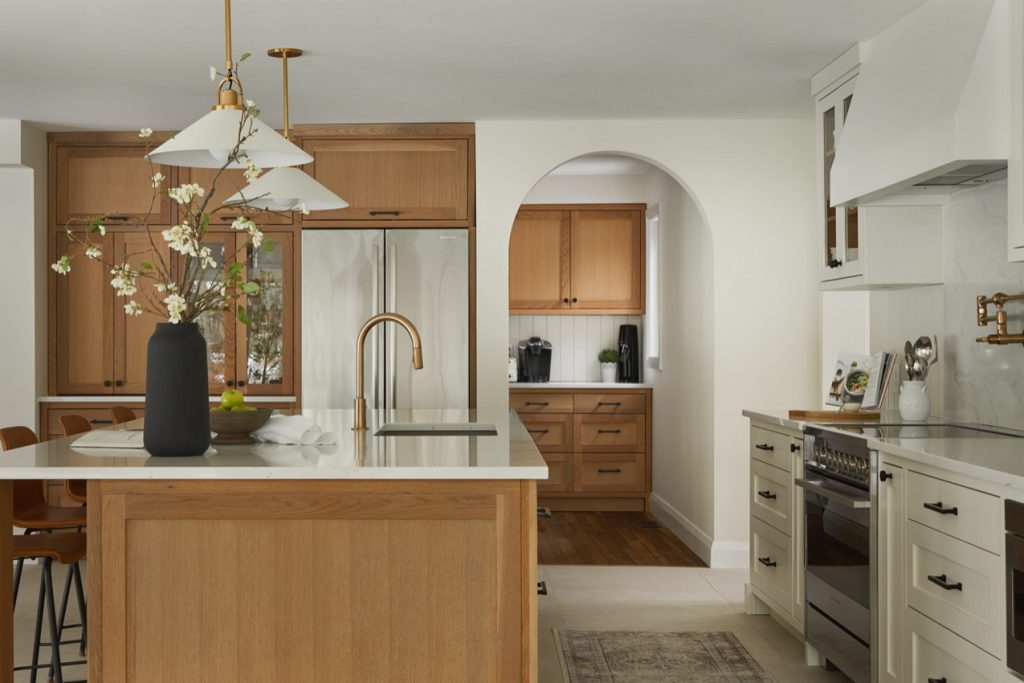
Project: Tanya Collins Design
The details: Arches are a common way to add curves in a space. In this renovation project, an arch was used to transition from the newly renovated addition to the original part of the home.
“We partitioned the space so that it served as a pantry for food storage and an extra freezer off the kitchen,” says Collins. “The arch in this example adds a subtle Mediterranean influence when combined with the earthy warm wood kitchen palette.”
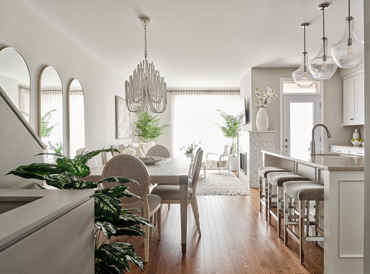
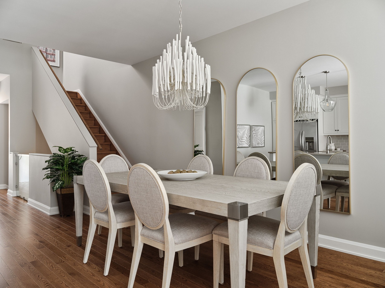
Project: The Weston model by HN Homes and Vogt Design
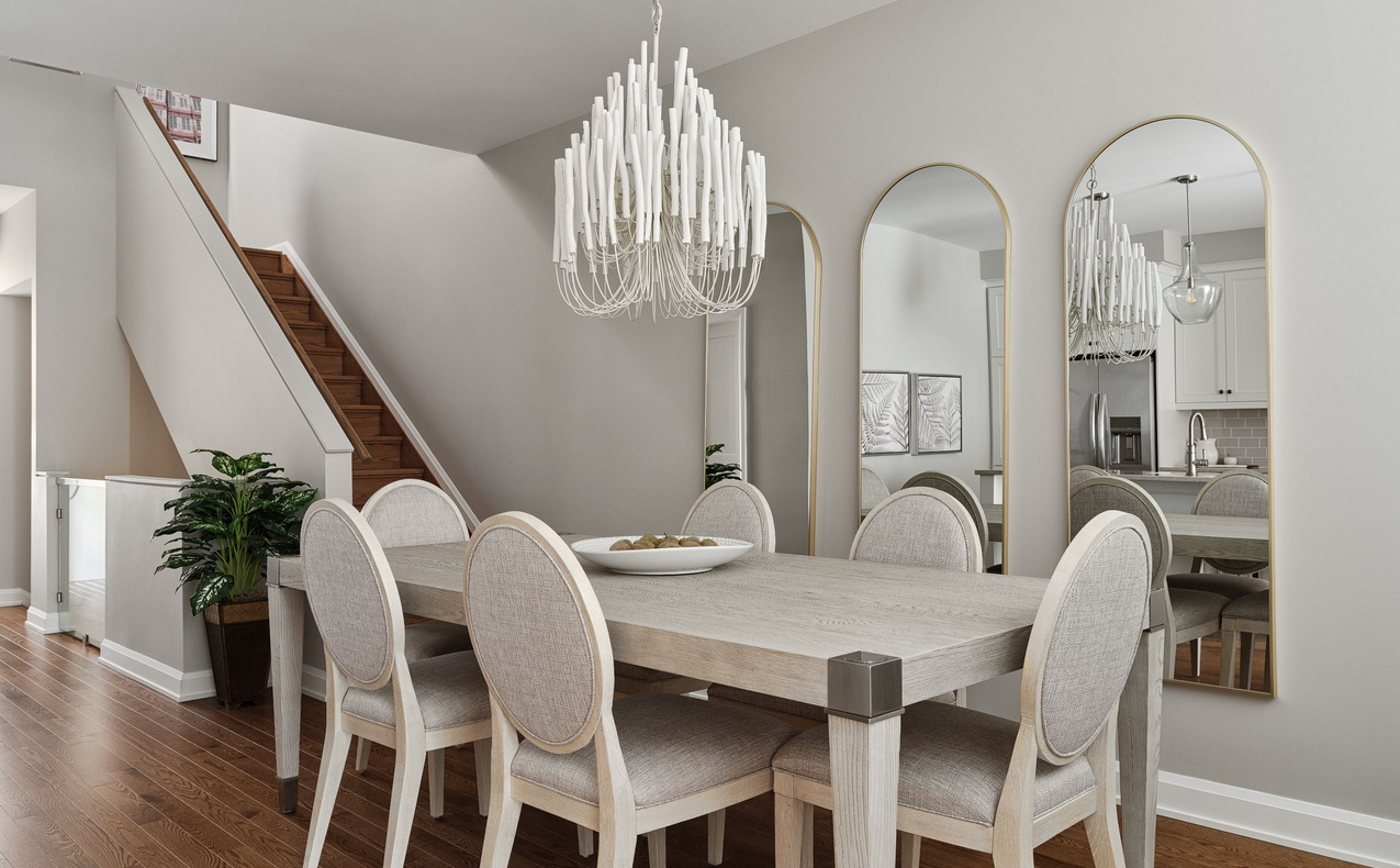
The details: The design style of this home is clean-line traditional, with curves introduced to give softness to the sharp corners, says Vogt. “The circular backs of the dining chairs are a clear nod to King Louis and neoclassical design,” while the trio of dining room mirrors creates “an arcading effect that is very classical in nature and balances the three round pendants above the island.”
The main focal point is the chandelier, which is meant to mimic a fixture filled with candles, “one of the most traditional ways to illuminate an interior. All these rounded edges and curves, paired with the pale colour palette, create a beautiful airy feminine space.”
The home was a finalist in last fall’s Housing Design Awards.
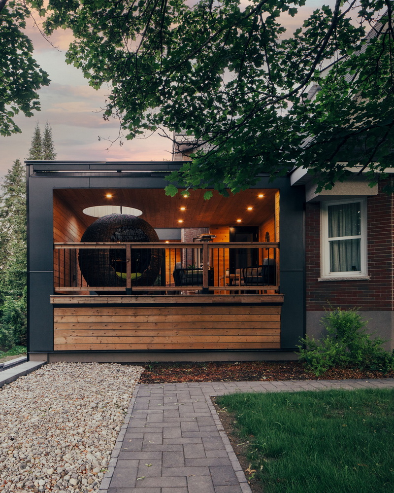
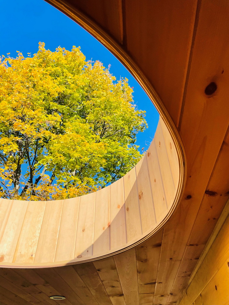
Project: 25:8 Architecture + Urban Design
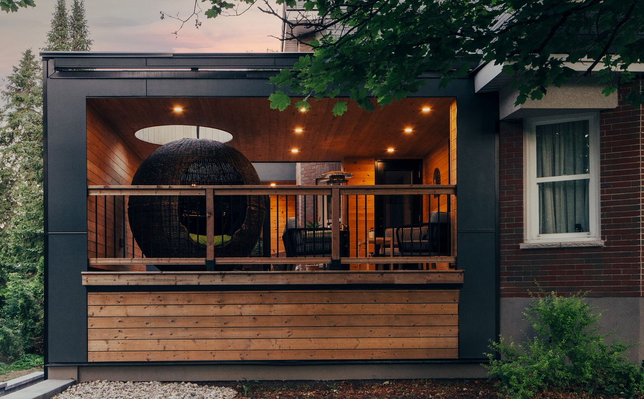
The details: A covered deck added to a historic home allows the owners to enjoy their outdoor space even in poor weather. “While it did prevent rain, it also blocked the view of the mature treetops,” says Lim.
An oculus, or eye, was cut into the roof, partly to accommodate (and echoing the shape of) a dramatic round ratan chair, and partly to frame a view to the sky and surrounding treetops. “The fall rhapsody against the blue sky makes the colours even more vibrant.”
The project was an awards finalist.
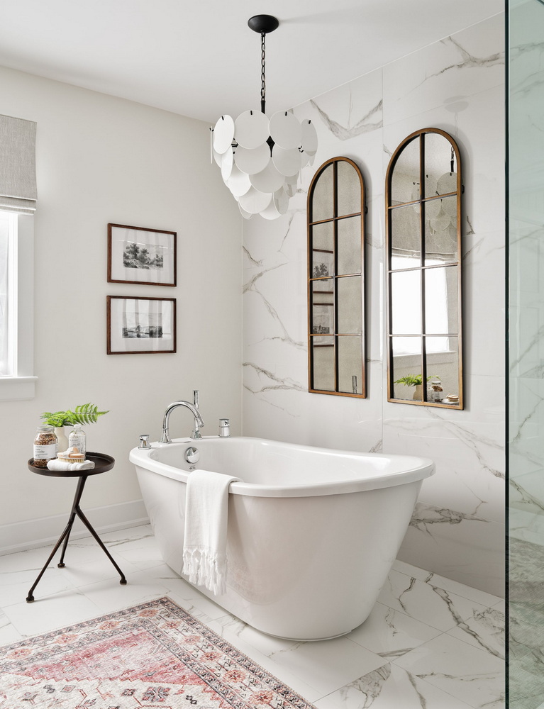
Project: The Kensington model by Tamarack Homes and Sonya Kinkade Design
The details: The ensuite of the primary bedroom is a bath “encompassing balance, colour, movement, pattern, scale, shape and visual weight,” Kinkade says in her submission to the Housing Design Awards. Curved elements such as the standalone tub, the chandelier and the arched mirrors add a softness to the space for “picture-perfect moments.”
The home, and its ensuite, were finalists in the awards.
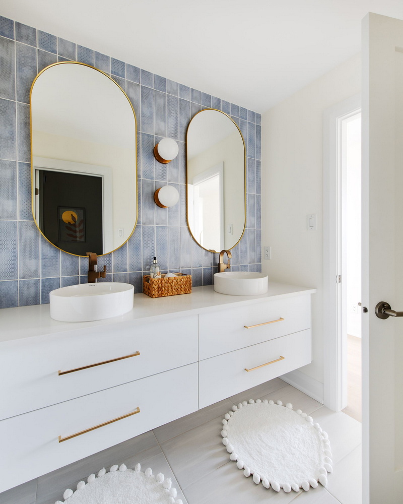
Project: The Santa Maria model by Urbandale Construction and Laurysen Kitchens
The details: “The use of curves is a subtle way to incorporate biophilic design (or design that connects to nature) in our homes,” says Urbandale’s Melissa Boudreau. “Rounded edges of furniture, lighting and accessories echo organic forms and introduce a sense of fluidity and calmness, making the hard edges of many modern spaces feel less rigid.”
Urbandale’s Santa Maria model is an example of this, with the ensuite of the mid-century-modern-inspired home balancing clean lines with curves. “The vanity’s backdrop has a geometric tile presentation that plays with colour and texture. Rounded mirrors and globe sconces soften the composition, with sinks and faucets continuing the circular rhythm.”
The home was a finalist in last fall’s awards.
