Ottawa’s 2021 custom builder of the year is builder and renovator Art & Stone Group, which is run by Andrew Decristoforo and his wife, Alexandra Corriveau.
Following in his father’s and grandfather’s footsteps, Decristoforo focuses on high-end projects with an emphasis on using green materials and smart technology.
Besides the custom builder award, Art & Stone won four trophies at the Housing Design Awards put on by the Greater Ottawa Home Builders’ Association last fall. One of those wins included Decristoforo and Corriveau’s own home, a charming four-bedroom infill that is both eye-catching and understated at the same time.
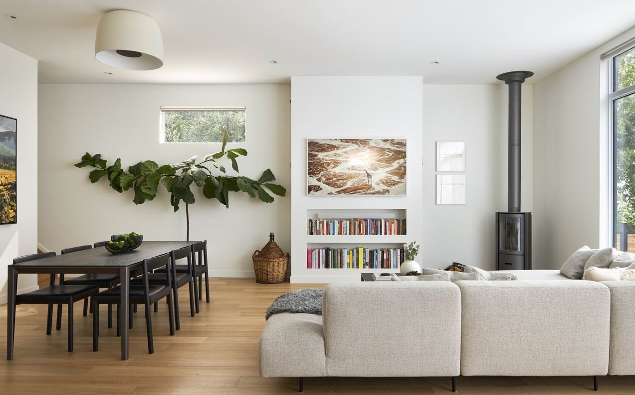
Corriveau, who is Art & Stone’s chief operating officer, describes the home as minimal Scandinavian, with clean simple lines.
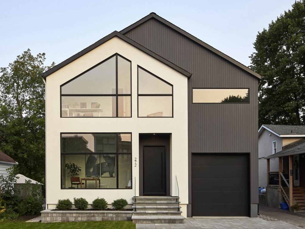
“We really wanted a great contrast in colour, which is why we went with an off-white and charcoal. We wanted one side to be almost all windows, keeping the look minimal and light, while the other side would be moodier, and have less glazing. We are really happy with the outcome; it isn’t always easy to design a captivating façade when the lot is so narrow.”
They designed and built the 2,850-square-foot home themselves, during the pandemic, prompting these travel enthusiasts to shift their focus to making it feel like all the places they love visiting.
“With COVID changing our way of living, we really made sure our home pulled some aspects that we loved about our favourite countries — like Japan, Europe as a whole, Scandinavian countries — so that we would feel like we were travelling, but at home,” says Corriveau. “We also made sure that we have tons of little nooks in the house, to ensure that we both had our space, given the fact that we were forced to stay home for the better part of two years.”
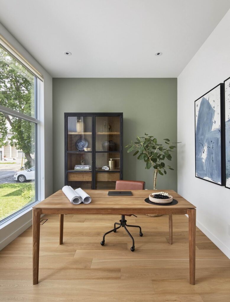
And they wanted to make sure they each had offices with lots of natural light all day, which is why both of their offices are at the front of the home, one on top of the other.
“Indirect light all day makes it bright but never aggressively bright or warm,” she says.
Corriveau recently answered some questions about their award-winning home. (Edited for clarity.)
Q: What was the best part of doing this project and why?
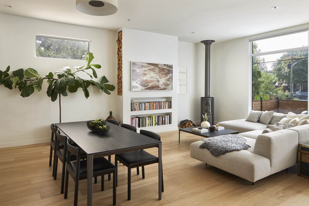
A: We love the kitchen and the living room. With the frigid winter we are going through, the fireplace is on every single night. It makes for such a cosy space with the amber glow and the wood crackling.
The kitchen is fantastic for hosting, although COVID hasn’t let us get the full use of it yet. But it’s a great space for cooking, as well as entertaining.
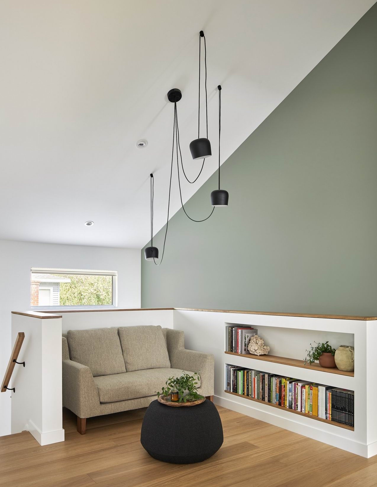
I also LOVE my little reading nook upstairs. It’s perfect for some alone time.
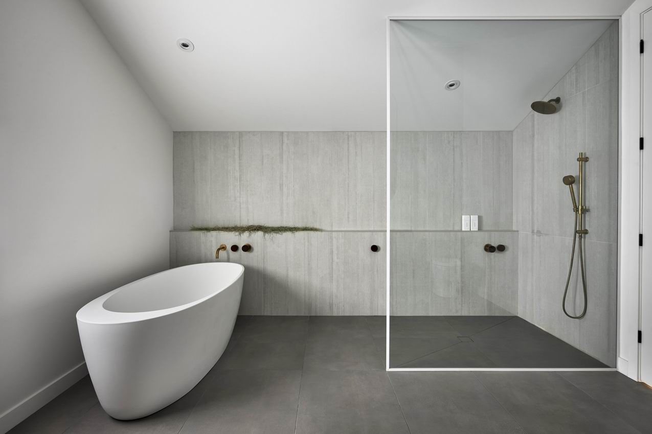
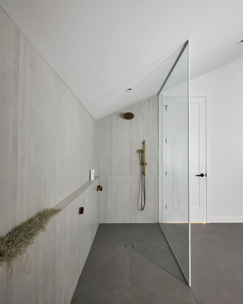
Our master bath is also wonderful. Pictures really don’t do it justice. It’s a showstopper for everyone who has been in the house. It’s so big but it still feels cosy at night — the milky glass pendants ooze a soft moon-like light and the walk-in shower feels like you are showering outside.
Q: What was the biggest challenge and why?
A: Design-wise, the vaulted ceilings upstairs make it a bit more difficult to design a home as you must place things strategically, due to the angles. I think we did a great job with it in the end.
Q: Besides your travels, how else was the home designed to meet and reflect your personality?
A: We are both very organized and tidy people, so the design of our home was cleverly done in a way that everything could be tucked away, removing unnecessary clutter.
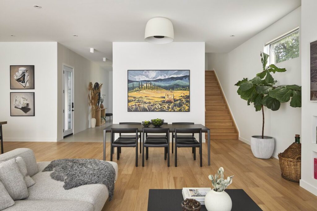
That being said, we both wanted our home to feel warm and inviting, so we used natural textures, soft materials, textured wall tiles, etc., to make it feel natural yet minimal. We love smart use of space, so every part of the home has its use and is (and will be) used every day.
Lastly, we love materials and objects with a story or history. We’ve carefully chosen high-quality materials and products that come from companies with likeminded values. We’ve also integrated some heirloom pieces from Andrew’s Italian family.
And we’ve commissioned a wonderful artist to paint this big piece for our dining area of, I’ll say, arguably our favourite place on Earth, Tuscany. Every time I look at it, it makes me so, so happy.
Q: There are some interesting lighting choices. Why did you choose the fixtures you did, particularly the powder room?
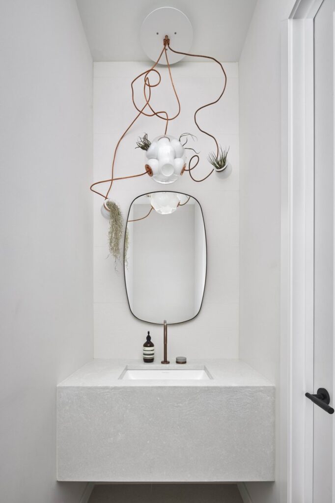
A: The powder room light is probably the funkiest thing in our home. We love Bocci, and we really wanted a light fixture that had copper in it, to work with the Watermark antique copper faucet. Both the light fixture and the faucet will develop a patina over time, which will yield a lovely green copper tint.
The rest of the bathroom is very tame in colour, all really focusing on the texture of the concrete vanity and the texture of the matte wall tiles, so we thought the pop of funky would be lovely in there. The light also hosts live plants, which we thought was such a cool feature.
Q: Who designed the kitchen and what informed the design choices there?
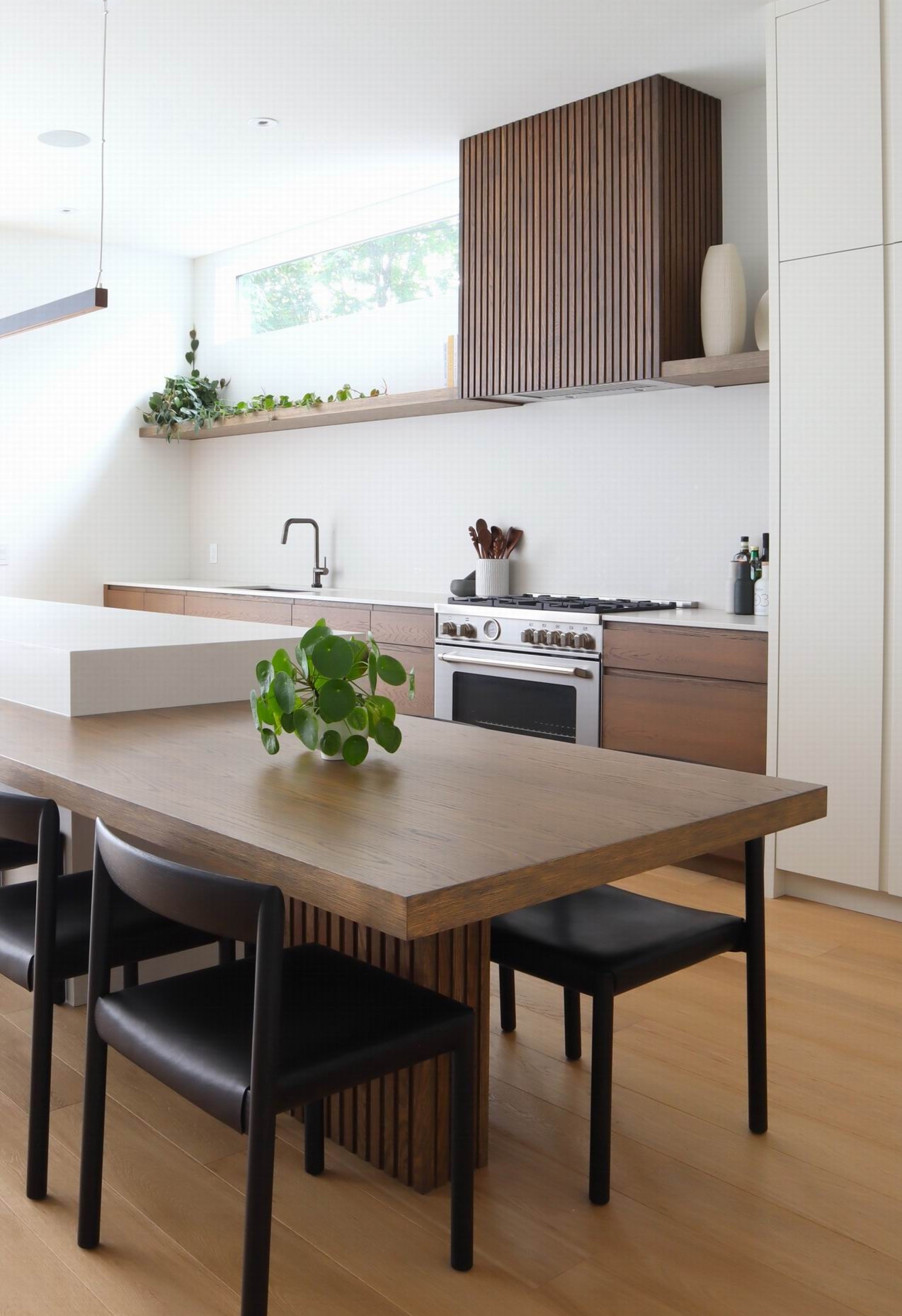
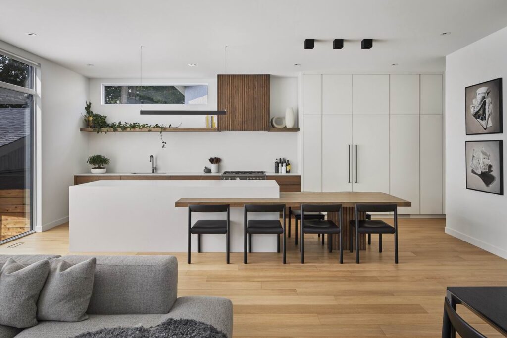
A: I designed the kitchen with the help of our kitchen company, Handwerk, which did all the millwork in the home. I wanted a minimal kitchen that would be extremely functional, but that wouldn’t look extremely functional.
You can’t really tell but each drawer and cabinet has a purpose. I had a master list of everything I had to fit in the kitchen, and it all did. We even have our full pantry in here as well.
I wanted the island to be big, but not look massive. I think the soft look of it makes it perfectly proportionate. We always end up eating at the island and that’s why I decided to do the table attached to it. It also serves as a bar area for guests to sit at while I cook.
This style is very much inspired by a minimal Japanese essence. The richness of the wood really pairs well with the off-white creamy colour of the island and cabinets.
