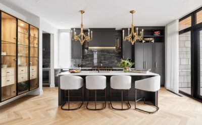
We hear a lot about the importance of a home’s curb appeal, how it creates a first impression, welcomes visitors in and sets the tone for what’s to come inside. But often forgotten, yet just as vital, is your home’s entrance, or foyer.
“It’s like the start of a good book or movie,” says architect Anthony Bruni of Colizza Bruni Architecture. “It does set the tone for the rest of the house, but it should be very thoughtful and be a special moment all its own.”
Ideally, adds Brian Saumure of Maple Leaf Custom Homes, “the foyer offers a glimpse of other rooms in the home and piques an interest in your guests as to what lays beyond.”
Jump right to:
→ Are foyers a casualty of shrinking homes?
Playing with aspects like furniture, decor, lighting and scale “allows the host to create a dynamic, layered mood,” says designer Julia Enriquez of Astro Design Centre.
American architect Frank Lloyd Wright was known to design compressed, darker foyers with lower ceilings to allow visitors to “discover” the comparatively more spacious openness of the home beyond, notes Hugo Latreille, an intern architect at Hobin Architecture. “This trick might not be used very often in modern homes, but it’s a good example of how the foyer is an integral part of ‘manipulating’ your spatial experience when you walk in. These days, we tend to favour warmer, more inviting spaces that transition visitors gradually into the rest of the home.”
But the foyer is also a hub, says architect Rosaline Hill. It’s not the same kind of hub as the kitchen, which she refers to as the living hub, rather the foyer is the movement hub.
“The foyer is about connection. It’s where the pieces of the house kind of come together … The more connected it feels to the house, the more meaningful it is as that hub.”
Taking inspiration from several entries in the latest Housing Design Awards, we shine the spotlight on this transitory space in every home.
Elements of a good foyer
Functionality is key, but also important are style, lighting, decor and maintenance, says Michael Mazzarello of RELM Builders.
And if you don’t have a mudroom to provide a separate space for the family’s comings and goings, your foyer needs to handle many functions. “There’s often a lot of thought has to go into that to serve all those different purposes,” says Bruni.
If it’s your primary entrance, the foyer will be one of the harder working rooms in your house, adds Steve Ardington of Ardington + Associates Design. “Consider your daily routine during each season and take an inventory of all the items your family will need to store, and make sure everything has a home.”
Cabinetry is a great way to make a foyer feel homey and cosy, while also storing away all the family’s clutter, says Alexandra Corriveau of Art & Stone. “Once that is designed, we can play with colour and textures to make it extra inviting.”
If you have the space, try adding a console table with a bench to give you a spot to drop your bag, mail and keys when you come in and your guests a place to sit while they remove or put on shoes, adds Enriquez. “Let it showcase your style, mood and personality.”
She also recommends a mirror above the console table to give it that finishing touch. “Mirrors will make the foyer light, bright and airy … Also, that beautiful mirror will give you a chance to check yourself before you head out the door.”
Also key: impactful and practical flooring, says designer Brenda MacPherson. “This is an area where you can make a statement with interesting tile or an area carpet. Both have to be practical and withstand the outdoor elements.”
Tile that has some texture and variation will help disguise dirt, water and salt, adds designer Sascha Lafleur of West of Main. “And if you have a sleek, polished tile, make sure to place a substantially sized indoor/outdoor rug to minimize any mess.”
Latreille also notes that we often treat foyers purely as the entrance to the home, but we must consider it’s also the last space we venture before we leave. “How often do guests congregate at the front door to continue the evening’s conversation on their way out at the end of a late night? Having a pleasant space that is large enough for people to say their goodbyes, hugs and just generally conclude the evening will set the tone for how visitors remember their experience.”
Foyer trends
Today’s foyer is “more flexible now and it can be almost anything, depending on the lifestyle of the client, depending on the design of the home,” says Bruni. And that’s leading to many observations.
Attention grabbers: Several industry experts are noticing a trend toward more adventurous foyers, whether it’s through bold colours, tile or decor. “We’ve seen a shift toward moodier, rich spaces in design,” says Lafleur. “With foyers typically being smaller, separate spaces at the front of the home, this is a perfect opportunity to apply bolder design choices.”
Fun with flooring: There’s a resurgence of more classic finishes, like a checkered floor — “this pattern is timeless and elegant and I love how it brings the past and present together,” notes Enriquez. Another classic pattern, herringbone, is also becoming popular again, “or something unique on the floor to draw some attention there,” adds designer Gordon Weima.
Foyer furniture: Elevating functional items for storage and seating into furniture, like an armoire instead of a closet, is also growing, along with incorporating other pieces into the space. “It makes the entry a little more personalized and comforting,” says Ardington.
Open concept: “We are seeing foyers being more integrated into the modern open-concept design,” says Doug McCausland of Crossford Construction. “High-quality front entry doors that shield from the cold and the rise in popularity of separate mudrooms for your immediate family’s daily use are allowing people to further reduce compartmentalization of the foyer from other main living spaces.”
Melding with the mudroom: “As we move forward, we’re going to be reducing the size of our homes,” says Hill. “One of the great functional combinations to save space is combining the foyer and the mudroom. The challenge in the future will be to combine the mudroom with the foyer without losing the glory of the foyer.”
Are foyers a casualty of shrinking homes?
In some cases, yes, says Mazzarello. “With limited space, some newer homes are opting for more compact entrance areas that serve the practical purpose of providing access to the home, but may not have the space or design elements to be considered a formal foyer.”
But the trend towards smaller homes doesn’t necessarily mean the end of the foyer, he adds. “Many homeowners are still incorporating foyers into their design plans, even in smaller homes, as a way to create a welcoming and stylish first impression for visitors.”
Every home has a foyer, notes designer Gina Godin of Mainstream, from smaller war-time homes to large estate ones. “How you create a functional visual space when you enter the home is really the key.”
Katherine Toms from eQ Homes agrees. “A foyer doesn’t need to be the size of a ballroom to have an impact. The right console table, wall decor and choice of paint colour can transform the smallest entryway into a welcoming space that sets the right tone.”
Foyer inspirations
Here are 19 examples of Ottawa foyers to inspire your next foyer project:
Project: Colizza Bruni Architecture & Citymaker Homes
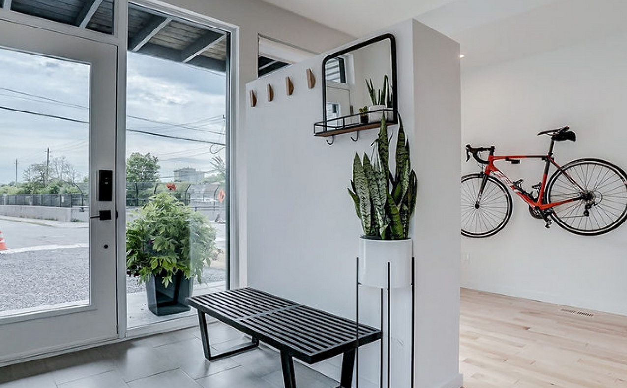
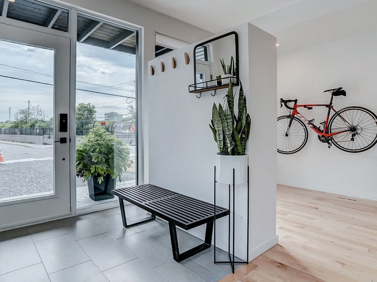
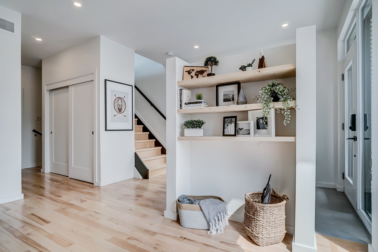
About this foyer: This ground floor offers a unique solution for a very narrow urban lot. Rather than trying to fit a foyer and the main living area on the same floor, the kitchen, living room and dining room were shifted to the second floor, leaving lots of elbow room at the entry, says developer Harrison da Costa of Citymaker Homes.
With no garage or mudroom, the ground floor becomes important for storage — note the bicycle hanging on the wall in the adjacent office area. The area by the front door is kept minimalist and clutter-free for guests, with a partial wall to provide separation yet allow light to flow through, while closet space further in creates storage for the family. This floor also includes a full bathroom and the home’s third bedroom.
“In a place like this that doesn’t have a garage or a side entry, this entry had to serve many masters,” says architect Anthony Bruni. “So, it was designed to be as flexible as possible but not be completely open to the other spaces; it has subtle separations.”
Project: The Oliver model — eQ Homes, Rosaline J. Hill Architect & West of Main
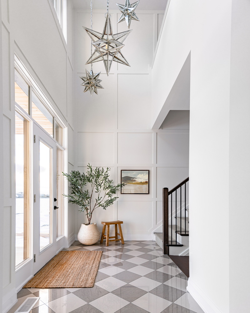
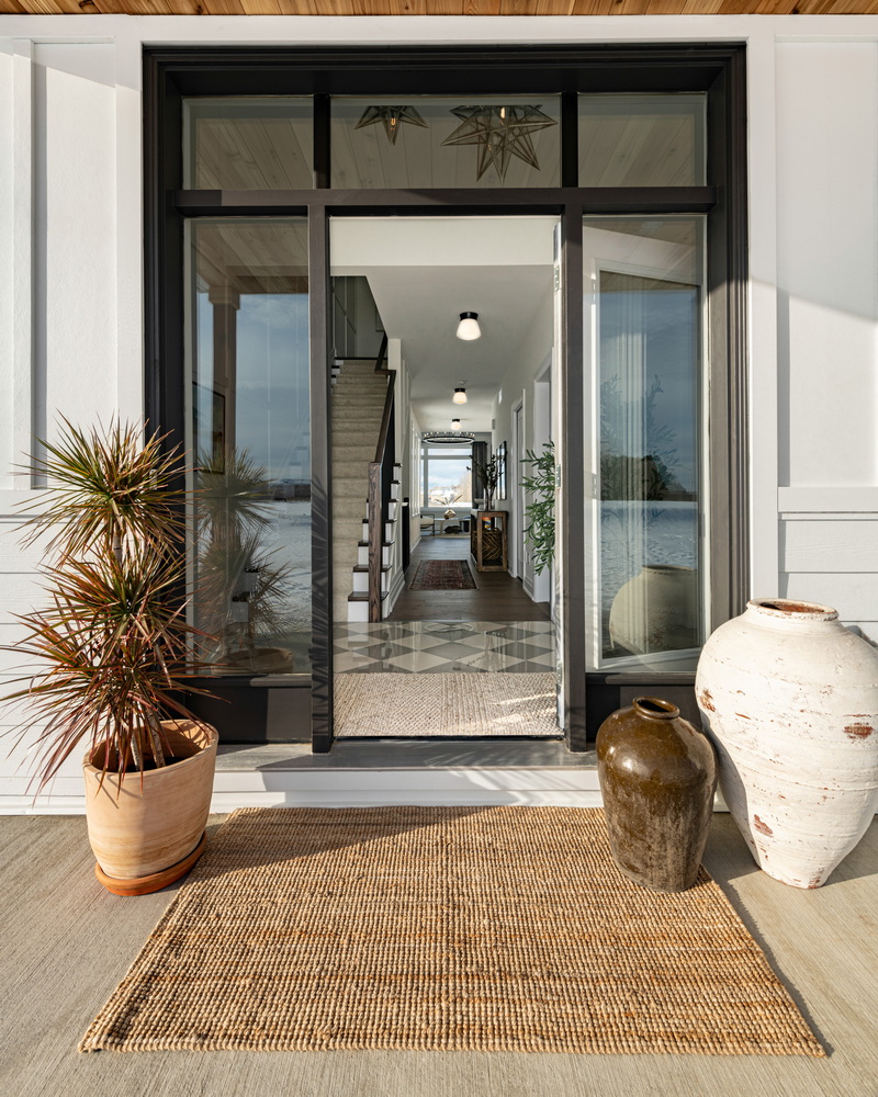
About this foyer: It looks like a custom project, but this is a production builder model home. “We didn’t just go for maxing out square footage,” says architect Rosaline Hill. “The foyer is about connection. It’s where the pieces of the house kind of come together and this one has the stair coming to the foyer and the second floor opening onto the foyer so you get that real sense that this is the hub.”
Hill made the foyer a priority when designing the Oliver, which is a new floor plan for eQ Homes. “The stair was designed to make the foyer what it is. The upstairs was designed leaving that space open to below in order to capitalize on views.”
Because the home includes a mudroom for daily family use, the foyer is more about the guests, says interior designer Sascha Lafleur of West of Main.
“It becomes a place where you’re really celebrating architecture and making a room that you can enjoy with your guests for all that time you spend chitchatting at the front, which in this house I hope would be a lot because it would be fantastic there.”
This is an area where you want to create a statement and set the tone for the rest of the home, she says. “To do this, we like to integrate stylistic pieces and finishes into the design, like sculptural lighting, interesting floor tile, large-scale accessories — like the pottery and plant seen in the Oliver — or even a beautiful custom door.”
The foyer also takes advantage of the double-height ceiling by including a tiered light installation with multi-scale Moravian star pendants. “An installation like this helps bring the ceiling down to create a cosier feeling without compromising the benefits of the tall ceilings.”
West of Main also designed custom wainscotting on the walls to add visual texture and chose a 12×12 square, polished tile installed in a classic checkered pattern and softer tones than the more typical black and white so that the flooring would not compete with the many architectural features in the space. “The lighter contrast feels softer, but still creates impact,” Lafleur says.
MORE: Discover the Oliver model home
Project: River Terraces II, Suite 204 — eQ Homes & Hobin Architecture
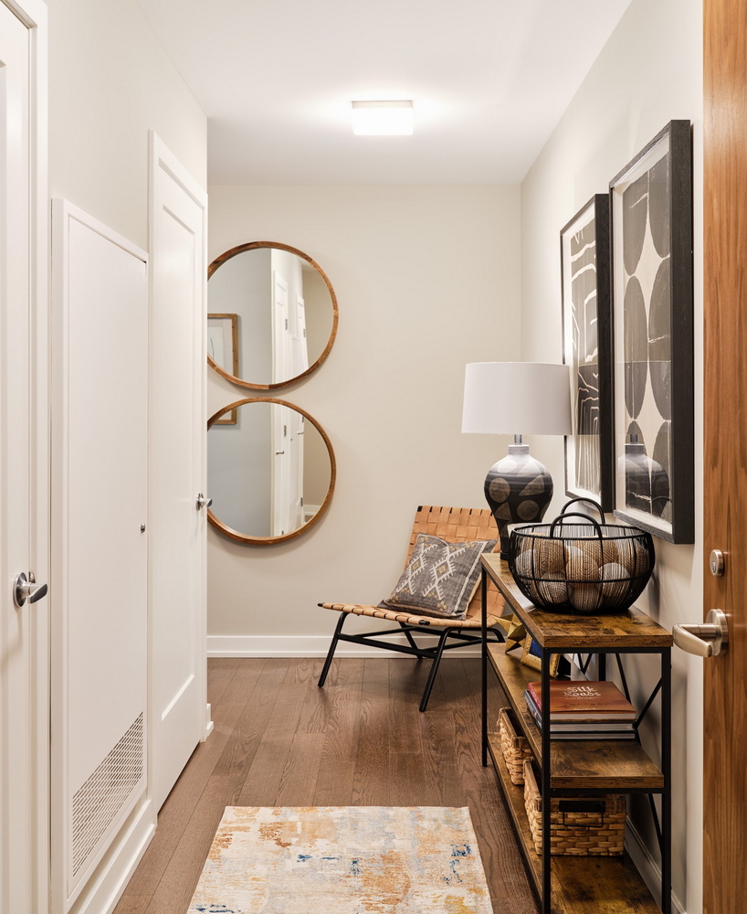
About this foyer: The foyer in this model is a long, narrow space, says eQ design studio manager Shannon Granger. “We added mirrors and a chair at the end of the foyer to draw people into the space.” A console table makes a handy drop zone while leaving space to display accessories and add baskets and decorative boxes to store items such as hats and gloves. A long runner on the floor invites people to walk further into the space, allowing for more people to enter at the same time.
“This is also a great opportunity to introduce visitors to your personal design style,” she says. “We imaged the homeowners in our model suite loved to travel, so we incorporated mementos from their extensive travel into the foyer’s decor.”
Along with giving you a first impression of the home’s design style and mood, “it can also give you a clue as to whether the home has been thoughtfully laid out, adds eQ marketing associate Katherine Toms. In this model, “the foyer helps transition you from public space to private space. The hallway invites you into the suite and puts some distance between the main living area and the outer hallway. It also houses the washer/dryer combo. The result is a quieter, more private living space.”
MORE: Explore eQ’s Greystone Village
Project: Ardington + Associates Design & Maple Leaf Custom Homes
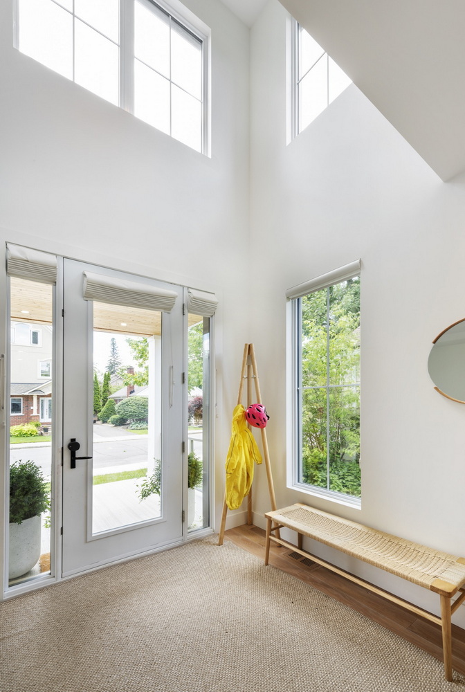
About this foyer: This home is bright, open and airy, which the foyer suggests, says designer Steve Ardington. The double-height space features big windows to bring in lots of natural light and add drama for guests coming and going.
The homeowners had recently moved to Ottawa from the West Coast “and were still in love with the lifestyle, so we wanted the design to reflect that. Sunlight was very important, but at the same time we wanted the home to have a front porch. The deep front porch blocked some of the sunlight, so by opening the foyer up to the second floor, we were able to have some unobstructed windows that do not require window coverings for privacy.”
Project: Hobin Architecture, RELM Builders & Astro Design Centre
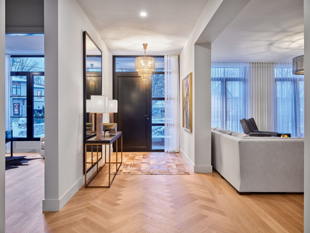
About this foyer: “This specific foyer creates a warm and inviting atmosphere for visitors, as it is very open and includes an oversized mirror to create additional depth,” says RELM Builders founder Michael Mazzarello. “The herringbone pattern in the hardwood is viewable right upon entry, which invites you directly into the living space.”
Project: Ardington + Associates Design & Maple Leaf Custom Homes
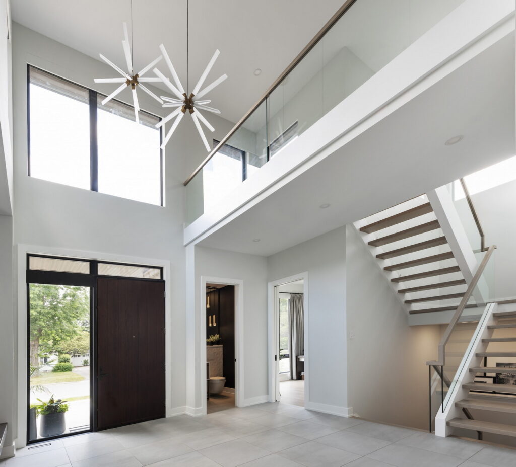
About this foyer: Like this team’s other project above, the foyer features a two-storey, open-concept design to emphasize the light and airy feel. “Upper-floor windows bring light into the foyer and a glass railing offers glimpses of a second-floor loft space,” says Maple’s Leaf’s Brian Saumure. “A built-in bench nook with a single-storey ceiling height at the side of the foyer space brings the scale down to a more personal level.”
Project: Greenmark Builders & Mainstream
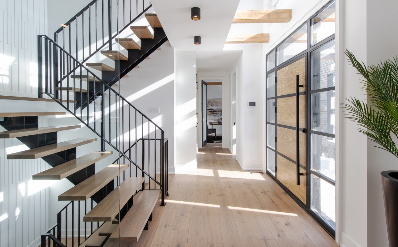
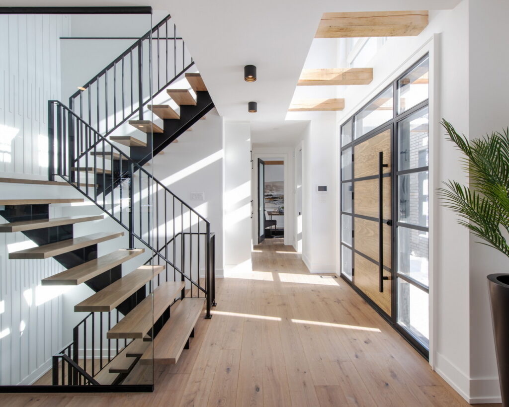
About this foyer: “The goal was to create a light-filled, open, spacious foyer — “modern with an industrial edge,” says designer Gina Godin of Mainstream. The wood beams were designed to carry in from the exterior and create a light-and-shadow effect, adding interest without feeling heavy, she says.
“This space was tricky because there really was not a lot of space to do a coat closet or have an area to sit.” A mudroom off the garage takes care of family needs, but this space needed to feel like a part of the living area due to the open-concept nature of the home. “We were limited by the proximity of the stairwell to the entry door. Adding custom cabinetry in the hallway allowed for storage yet kept the furniture feel to the space. The light and large windows really elevate the space and make it feel larger than it was.”
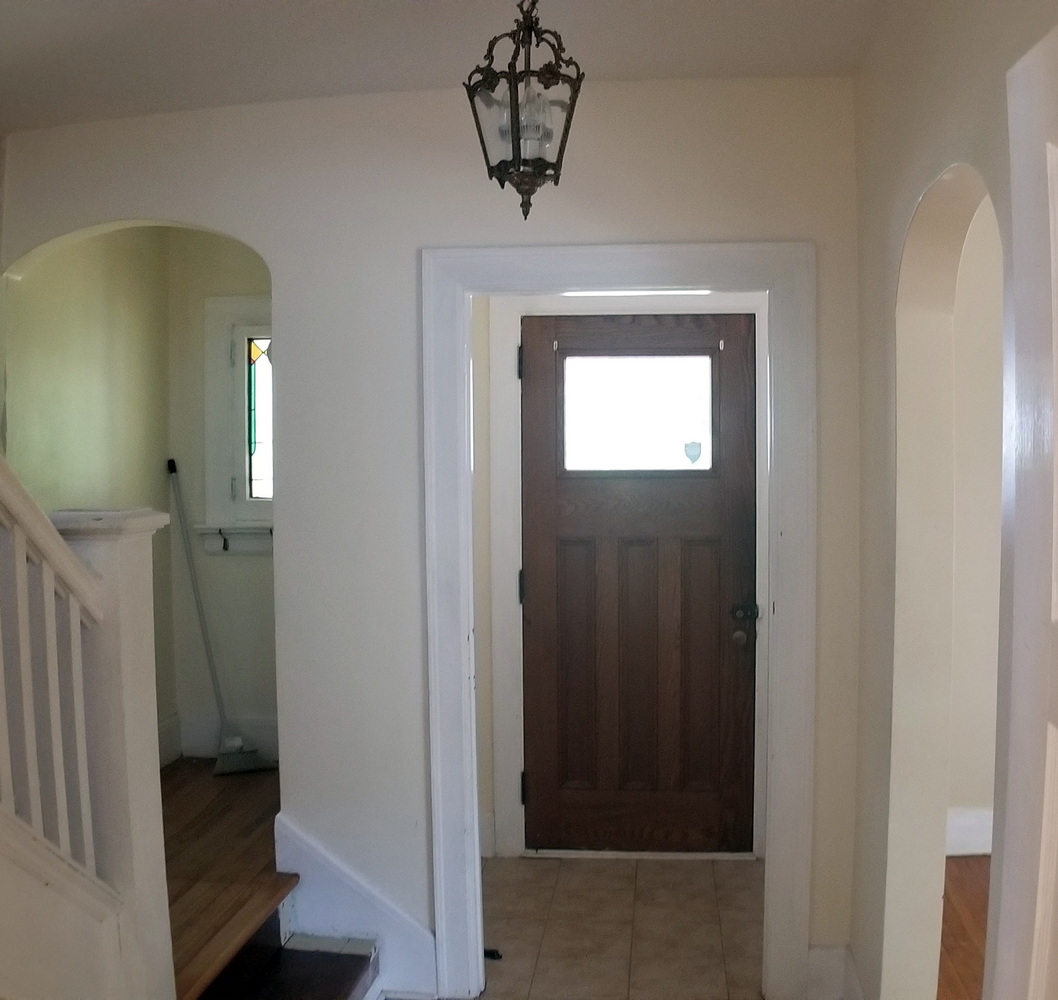
Project: Lagois Design-Build-Renovate
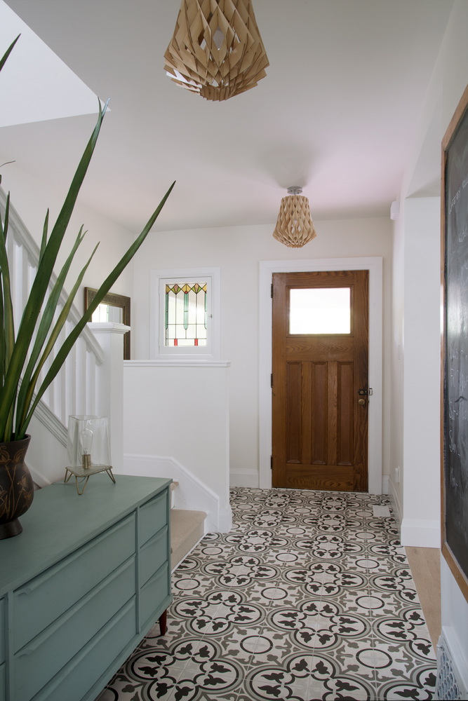
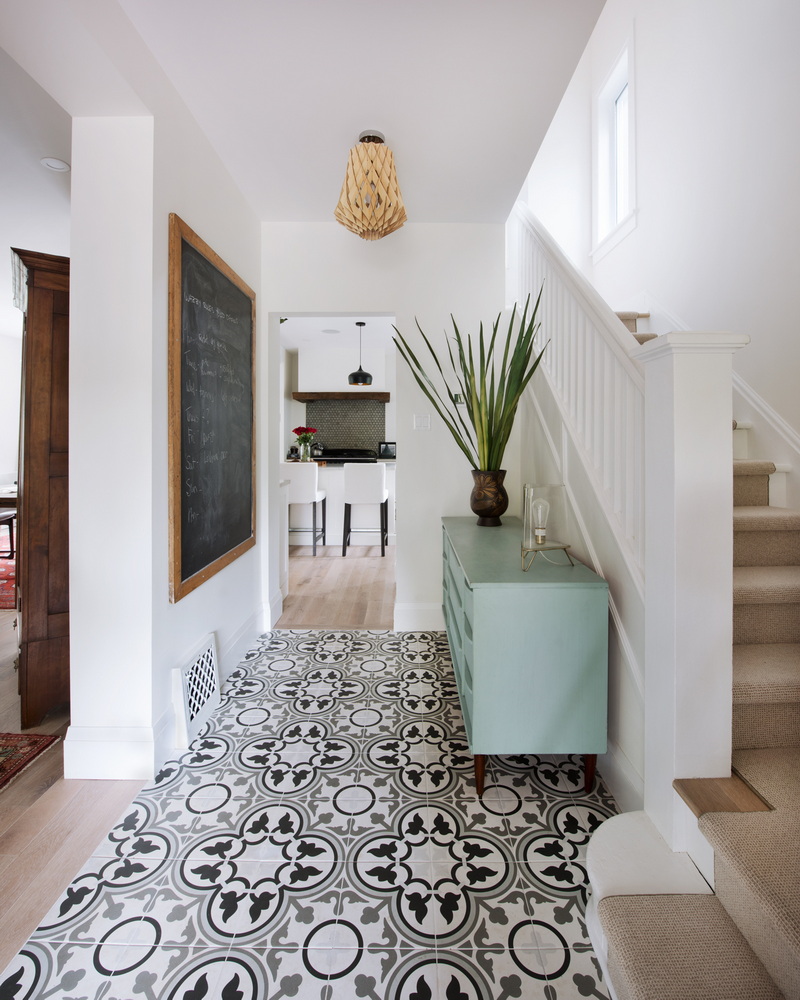
About this foyer: “This foyer is inviting — simple yet interesting,” says Lagois project development manager Sophie Villeneuve. It sets the tone for the black-and-white elements in the remainder of the home, with furnishings and artwork adding a splash of colour. “The tile gets all the attention and invites you into the home.”
Originally this space was broken up by a small airlock that closed off the front door from the rest of the home, and by a closet off the stair landing. Both were removed to open things up, with an alcove housing a bench added to the right of the door.
The dresser is used as a drop zone and adds character and colour.
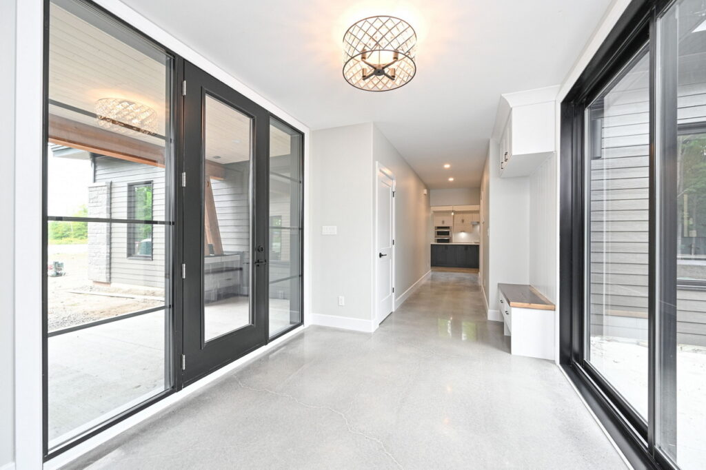
Project: Lockwood Brothers
About this foyer: Capturing the key features or style of the home, this foyer displays elements of a light and bright modern space, which is carried throughout the home, says Lockwood architectural designer Nicole Craftchick. “The large black windows, abundance of natural light, polished concrete floors and open floor plan are all characteristics of a modern home.”
It also acts as a buffer between the outside world and the home’s private space. There is a defined area that leads to the main living space and keeps the main living hidden from those standing at the front door, while also creating an elaborate entry for guests.
“These clients wanted a grand foyer, with the main wow factor of seeing directly through to the backyard upon entering the home,” she says. “The foyer also acts as the mudroom as it is the transition area from both the garage and front door, which is an efficient use of space.”
There’s a coat closet, decorative bench for guests and a powder room easily accessible from the backyard.
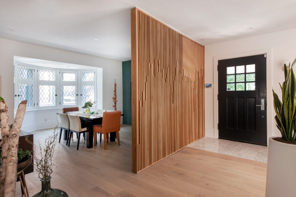
Project: Crossford Construction
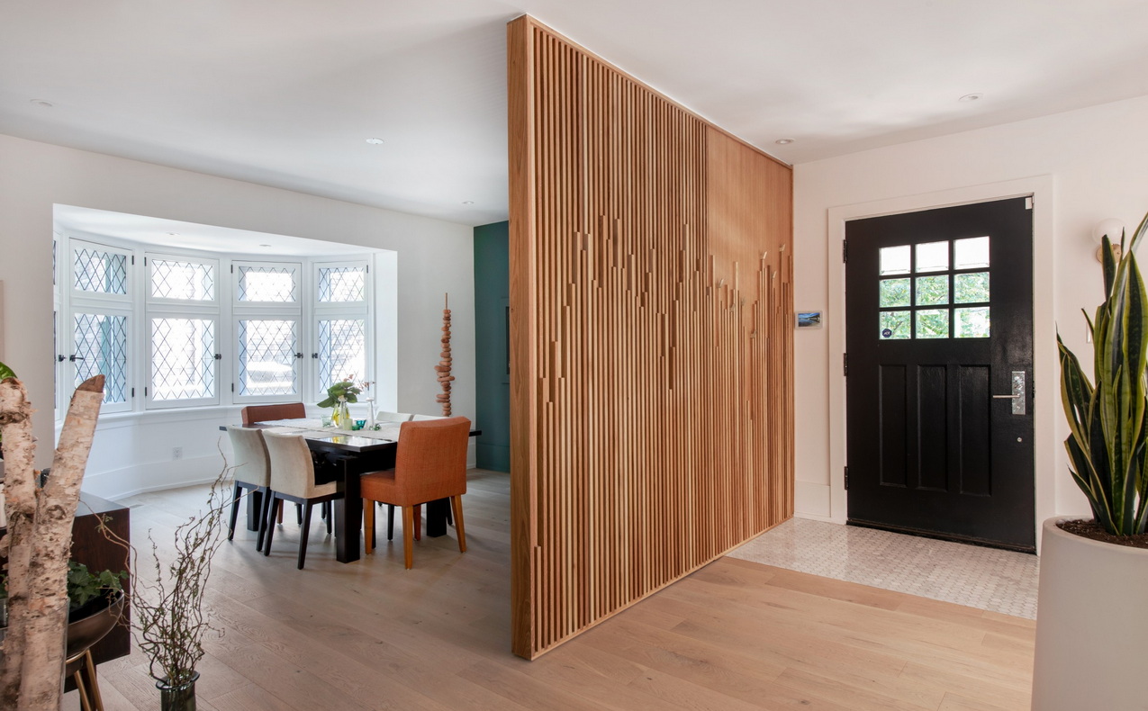
About this foyer: This was a large-scale renovation of a century home but many original features were maintained while simultaneously being modernized to allow for modern living, says Crossford general manager Doug McCausland. “Creating a functional and open feel to this foyer, while providing just enough structure to define it without modifying the front building façade was a challenge, for sure.” The closet was moved further into the home to keep the space airy, while a custom wood wall that’s like a work of art anchors the space, provides visual interest and separates the foyer from the dining room.
MORE: Renovating this century home
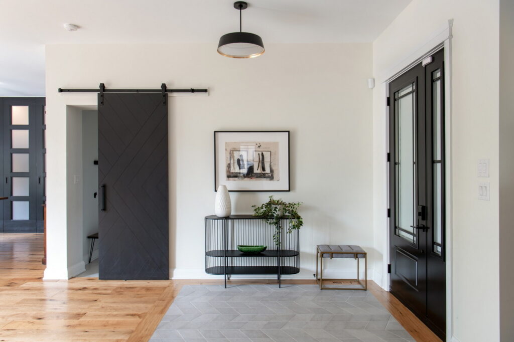
Project: Crossford Construction & designer Brenda MacPherson
About this foyer: Crossford needed to create and define an attractive and functional foyer as part of a fully open-concept floor plan in this custom home, says general manager Doug McCausland. The custom barn door leads to a walk-through closet that connects the mudroom to the front foyer, “providing discreet but generous function just steps away,” he says.
The materials and colours chosen for this foyer emulate the style and mood of the home, adds designer Brenda MacPherson. “This was very important since it opened into the main-floor living space.” An 8×10-foot tile insert at the front door allowed for practical functionality while flowing nicely into the engineered hardwood used throughout. And the Chevron pattern in the floor tile worked well with the wall tile on the fireplace and kitchen backsplash (not shown).
The foyer lighting was selected to complement the kitchen pendants and dining room fixtures (not shown) without competing with them. “We kept it simpler since the dining room had two very dramatic pieces,” she says.
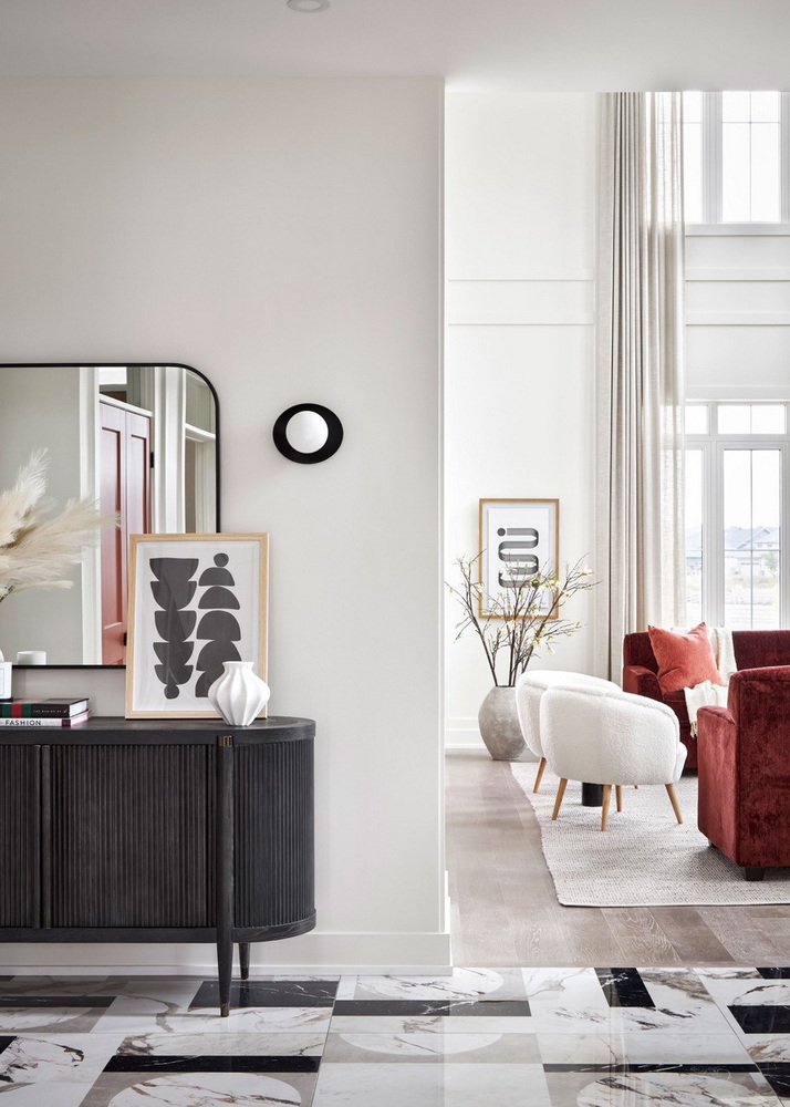
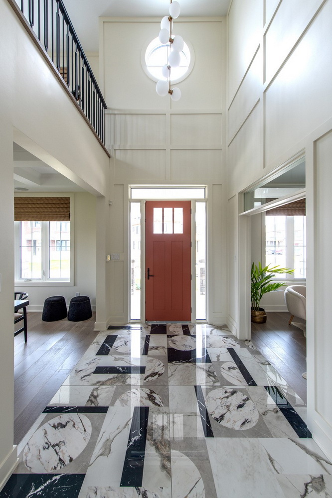
Project: 2021 Minto Dream Home — Minto Communities & Tanya Collins Design
About this foyer: The dramatic tile references the shapes and textures found throughout this mid-century modern/Art Deco-inspired interior, says designer Tanya Collins. “Other than a closet for guests’ clothes, a cabinet (image 1) not only provides a function in storing overflow items along with keys and mail, the black cerused oak fluted details reference the interior design found throughout the home.”
Viewed from another angle (image 2), this space shows how — when there is no available space to place furniture right upon entry — you can always make an impact with things like a statement light fixture, applied wall mouldings to add interest and texture, and painting the interior of the front door to reinforce the colour palette, she says.
MORE: Tour the 2021 Minto Dream Home
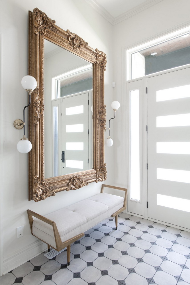
Project: 2022 Minto Dream Home — Minto Communities & Tanya Collins Design
About this foyer: A bench and mirror can usually be accommodated when space is at premium, says designer Tanya Collins. “A mirror not only opens up a small foyer but is practical to check your appearance. A bench also provides a spot to sit to remove shoes.”
MORE: Tour the 2022 Minto Dream Home
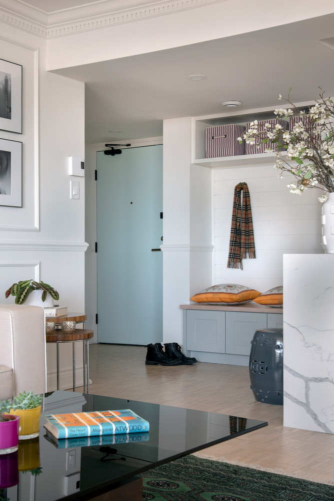
Project: Tanya Collins Design
About this foyer: Even in a condo without a defined foyer space, “we still found a way to incorporate a sense of entrance with some storage as shown by the built-in bench we designed,” says Collins.
Project: Tanya Collins Design
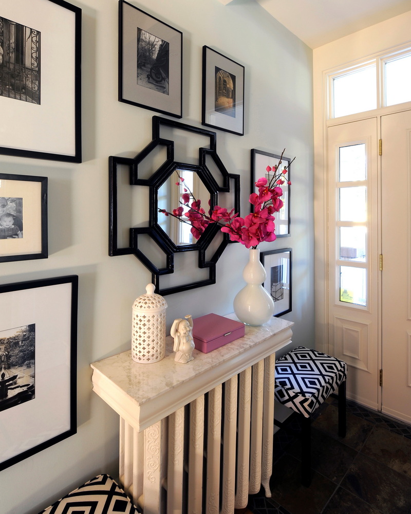
About this foyer: Although a project from 15 years ago, this one is timeless and shows how Collins found a way to deal with a radiator that consumed much of the entrance by using a leftover piece of marble tile and casing to create a console top to house keys and incoming mail. “With some custom David Hicks’ fabric-upholstered stools, the client’s travel photography displayed on the walls and a mirror reflecting the client’s love for chinoiserie, this small entranceway makes a statement while becoming more functional.”
Project: Gordon Weima Design Builder
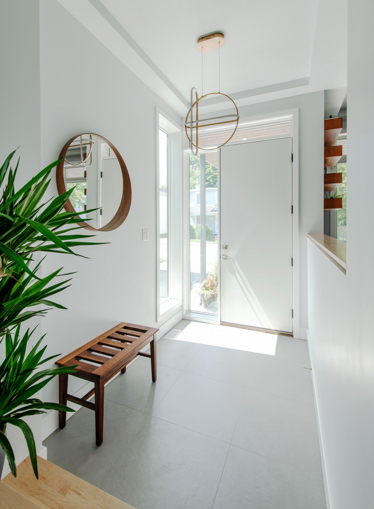
About this foyer: This “is probably the smallest entrance I’ve ever built,” says Weima. Built on a 25-foot lot, the home itself is about 19 feet wide, leaving room for only the living room and a tight foyer across the front. Weima wanted the entry to be bright, open and airy, yet semi-private to hamper cold drafts.
Corner windows let in light, a sunken floor is more inviting from the street (while adding ceiling height for volume) and a half wall offers both separation from and connection to the living room.
“We pushed the closet back into the house a little bit more so we could keep this space as wide and open as possible and also to let as much light in to create a nicer environment.”
Project: Hobin Architecture
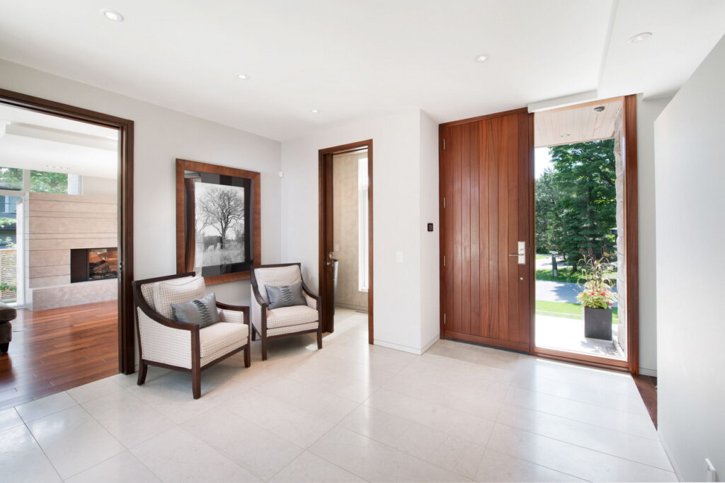
About this foyer: This foyer is an example of how surrounding rooms can be positioned near the foyer to expand on the entrance experience and strategically offer a glimpse into the more private spaces, says intern architect Rheal Labelle. “Closet, powder room, feature stair, dens and living spaces are typically organized to celebrate and frame and/or expand the entrance experience, allowing them to stay relatively compact but can be perceived as being much larger in an open plan.”
Project: Corvinelli Homes
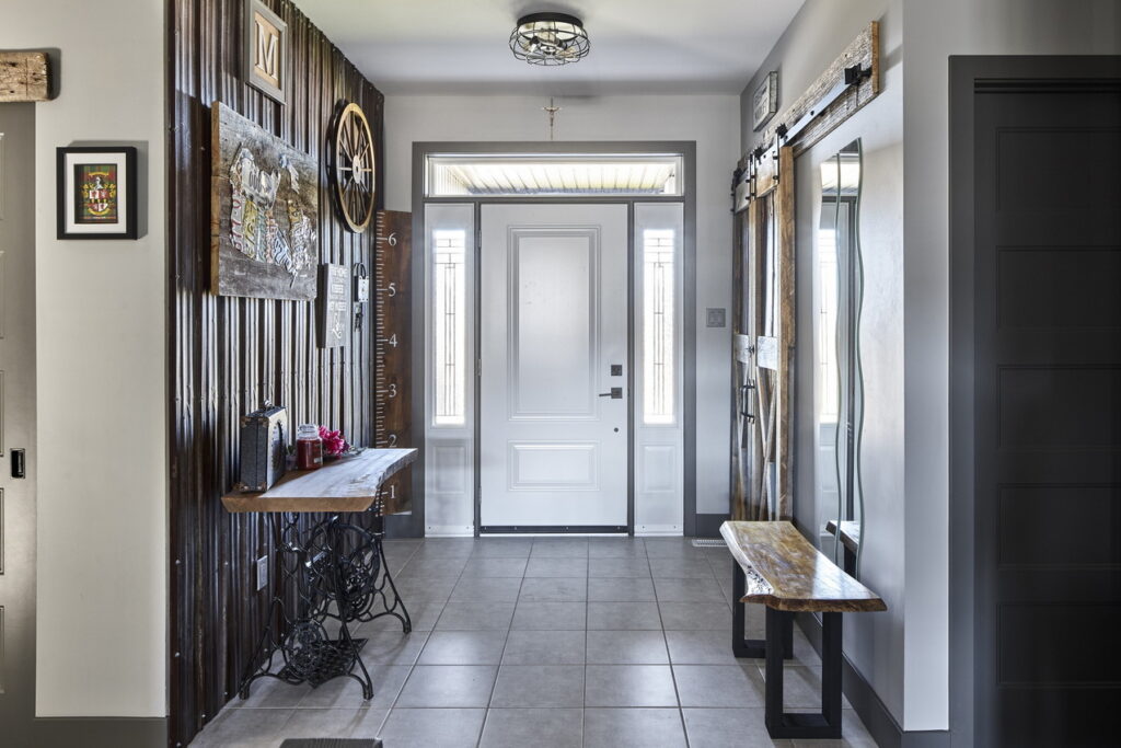
About this foyer: “Once you see this foyer you know you are going on an adventure, just as this couple did to collect all the gems displayed,” says Corvinelli office manager Krista Hubbard. “No matter where you look, there is a piece that can be spoken about, a story to be told or a fond memory to share.”
There’s an easy flow from the front to the rear entry from the garage, which features another closet and the laundry area. It’s all tiled to hold up to the weather.
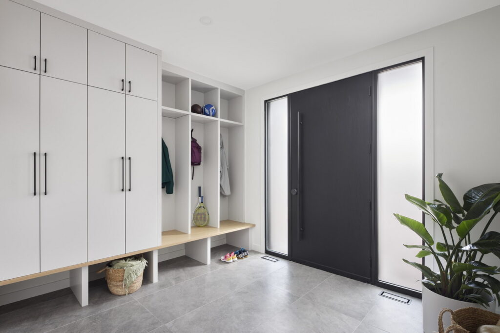
Project: Art & Stone
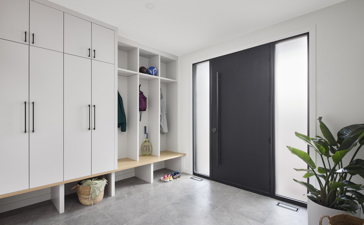
About this foyer: Art & Stone wanted to create a space that felt expansive while being very functional for the home’s family of five and a dog. Also important was providing easy-to-clean surfaces. “We opted for an oversized floor tile that would receive everyday use quite well and hide dirt, while being beautiful and elegant,” says COO Alexandra Corriveau.
Large side lights on either side of the door bring in lots of natural light and the millwork pulls on the colour tones throughout the home. “We decided to do some cubbies for the kids, to keep the millwork visually interesting, and then do a full-size cabinet to store everything that the family required.”
Final thoughts
“Foyers are the first space that visitors will experience in your home, so make sure to set the tone appropriately with colours, decor and feel,” says Corriveau.
Adds Collins: “Whether large or small, the foyer is an important area to consider as it is your first chance to make an impression.”
