This is it — the All Things Home People’s Choice 2023 final round!
For the past six weeks, the public has been voting on the entries in the Ottawa Housing Design Awards, choosing finalists for the People’s Choice Award. Now it’s time to pick the winner.
The People’s Choice Award, which is sponsored by All Things Home, is a prestigious trophy given out at the annual awards gala — a much-anticipated celebration of the Ottawa housing industry’s finest in design that’s put on by the Greater Ottawa Home Builders’ Association.
“We are very excited to invite the public to vote for their favourite designs through our People’s Choice Award,” says Linda Oliveri Blanchard, who chairs the awards committee. “While winners of the Ottawa Housing Design Awards are selected by judges from across Canada — judges who are top-level professionals in the architecture, construction and design industries — the People’s Choice Award is selected by the public.
“It is always interesting to see what the general public selects as their favourite design because it gives our industry’s designers insight as to what people are looking for when it comes to looks, feel and functionality,” she adds.
“Because of this, many of our finalists see this as the most prestigious trophy of the awards program. We draw thousands of votes from the general public, and we are very excited to see what design the public selects this year as the very best of the best.”
Since Aug. 15, design enthusiasts have voted online for their favourite entries in several preliminary rounds to determine the 16 finalists among production and custom homes, condos, renovations, kitchens, bathrooms, green innovation and design details.
The winner will be announced at the awards gala Nov. 4 at The Westin Ottawa.
How to vote
There are two ways you can vote.
In person: Cast your ballot at the huge GOHBA display at the Ottawa Fall Home Show Sept. 28 to Oct. 1. All 200+ entries in the Housing Design Awards will also be on display to offer inspiration for your next project and provide examples of renovators, designers, suppliers and builders you may be researching.
Online: You can also vote online at gohbavote.ca from 10 a.m. Sept. 26 to 11:59 p.m. Sunday, Oct. 1.
Here’s a look at the entries in the People’s Choice 2023 final round:
Production homes
Entry: Featherston Model — Mackie Homes
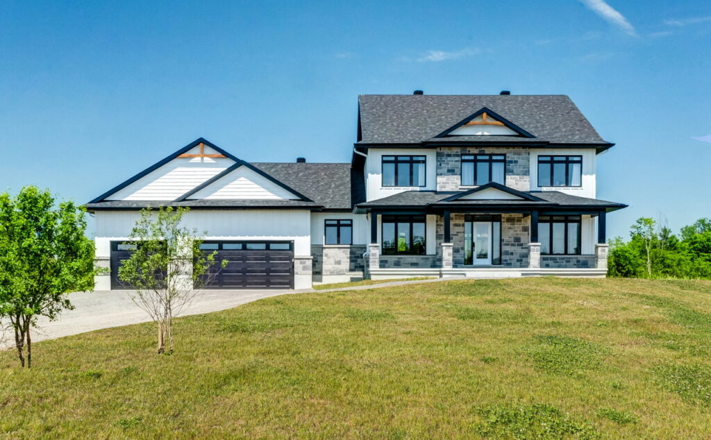
Mackie Homes’ Featherston model is a four-bedroom home with 2,973 square feet and a three-car garage. It features an open-concept layout with a main-floor office, walk-in pantry and an oversized combined mudroom / laundry room.
Calling it a “quintessential Canadian home” in its entry submission, Mackie says it’s designed for the modern family with a layout that is “perfect for both entertaining and family living, with formal and open-plan spaces that capture natural light.”
Entry: The Russell — Park View Homes
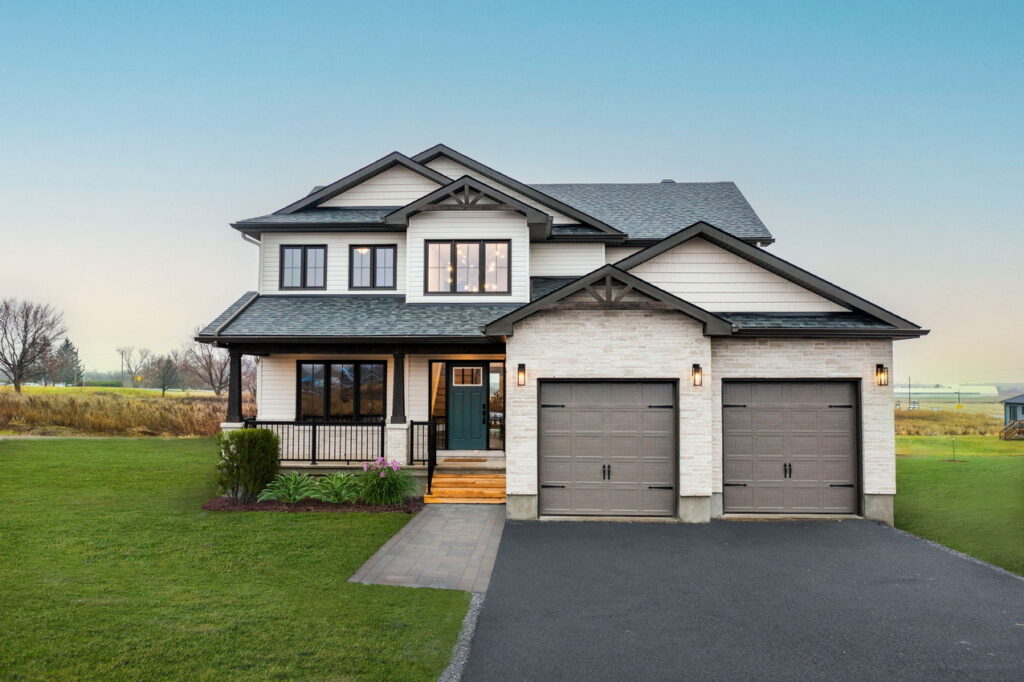
The Russell is a three-bedroom home with 2,235 square feet and an open-concept kitchen, dining room and living room across the back of the home.
Done in a modern farmhouse style, notable features include a main-floor office that could also be a bedroom, with a walk-in closet, a finished basement, a large combined mudroom and laundry room, a walk-in pantry and an expansive primary suite with double walk-in closets.
Custom homes
Entry: Soul Sisters Cohousing — Rosaline J. Hill Architect
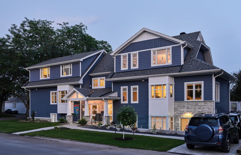
This is a unique project in Vanier, designed and built as a cohousing home for four friends. Although it has the appearance of a long semi-detached home, it has four individual apartments plus shared common space.
“This project seeks a more traditional appearance but envisions a new way of living for its inhabitants,” Hill says in her submission. “Each woman then has their own compact two-bedroom unit, which were designed with aging in mind.”
The home includes an elevator and shared entertaining space (with a large kitchen, dining area, second-floor terrace and sitting area) as well as shared basement space where there is a guest bedroom and a crafting area.
Entry: The Wilfred — S.J. Lawrence Architect & Theberge Homes
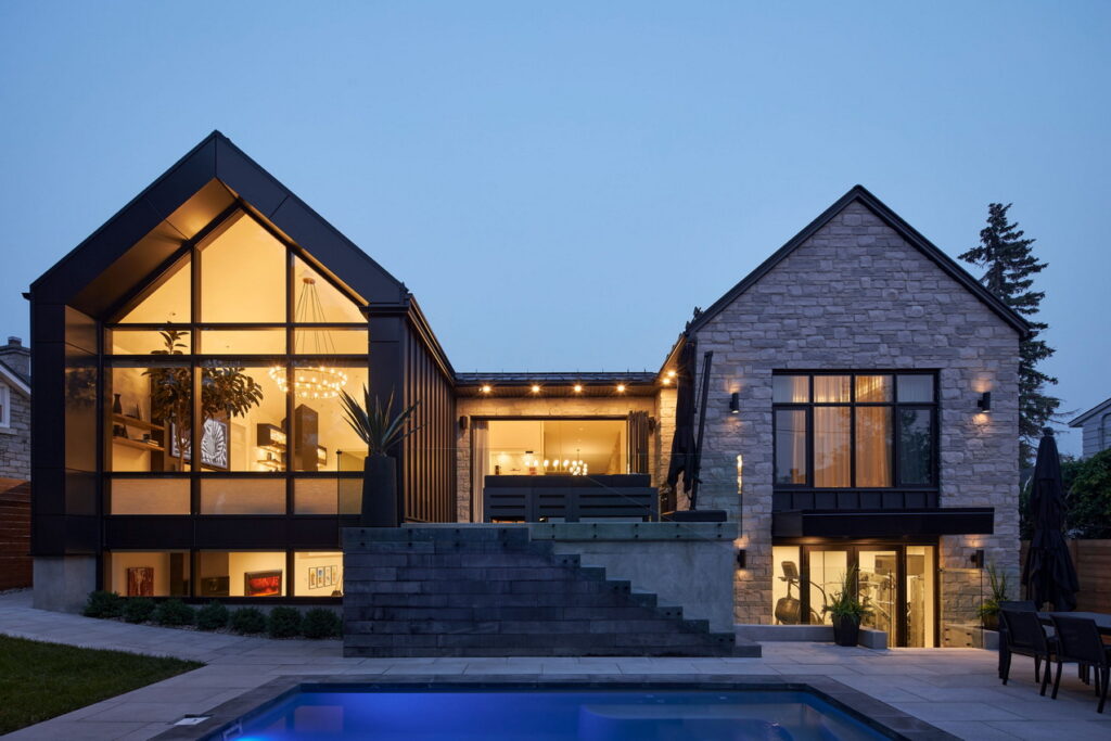
A modern interpretation of an historic home in the City View neighbourhood was the inspiration for this 2,676-square-foot custom home.
“The Wilfred was heavily influenced by the existing heritage home and incorporates complementary massing and materiality,” their submission says. “The H-shaped layout creates a recessed entrance for privacy as well as an intimate seating area at the rear for entertaining.”
The exterior is made up of natural rustic stone contrasted with smooth aluminum panels and composite lap siding, while the interior boasts an open-concept main living wing and a bedroom wing that are joined by the dining room in the middle.
Condos / Rentals
Entry: Brookfield Student Living — Hobin Architecture
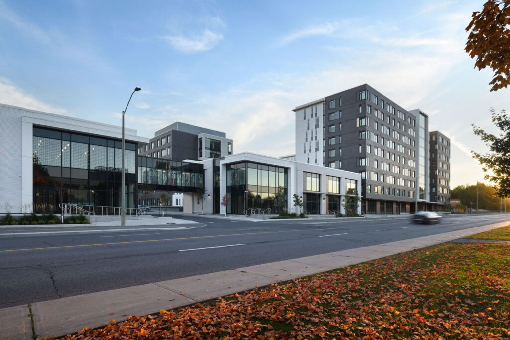
Brookfield Student Living is a complex where the first phase includes 426 suites with a total of 705 beds, including 256 bachelor suites, as well as 18,000 square feet of ground-floor retail space that is intended to support the tenants.
Located near the Rideau Canal and Mooney’s Bay, the site embraces pedestrian and bicycle connections to the multi-use pathways that provide quick access to LRT and other amenities, Hobin Architecture says in its submission. Building amenities, meanwhile, include quiet rooms and multi-purpose rooms for collaboration, games rooms, TV rooms and fitness rooms.
“The building was designed to support study and collaboration while ensuring a memorable student life.”
Entry: The Lookout — The Lake Partnership
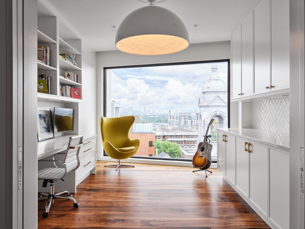
The Lookout is a 3,800-square-foot two-storey penthouse that oozes contemporary elegance.
It boasts features such as a recurring theme of walnut and onyx, a cantilevered walnut staircase surrounded by windows, an in-suite elevator, three bedrooms (each with its own ensuite), two offices, a wraparound terrace and more.
“This space is designed to provide a harmonious living experience where every detail is thoughtfully curated,” the company says in its submission.
Renovations
Entry: French Country Farmhouse — Neoteric Developments
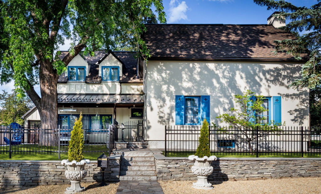
French country comes to Ottawa in this extensive renovation and addition, which saw the original farmhouse wrapped in stucco and the addition in a board-and-batten-style cement board of the same colour.
“The addition remains distinct from the original farmhouse to the discerning eye,” Neoteric says in its submission.
Blue window frames and shutters further tie together the old and the new and bear the added touch of fleur-de-lis engravings.
Entry: The Hintonburg Renaissance — GoodStory
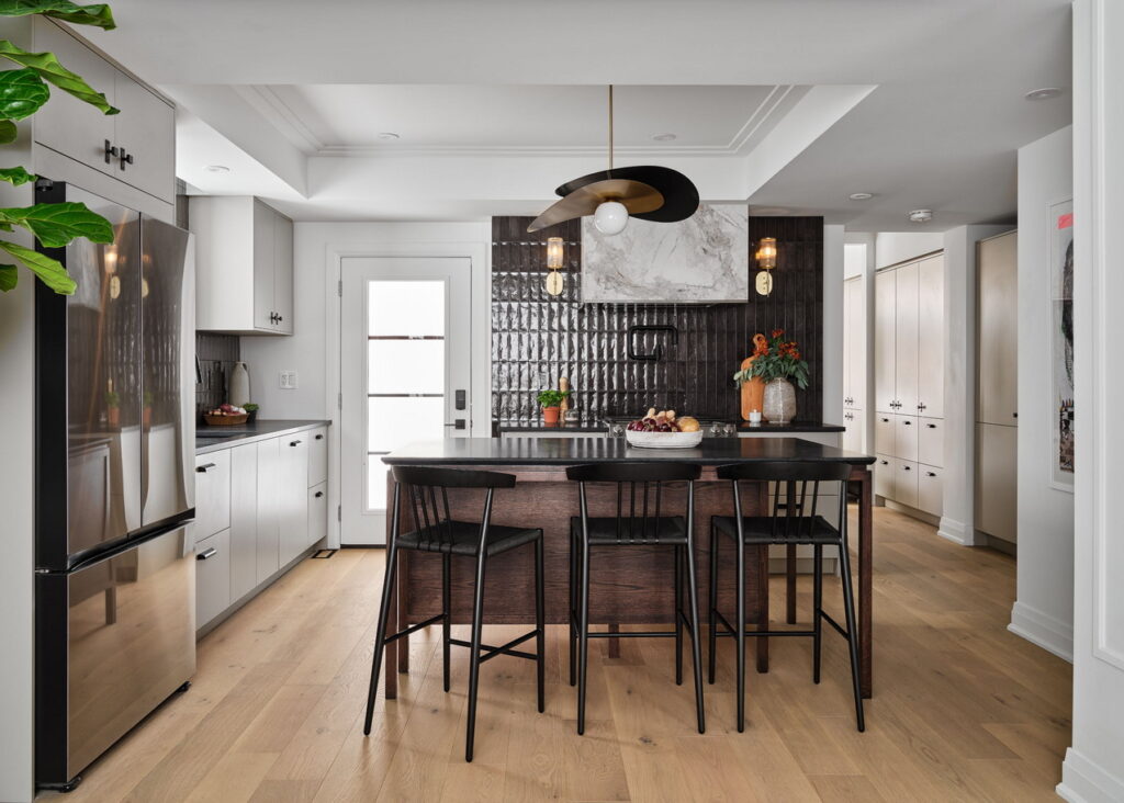
This one-and-a-half-storey century home went through a challenging full gut and rebuild to transform it into a modern family-friendly home.
The intensive 14-month renovation included rebuilding foundations, supports, the roof structure and more, while adding a designer touch to the interior spaces.
“Given the compact size of the home’s footprint, the design underwent numerous refinements, centered around maximizing space utilization in every room and ingenious storage throughout,” GoodStory says in its submission.
The home is also a stop on this year’s Reno Tour.
Kitchens
Entry: “Coop! There it is” — Eastboro Designs & Parliament Millwork
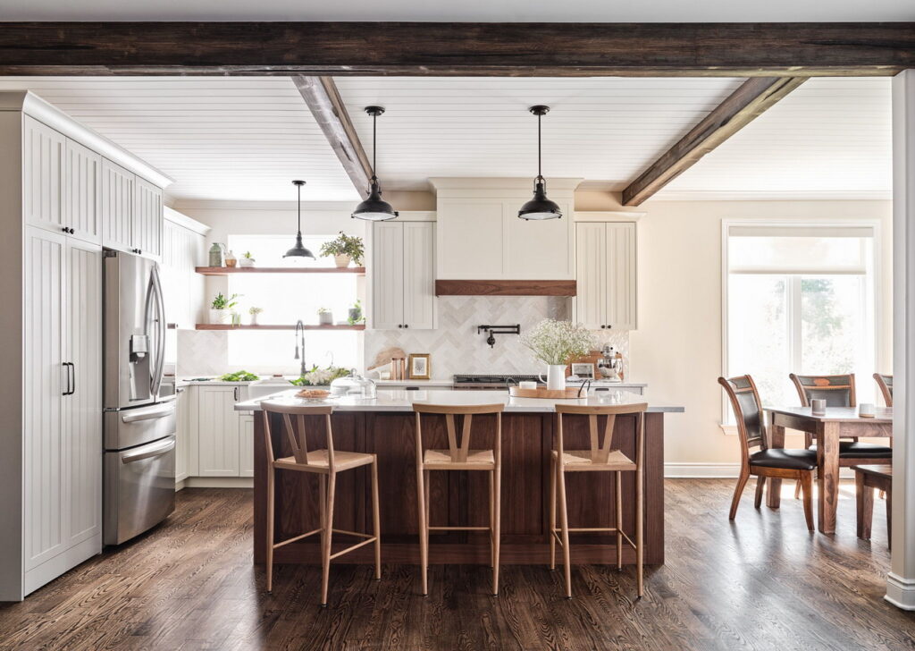
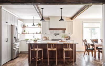
A working farm kitchen gets a fresh take in this renovation, which included knocking down the wall separating the under-utilized dining room and incorporating it into the new space. Part of the dining room has become a pantry with a hidden arched doorway entrance while the new kitchen includes a large island for casual seating and turns the old breakfast nook by the bay window into the dining area.
“The goal was to create a new kitchen, eating area and hidden butler’s pantry that would maintain the character of the property while incorporating modern elements and a tastefully country esthetic,” the entrants, Eastboro Designs and Parliament Millwork, say in their submission.
Entry: Coastal Charm — Laurysen Kitchens
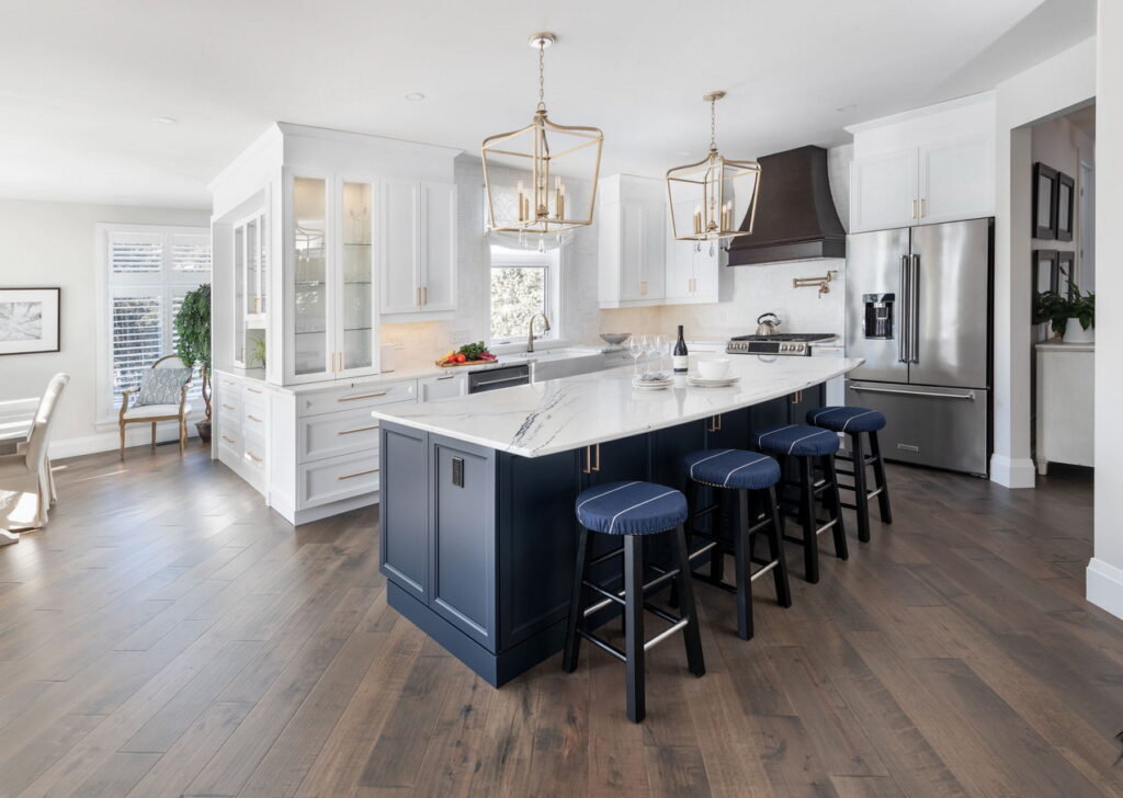
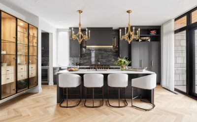
“The goal here was to design a classical looking kitchen, but with a modern timeless look to address the desire of this couple to have a complete open concept kitchen layout that opens and connects to the living and dining rooms,” Laurysen says in its submission.
A mix of white perimeter cabinets and a blue island add definition without being imposing on the open-concept layout. As an additional touch, the cabinets were wrapped around the wall to serve the dining room as a buffet hutch style with glass cabinets and glass shelves.
Not shown is a separate bar area that is also a part of the kitchen with a bar sink, wine racks, wine fridge, glass cabinets with glass shelves and decorative shelves.
Bathrooms
Entry: Tranquility Project — BuildABLE
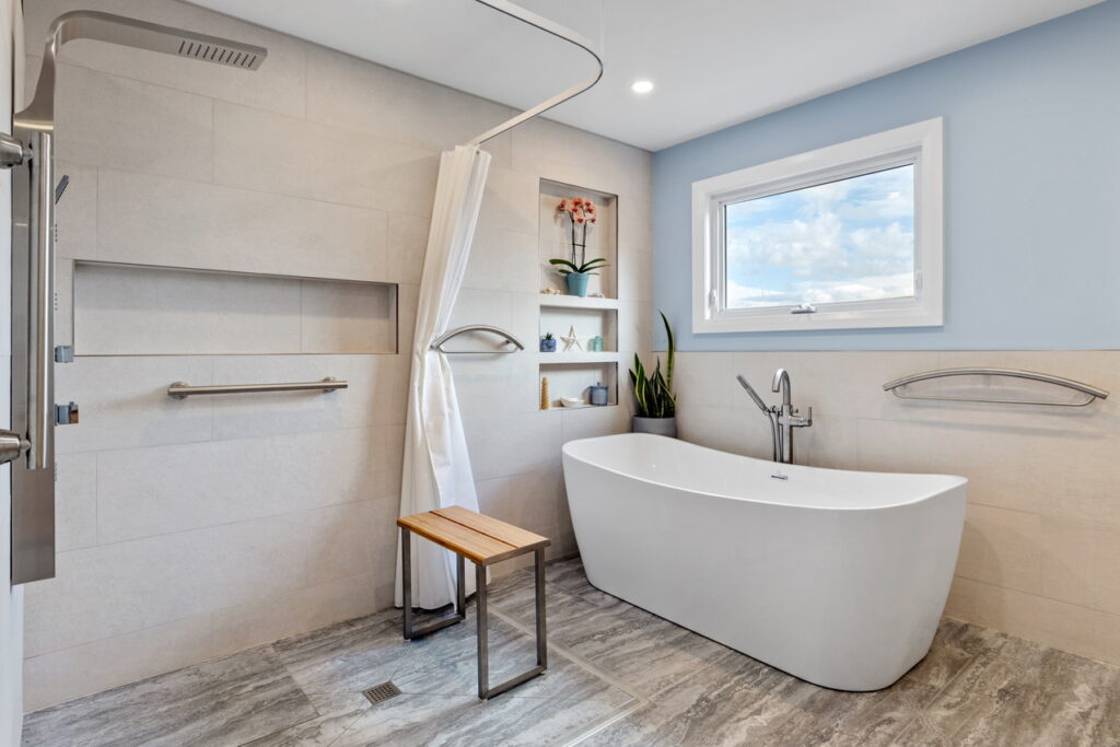
This ensuite was designed for a younger, retired Canadian veteran who required a few accessible supports throughout the bathroom due to unforeseen balance issues, BuildABLE says in its submission.
“While her partner was still quite mobile, this was also a multigenerational house, which included aging parents.”
The bathroom did not need to accommodate a wheelchair, but it did need some barrier-free safety modifications while still meeting the needs of a mobile partner and a design esthetic for a “warm, country-chic oasis.”
Entry: Breezy Blue — Laurysen Kitchens
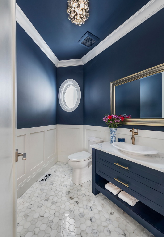
The second bathroom finalist is a powder room, and Laurysen’s second project from the same house to make it to the final round.
“This powder room is all about class, elegance and comfort,” the company says in its submission.
The blue vanity and blue upper walls are paired with white and gold to brighten up the unusually shaped room.
“The Port Rush quartz countertop and the marble tile flooring balance the colour and pattern in this space. They are a perfect complement to the gold hardware, adding a taste of luxury.”
Design details
Entry: #Ferndale_Flightdeck — 25:8 Architecture & Urban Design
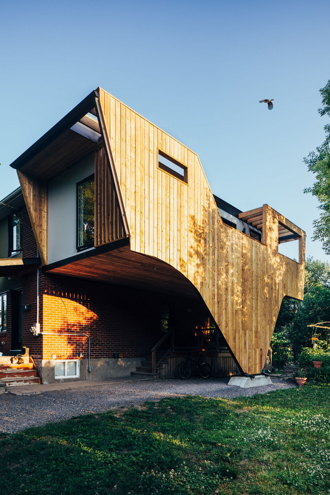
Appropriately, given the interests of the homeowners, the design for this addition takes its inspiration from a bird in flight and builds on an existing car port to provide a new family space and rooftop deck for enjoying nature.
“As avid bird watchers, the owners wanted to take advantage of the property’s unique location in a diverse, ecological landscape,” 25:8 Architecture says in its submission.
A dramatic wooden screen along the side façade provides privacy and serves as a guard for the new rooftop balcony, with the wood extending to the ground, like a wing of a bird, to mask the new “V” column and paddle board storage at ground level.
Entry: Form, Function and Flowers — Neoteric Developments
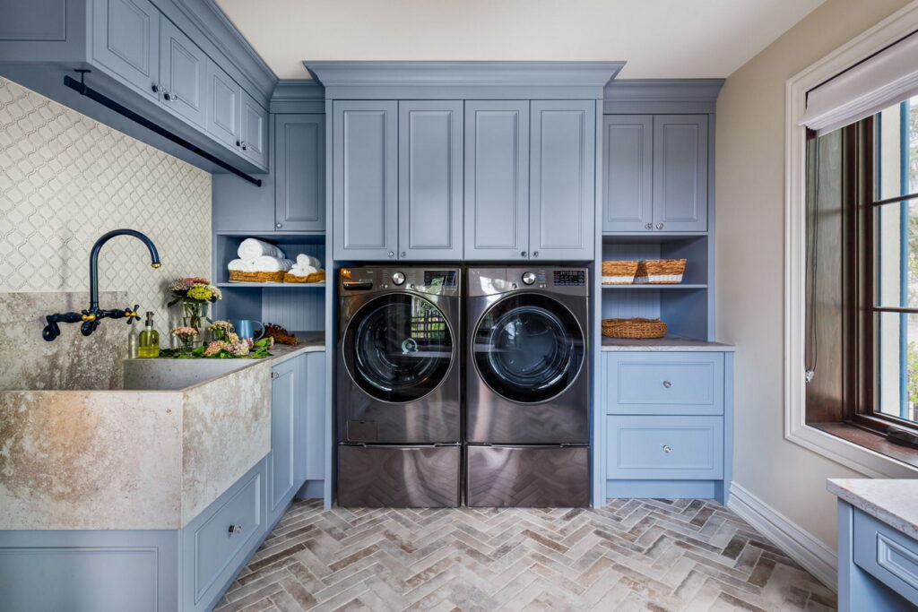
Much like Laurysen’s kitchen/bathroom combo, this laundry room is the second entry for this home to make it as a finalist, along with the French Country Farmhouse renovation.
A multi-purpose space with windows on two walls to make it light and bright, it combines laundry and mudroom (with a sink big enough to wash the dog) and adds a desk for a quiet homework spot. It’s all tied together with powder blue cabinetry and a Caesarstone sink, counters and bench with the look of a concrete finish.
“This laundry/mudroom has many effective and purposeful design elements,” Neoteric says in its submission.
Green innovation
Entry: Caton — RND Construction
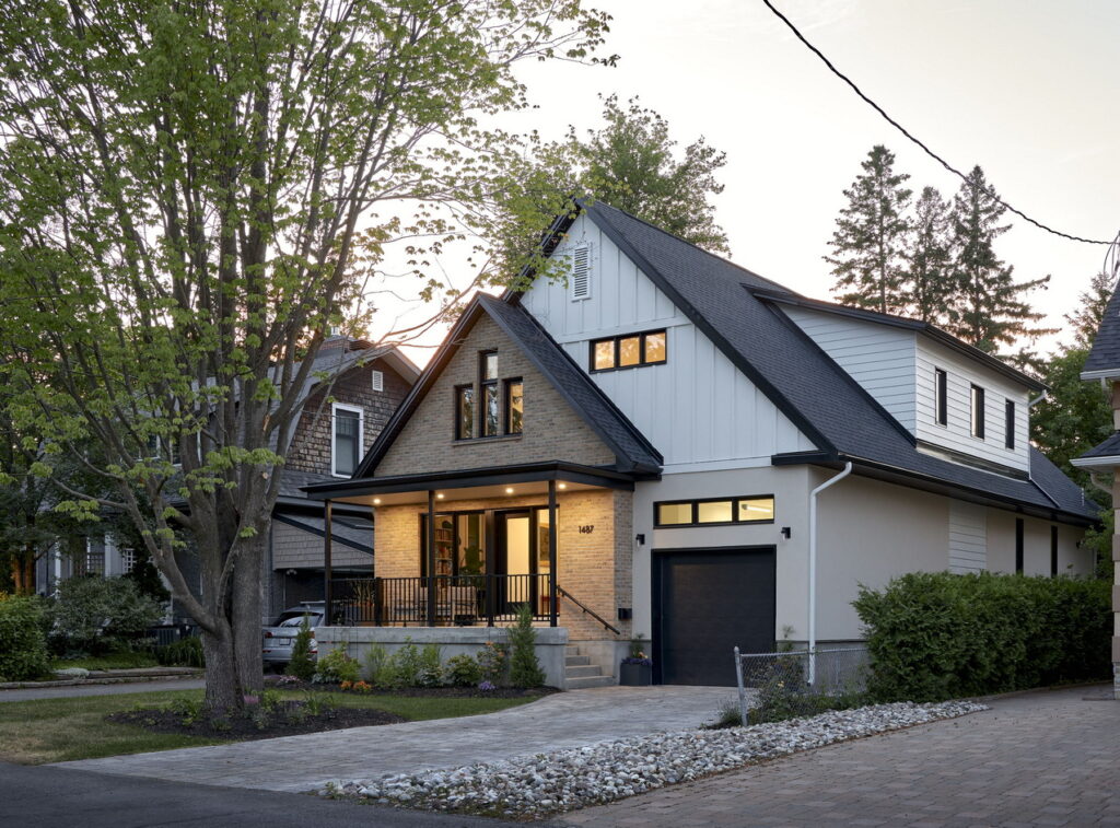
Nominated for green custom home of the year, this Net Zero home is built on a narrow urban lot, with an emphasis on ensuring indoor air quality and comfort, while blending well with the neighbourhood, RND says in its submission.
“The home, purchased by a multigenerational family, includes accommodations for aging in place, making it perfect for families seeking a flexible, inclusive living arrangement.”
Features include a second primary suite on the main floor, an electric car charger and a secondary dwelling in the basement with its own entrance.
Entry: Quarry Park Modern — RND Construction & Hobin Architecture
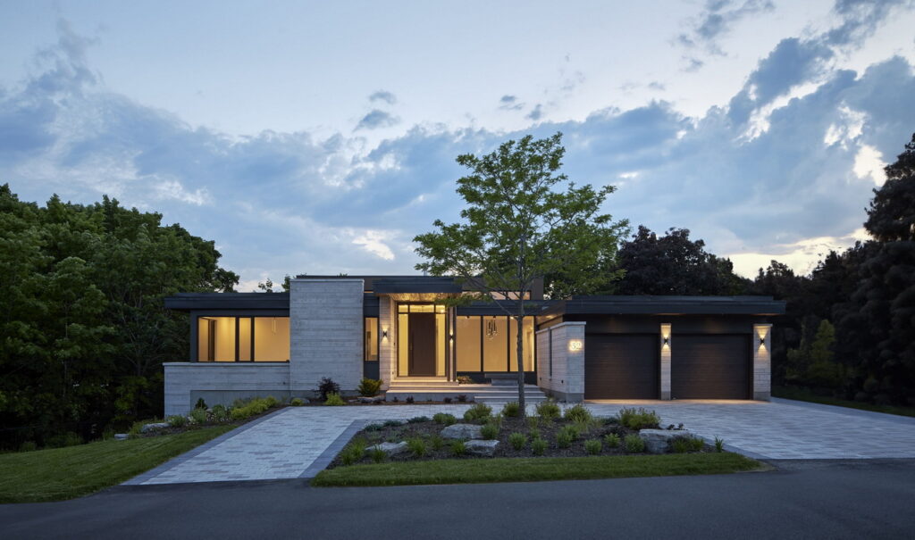
A second entry by RND for green custom home of the year, this time with Hobin Architecture, is also a finalist for the People’s Choice Award. The project is also Hobin’s second entry to make it as a finalist.
This contemporary cliff-top bungalow is built on an unusual lot that includes a 20-foot rock face and ravine, allowing for a dramatic treatment at the side and rear, a cantilevered terrace over the ravine and a walkout basement overlooking the views.
“Below the escarpment is a densely treed ravine that offers a lush natural edge on which to focus the primary views from the home’s inside and outside living spaces,” the companies say in their entry. Built on spec, the luxury home “was intended to attract someone who appreciates a strong connection with nature, while enjoying a modern and convenient living environment, all wrapped in sustainable construction.”
