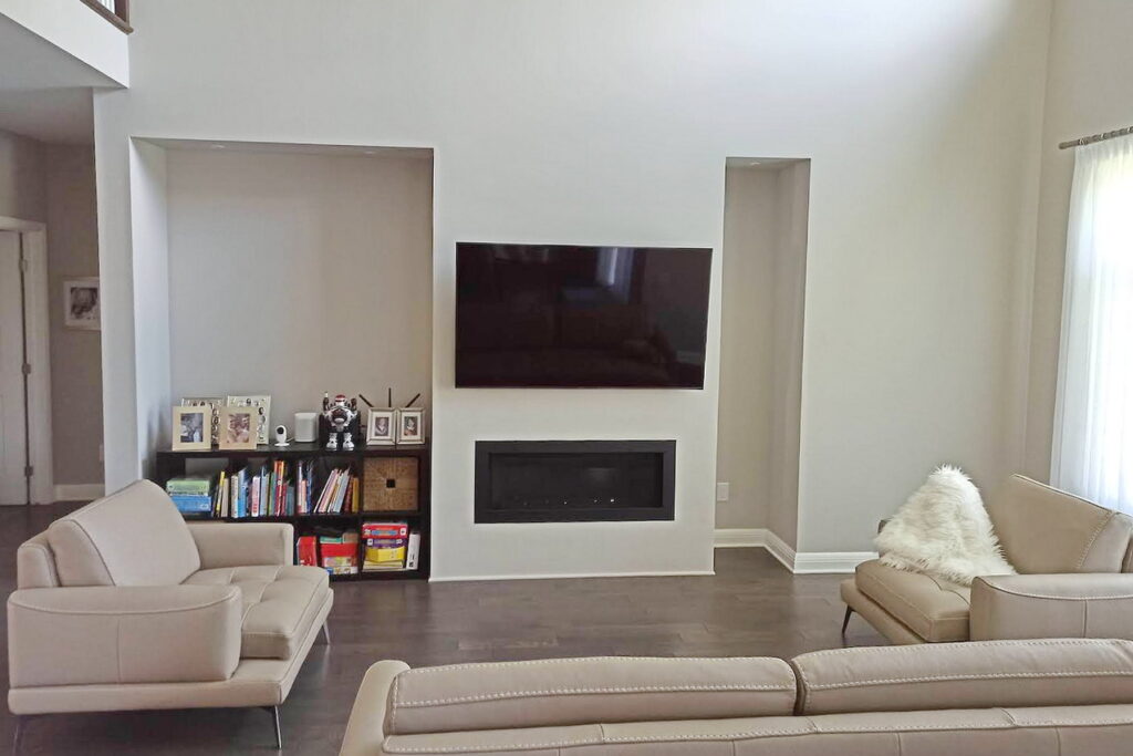
One of the most common design dilemmas we see is when something is asymmetrical, or unbalanced, among a room’s structural elements. This could be odd wall or ceiling angles, awkwardly located doorways, or asymmetrical focal point placement like a fireplace or display shelving.
Although they can be tricky, asymmetrical design elements can be a wonderful opportunity to add interest to a space. We recently helped a client who had been struggling to come up with
an attractive and functional solution for their family room, which featured a two-storey-high wall with a small fireplace flanked by mismatched alcoves.

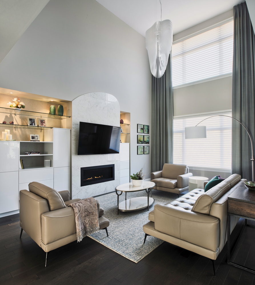
To kick off the transformation, we started by adding weight and interest to the fireplace so that it became a fabulous focal point in the room. Playing on the curves in the room’s existing
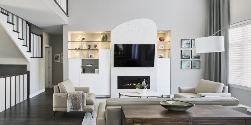
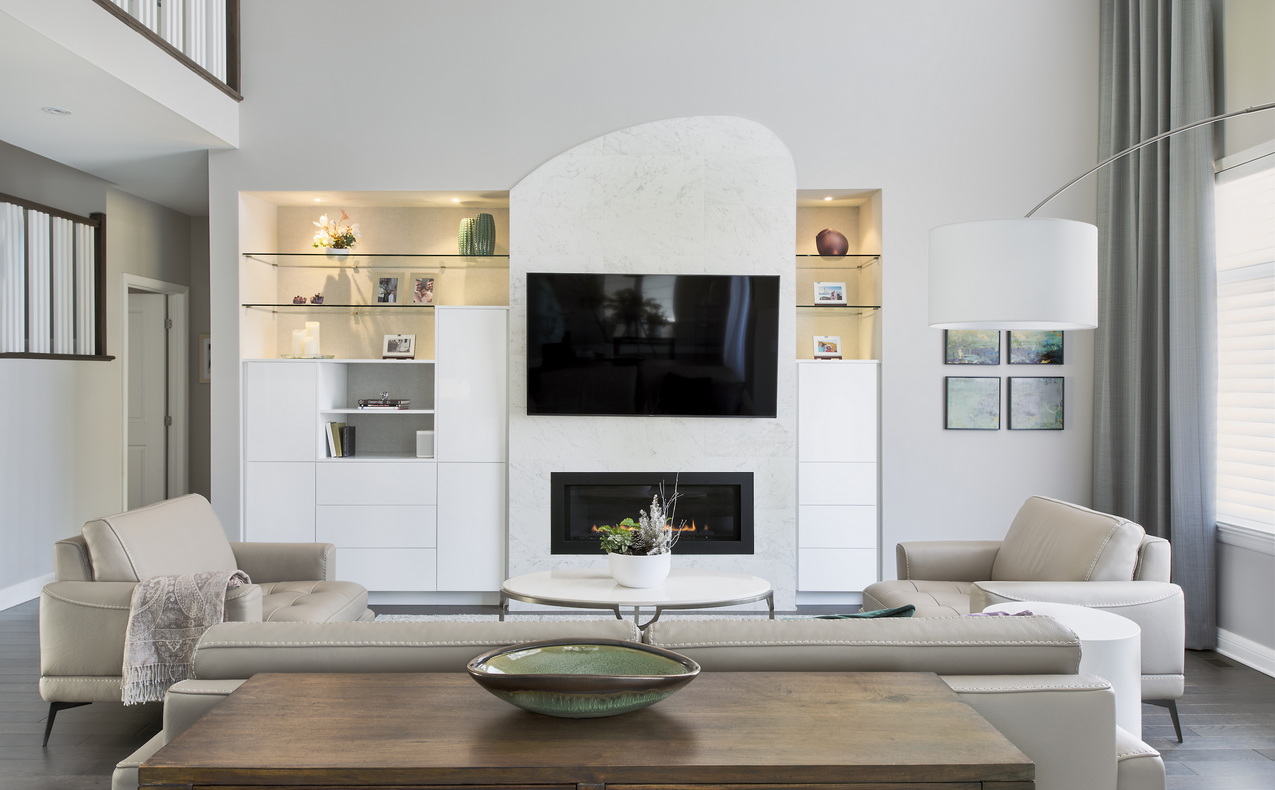
contemporary chandelier, we designed a stunning marble surround to increase the scale of the fireplace in relation to the soaring wall.
We then anchored the fireplace on either side with custom high-gloss cabinetry in complementary tones that blend seamlessly with the fireplace tile. Glass shelves add sparkle and light while supplying ample display space. Wallpaper behind the glass shelving elevates the custom look.
Because the alcoves were not the same size, we were left with blank wall space on one side, where we added eye-catching abstract artwork that adds colour and balances the wall.

A soft wool area rug was used to add softness and define the seating area. The oval marble coffee table ties in with the fireplace tile, while a modern white side table and wood console
table provide added function and storage.
To tie the room together, we brought in a selection of accessories in a variety of sizes and shapes to add colour and interest. Pops of emerald green and purple bring the neutral palette
to life.
With a few creative design ideas, we were able to transform this asymmetrical fireplace wall from bland and unbalanced to a beautiful focal point in a warm and welcoming living space.

Top tips for decorating an asymmetrical wall
#1. Use a variety of sizes and shapes: Rather than trying to find one large piece of art or decor to fill the space, consider using various smaller pieces in different shapes and
sizes. This can create a more dynamic and interesting display.
#2. Create balance: Even though the wall is asymmetrical, you can still create balance by placing items in a way that feels visually balanced. This might mean placing a larger
piece on one side and multiple smaller pieces on the other side.
#3. Use the fireplace as a focal point: The fireplace is likely to be the main feature of the wall, so use it as a focal point for your decor. This might mean placing items around the
fireplace, or even hanging art directly above it to increase its overall impact and scale.
#4. Vary the height: When placing items on an asymmetrical wall, it’s important to consider the height of each item. Aim for a mix of high and low items to create interest and
movement.
#5. Accessorize creatively: Don’t be afraid to incorporate glass, mirrors and plants to add interest and personality to the space.


