An abundance of white, glass and wood defined the winning entries at this year’s Design Excellence Awards put on by the Ottawa chapter of the National Kitchen and Bathroom Association (NKBA).
At a glitzy gala held at the Hilton at Lac Leamy May 4, the winners in 21 categories in the 9th annual awards were announced, with white in particular — and plenty of accents of glass, wood and marble — providing a design theme.
“A lot of the colour palette that we see often right now with the greys, the whites, spa-like feels in both the kitchens and the bathrooms — people were doing a lot of that,” says Anna Riopelle of Anna Riopelle Interiors, one of four designers and decorators judging the entries.
Fellow Ottawa judge Lee-Ann LaCroix of Lee-Ann LaCroix and Associates concurs.
“There was a lot of white, a lot of marble, a lot of glass. I almost wish there was more of something different in the elements. The ones that stood out to me were the ones that did add a little bit of black or a different finish, something that was a bit raw or they added colour.”
White will always be there, adds judge Alexandra Klich of A Very Fine House in southern Ontario. “People are still very conservative in their choices for cabinetry.”
The judges
- Lee-Ann LaCroix
- Anna Riopelle
- Irene Chu
- Alexandra Klich
But if we still lean white, we do like to add in other elements and this year one of those was wood, something Klich feels we’ll see even more next year, following on the heels of trends in Europe.
Adding in wood, and particularly raw wood like barn board or live edge, adds texture, says Riopelle. “That gives great visual appeal; it makes people feel comfortable.”
While the judges might have liked to have seen more colour, they were impressed with the quality of the designs.
“They were very, very well done,” says the fourth judge, Irene Chu of Paris Kitchens in southern Ontario.
Adds Riopelle: “There was a lot of brightness, a lot of freshness to the palettes. The biggest thing I noticed was the textural play, the palettes, and also a good sense of design as a whole.”
Having a ball
More than 165 attended the awards gala, which had a Masquerade Ball theme. Many in the crowd played along, wearing a variety of masks and posing with living statues at the pre-dinner reception.
“With design it’s all about the great reveal… To us the masquerade ball is the great reveal,” says the chair of the gala, Shelley Robertson of Centura Tile.
Following the four-course dinner, 40 trophies were given out in the 21 categories from among the 96 entries. In many cases, there was both a first- and second-place award.
Several designers had multiple wins with three — Nathan Kyle of Astro Design Centre, Elnaz Shahrokhi of Laurysen Kitchens and Emma Doucet of Grassroots Design + Build — each claiming three awards.

Caroline Castrucci, Laurysen Kitchens
A special trophy, named after Ottawa kitchen design pioneer Doris Lacroix and awarded to someone in the association who makes an extra effort to give back to the kitchen and bath industry, was given to Laurysen vice-president of administration Caroline Castrucci.
“As gregarious and outgoing as she is, (Caroline) never speaks about her accomplishments… and I don’t think anybody even realizes what she’s done and the contributions that she’s made,” says her husband, Giuseppe Castrucci, who is vice-president of sales and marketing at Laurysen and a founding member of the NKBA Ottawa chapter.
Noting that the kitchen business was all she had ever known, having joined her father’s company when she was 18, in accepting the award she joked that if she were to cut herself, “I’d probably bleed sawdust.”
Here’s a look at the winning designs
Note: All price ranges given below are for materials only and do not include labour.
Best New Designer
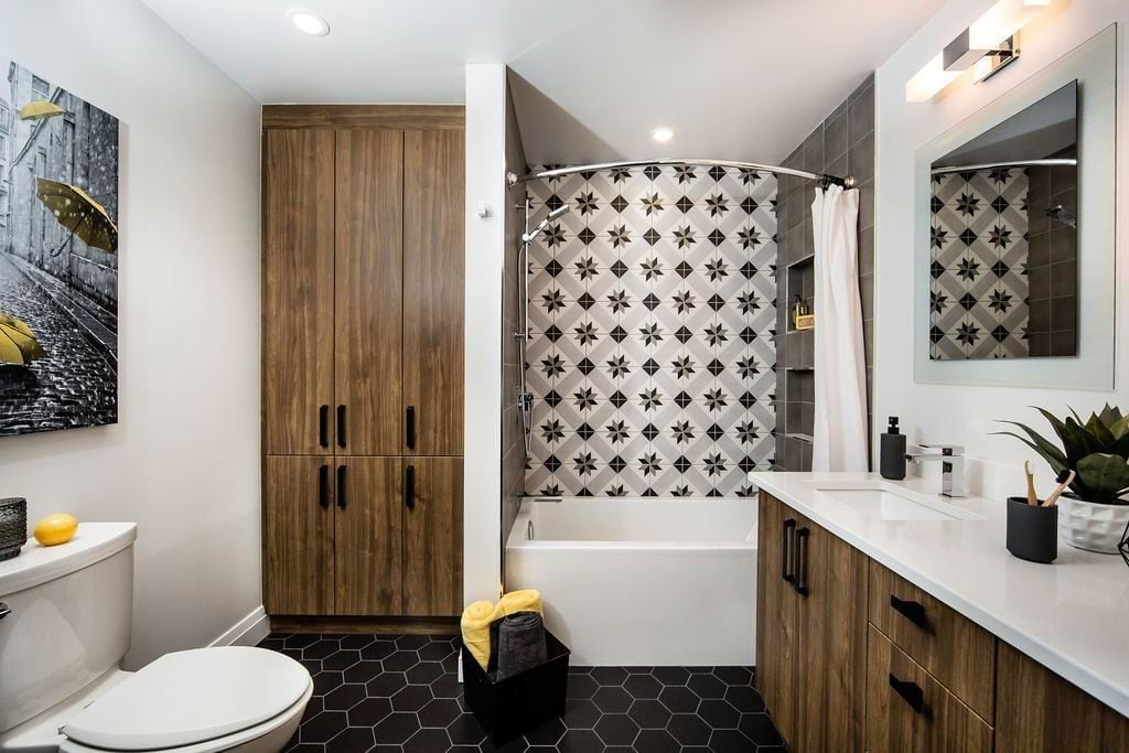
Best New Designer is awarded to an NKBA Ottawa member who has been working in the industry for 36 months or less.
Emily Meechan of Distinctive Bathrooms and Kitchens claimed first place with a bathroom remodel that needed both increased storage and some wow factor.
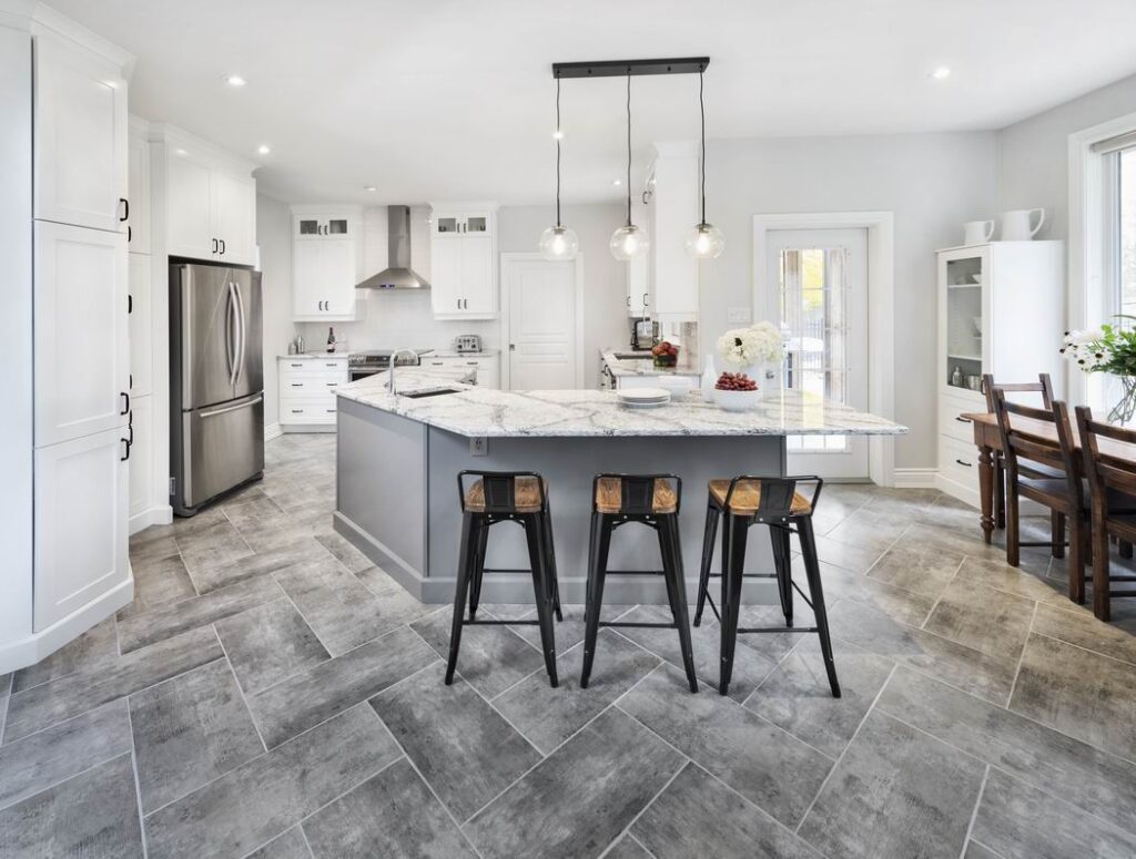
Second place for Best New Designer went to Ola Elmaghraby of Laurysen Kitchens for a kitchen dominated by an angled island.
Creative Concept

Creative Concept is not a “real-life” project and judging is weighted heavily towards creativity. Rutherford’s design explores an integrated indoor/outdoor kitchen.
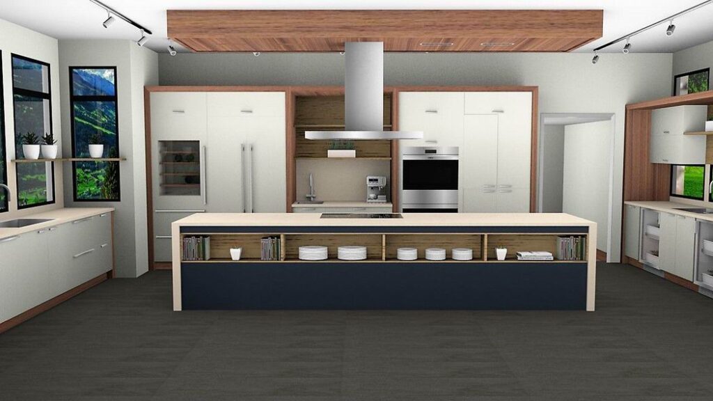
Price created an urban garden kitchen that integrates space for growing food, maintaining plants and preparing meals. “I found that was kind of clever,” says Riopelle.
Kitchen, Classic/Traditional ($20,000-$39,999)
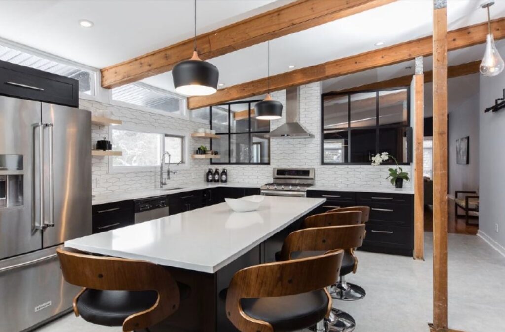
Dykstra won in this category last year, as well. This year’s project needed to relate to the open-concept main floor.
The homeowners wanted to create sight lines to the family room while incorporating an easy-living style that worked with the exposed post-and-beam construction and numerous transom windows that were defining features of the home.
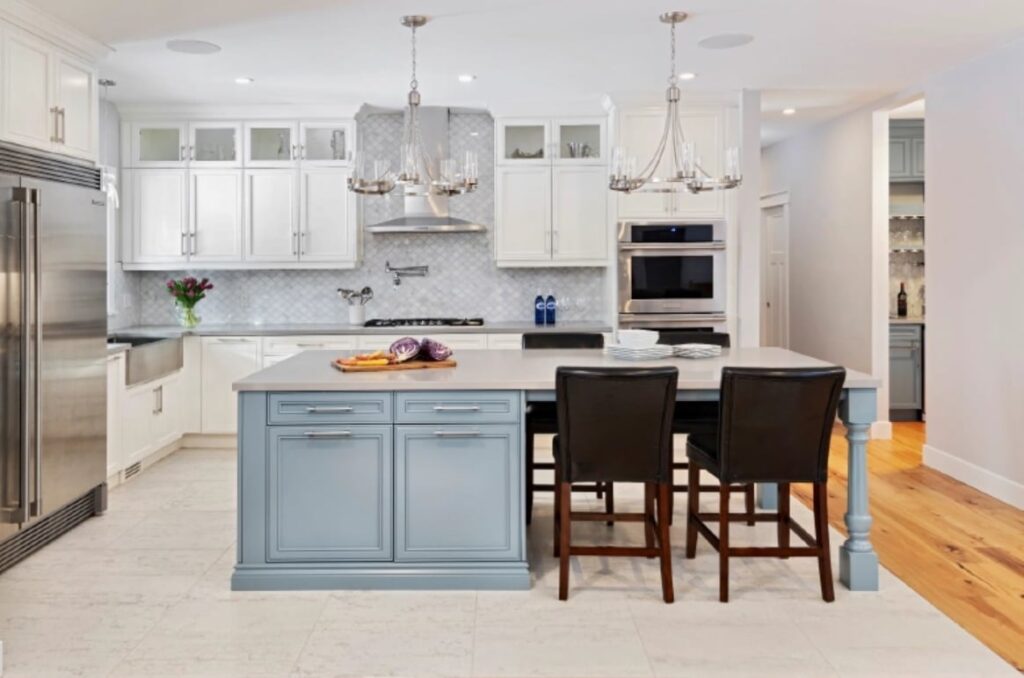
An island in Van Courtland Blue, surrounded by white perimeter cabinets, adds charm and timeless character to this new home. And incorporating a dining table into the island adds versatility without eating up valuable floor space.
Kitchen, Classic/Traditional ($40,000-$59,999)
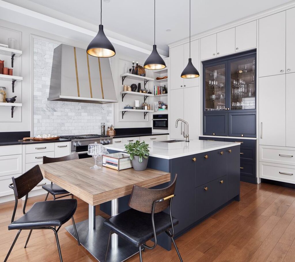
“The idea was to make it look like it had always been there,” Kyle says of this new-build kitchen. Layering in finishes, design elements and styles is part of the mixing and matching that more than one judge noted.
“You’ll have a very muted white kitchen or light grey kitchen and then you’ll have wood shelf put in or wood accents integrated in, and definitely a lot of islands,” says Chu.

“This house to me really felt like a super fancy cottage so I wanted to work with that,” says Doucet. “Spaces can feel ostentatious and not warm when they’re so big so it was important to fill it with nice lighting, the bench in the corner, the warm greys. And I added the walnut accents because I wanted it to be simple and beautiful.”
Kitchen, Classic/Traditional ($60,000-$79,999)
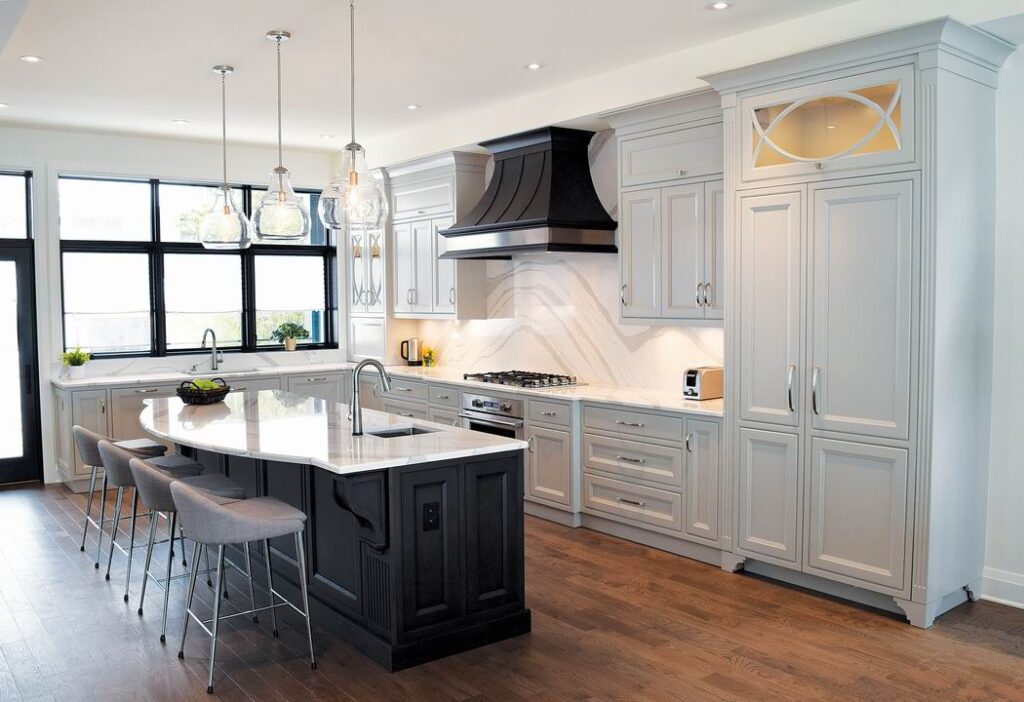
An island and range hood in Elmwood cabinetry with a hand-wiped stain contrast with a subdued and calming grey perimeter in this custom kitchen with vintage appeal.
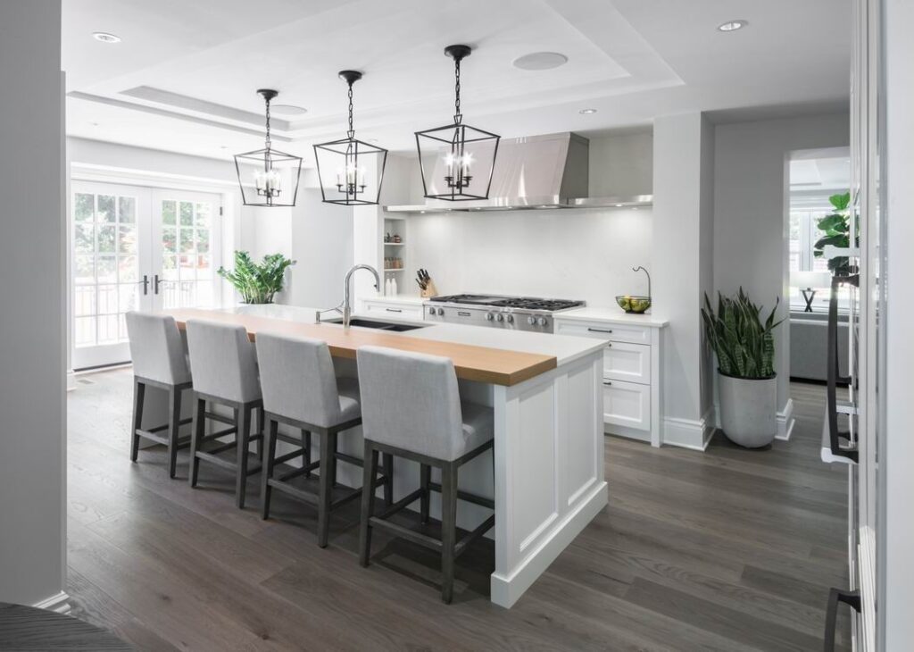
White profiled cabinet doors, the island base detail, the ceiling design and the aged iron hardware elements all work to define the classic language that is repeated throughout this renovated heritage home.
Kitchen, Classic/Traditional ($80,000+)
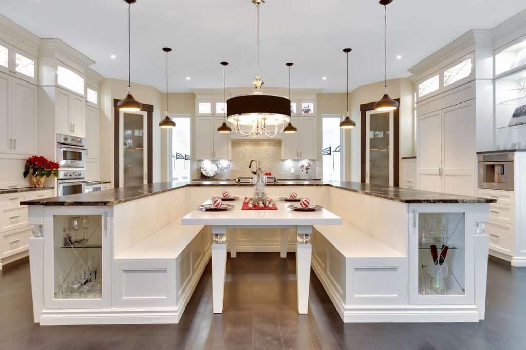
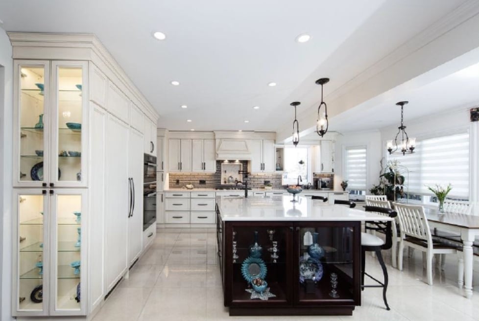
This is a kitchen meant for many and, as such, comes with many zones: beverage hub, baking and prep hub, cooking hub, cleaning area (with two dishwashers) and a large eating area. Throughout it all, crystal and glass details add glamour.
Kitchen, Contemporary/Modern ($20,000-$39,999)
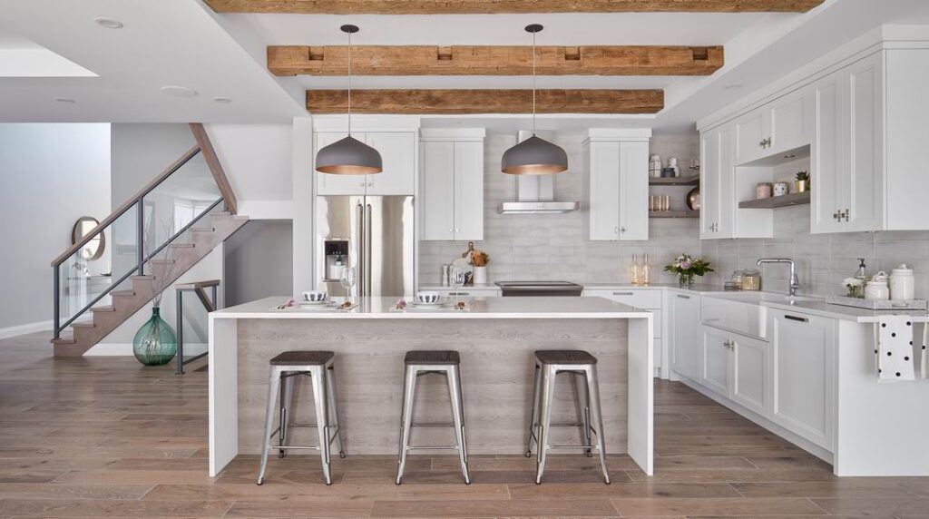
This space needed to provide some “wow” while keeping to a tight budget. Enriquez did that in part with a custom inexpensive crown that was designed to add interest to otherwise white shaker cabinets and allowed the space to feel contemporary yet transitional to go with the beams on the ceiling.
To add the wow factor, and keep in mind entertaining was a priority, a large counter was designed with a waterfall edge in a beautiful quartz. This project also won a trophy at last fall’s Housing Design Awards.
- 2nd place, Kitchen, Contemporary/Modern ($20,000-$39,999), as well as 1st place for Best Transformation Kitchen or Bathroom: André Guénette, The Kitchen Guy
- Before the transformation
An updated kitchen gets a modern, yet timeless, spin in white and grey with walnut accents. Guenette won this category last year as well.
Kitchen, Contemporary/Modern ($40,000-$59,999)

Light, neutral shades are used in this clean modern kitchen to keep it bright and happy, while grounding it with a splash of natural white oak on the island.
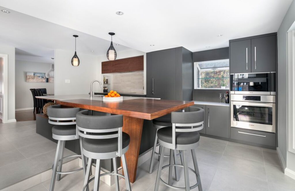
Opening up the original small U-shaped kitchen into the large sunken breakfast area provided needed space for this much more contemporary kitchen. The challenge presented by the two different floor heights was turned into an advantage: The countertop was kept level, with one end at regular counter height for the working kitchen area and the other at bar counter height with stools for dining.
This project is another example of wood accents, in this case a walnut veneer that adds warmth to the space.
Kitchen: Contemporary/Modern ($60,000-$79,999)
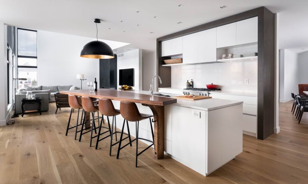
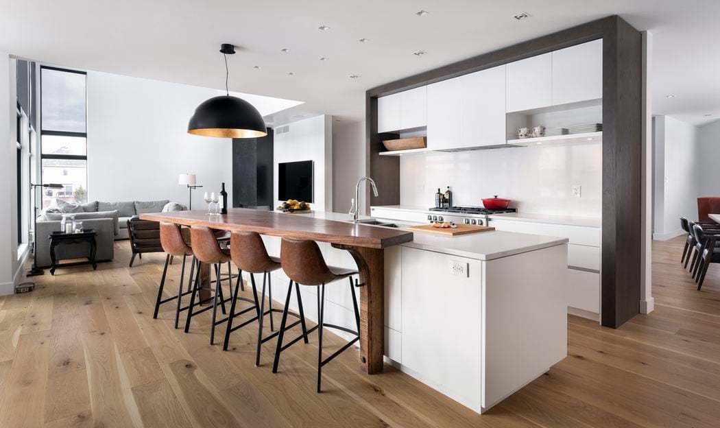
There’s a lot to like in this contemporary kitchen, but what stands out most are the wood accents, including the trapezoid-shaped countertop supported by two antique reclaimed wooden legs and the wood wall frame, which provide an earthy contrast to the pure white cabinets for a mix of symmetry and asymmetry.

Two-tone cabinets with an emphasis on walnut adds warmth to the clean lines sought in this kitchen update.
Bathroom, Classic/Traditional ($10,000-$24,999)
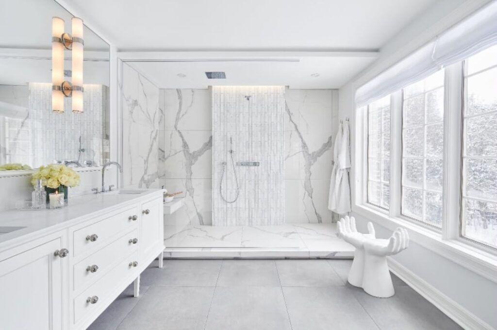
Without changing the footprint of this ensuite, which is in Bryson’s own home, she and Kyle were able to transform the space into a spa-like space that both respects the home’s more traditional style while adding contemporary flourish.
The walk-in shower becomes a focal point that has the appearance of floating so that it wouldn’t feel too heavy. “Even though you’re stepping up onto a platform in that shower, it doesn’t feel like you’re stepping over a curb. It feels like you’re elevating yourself to a different level in the bathroom,” says Kyle.
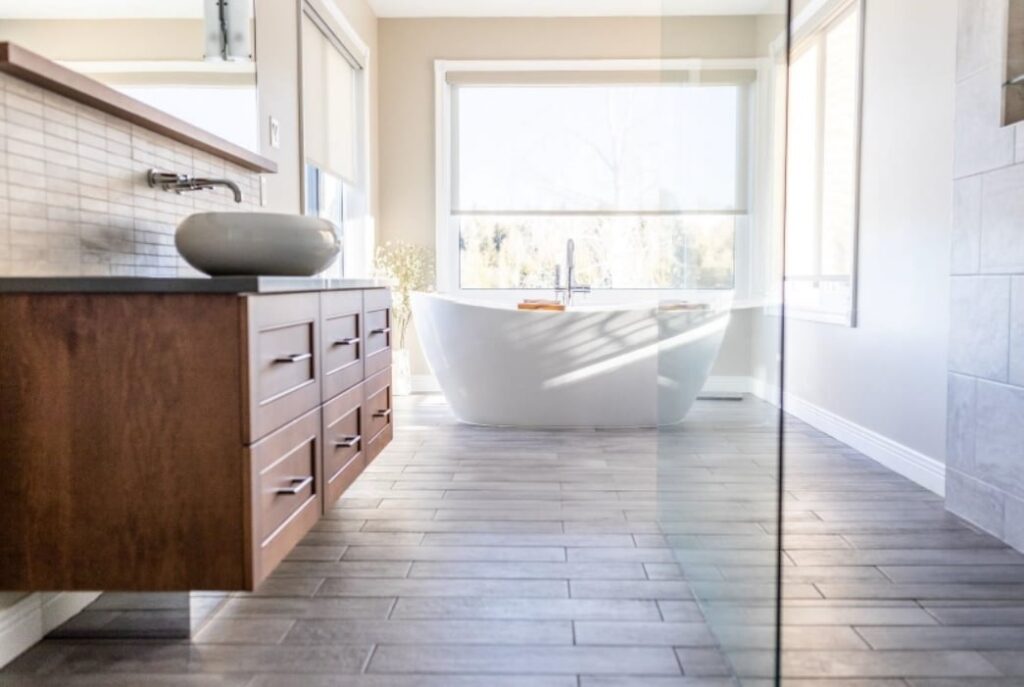
A poorly designed bathroom was transformed into a welcome retreat with a sleek walk-through shower, free-standing tub centred among the oversized windows — both of which allow the bather to enjoy the home’s beautiful country vistas — and graceful vessel sinks sitting atop double maple Miralis vanities.
Bathroom, Classic/Traditional ($25,000-$39,999)
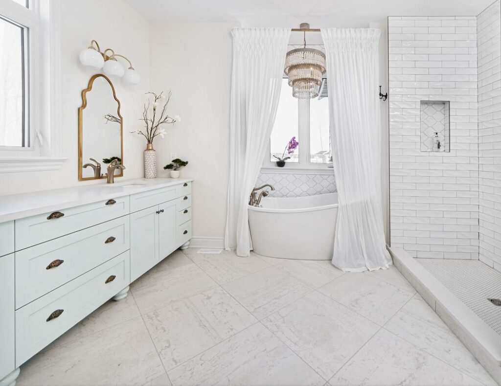
Classic styling but in trendy white and gold, this ensuite says elegance and pampering. Statement mirrors, an elaborate chandelier and gauzy curtains framing the standalone tub invite you in.
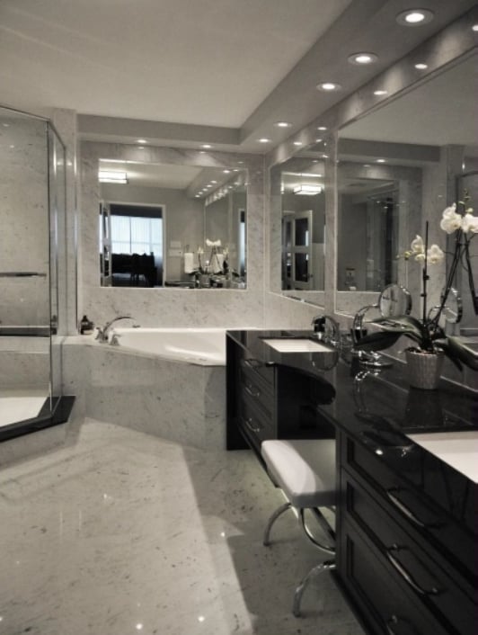
Classic in darker tones, this ensuite suggests a more muted pampering is at play here.
Bathroom, Classic/Traditional ($40,000+)
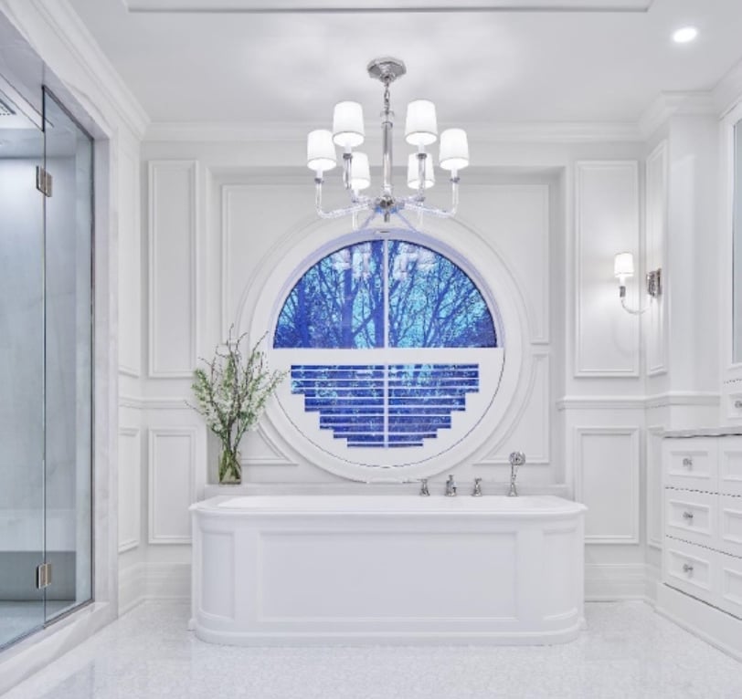
“That was a pretty special bathroom,” says Kyle, who was excited by the challenge that the project offered.
More than one judge loved the result, particularly because of the detail that went into it. “You don’t see that very often,” says Riopelle.
And LaCroix adds: “I could have lived in just that bathroom. Put a cot in there and I would have been happy.”
Every wall in the ensuite has details that needed to seamlessly integrate together, from the millwork to the tub positioning, to lighting, mirrors and even the shower sill, which was created from ¼-inch-thick porcelain onyx but has the feel of solid stone because of how it was applied.
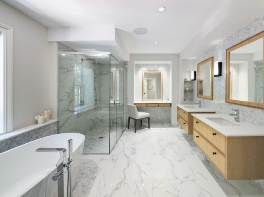
Unlike many bathroom renovations, this project was an example of an ensuite that was reduced to a more functional size to be in better proportion to the adjacent bedroom. Monochromatic finishes are interrupted by an accent of white oak on the cabinetry and matching framed mirrors. This caramel tone, along with the aged iron hardware of the cabinet knobs and light fixtures, echoes other classic details throughout the home.
Bathroom, Contemporary/Modern ($10,000-$24,999)

If this room looks familiar, it’s because it’s the ensuite in the 2018 Minto Dream Home as part of the CHEO Dream of a Lifetime Lottery.
Based on the competition, Shahrokhi was surprised it won the People’s Choice. “People sometimes look for something different. I thought maybe the gold was not for everybody, but I guess people are getting trendy,” she says.
Two bathrooms Shahrokhi designed for the 2017 dream home have also been award winners.
MORE: Explore the 2018 Minto Dream Home

Taking two smaller bathrooms and combining them into one larger one with a separate laundry closet allowed for the home’s character to shine through, says Doucet. She started with the cement tile floor, which the homeowner fell in love with.
“A lot of people are scared of cement tiles because they do rub off as the years go on, but to me I love that; it adds more patina and shows that it’s an authentic product.”
She then worked in the room’s various nooks and crannies and added a custom vanity, saying she likes using real wood in spaces because it relaxes the eye.
Of note, although the vanity is not large, offsetting the sink means two people can use it at one time, say one brushing their teeth while the other is applying makeup.
Bathroom, Contemporary/Modern ($25,000-$39,999)
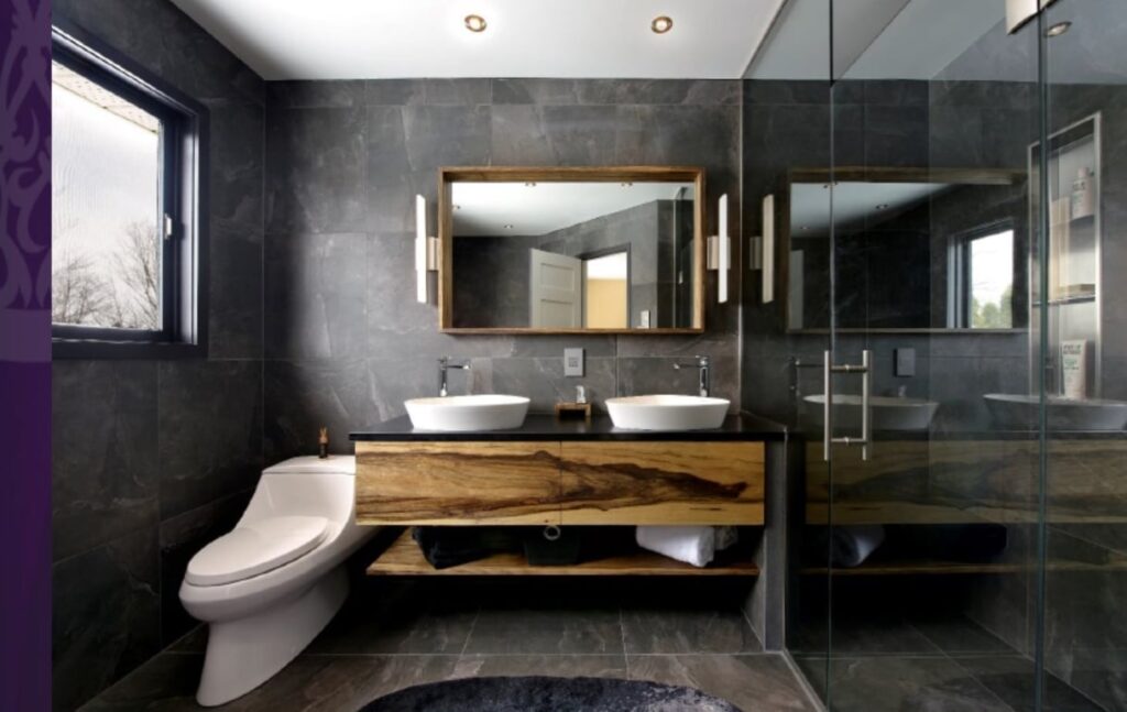
One of the few entries that was dramatic in dark tones, this bathroom was inspired by places the homeowners visited in their travels, in particular Reykjavik in Iceland. The couple wanted to create a contemporary organic looking space to clear the mind and calm the soul.
It was a space that caught the attention of Chu, who has also visited Iceland and appreciated the design choice. “It’s a country of contrasts: it’s hot, it’s cold, it’s white, it’s black, it’s wet and it’s dry. It’s just absolutely amazing.”
Large format slate-look porcelain tiles on the floors and walls around the room create the base for the contemporary and organic esthetic of the new space, Bowen says in her entry, while the dark charcoal colour is reminiscent of the black sand beaches and volcanic rock formations found in Iceland.
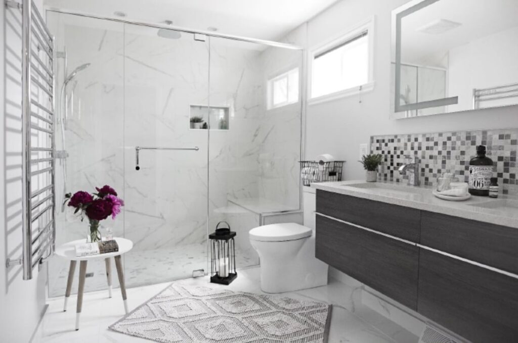
By stealing unneeded space from the master bedroom, a tiny bathroom was turned into a roomy ensuite with equally generous walk-in closet to give the homeowner the hotel-like suite she always wanted.
Bathroom, Contemporary/Modern ($40,000+)
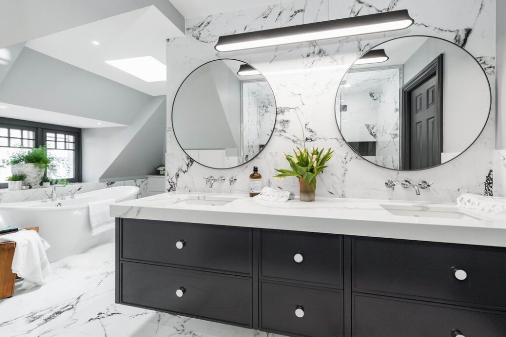
Low knee walls and sloped ceilings on the third floor of an existing Victorian home created challenges for this renovation, but by dividing the layout into two zones, Neilson was able to make the space work while giving a sense of symmetry and drama around the tub.
MORE: Read about this bathroom transformation
Powder Room, Any Style
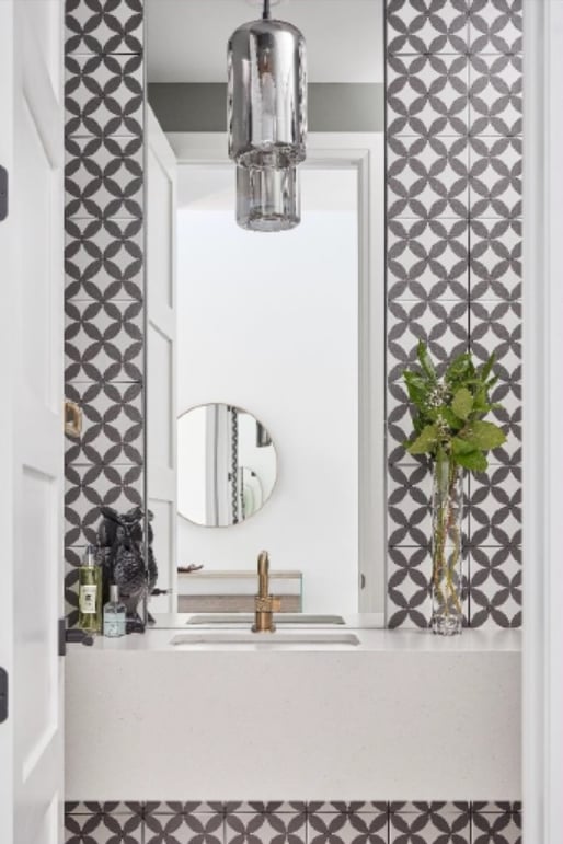
A vibrant, black-and-white theme was the goal in this powder room, which is heavily centered on the patterned tile and tall vertical mirror. To help the room feel more like a hidden gem than a utility space, the conventional vanity was omitted and replaced with a suspended counter.
Enriquez says in her submission that her intention was to just have fun with this space. Mission accomplished.
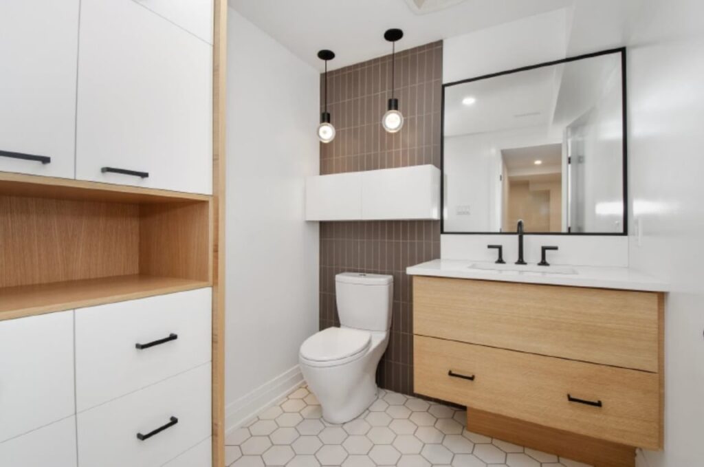
This powder room packs in a lot. It combines the cleanliness of white with the warmth of a horizontal grain white oak; it’s on trend with vertically stacked wall tiles and hexagon floor tile; and it maximizes storage with a custom floating medicine cabinet over the toilet and tall two-tone linen cabinet that includes an open shelf for personalizing the space with decorations.
The Look for Less, Kitchen or Bathroom
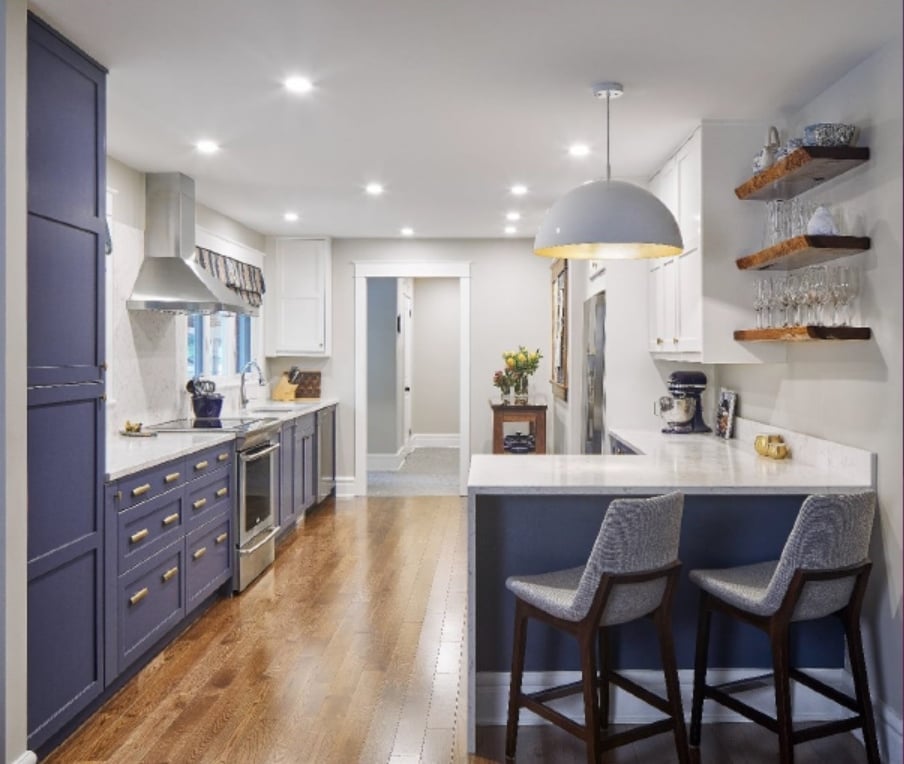
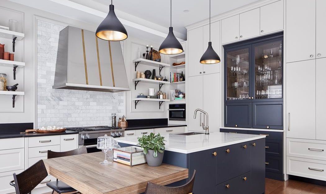
For an impressive third year in a row, Doucet has captured this category, this time with a kitchen that “has all the elements I love about kitchens,” she says. “I never get tired of the navy blue with the brass handles… It’s classic, it doesn’t get old.”
But as Doucet is quick to point out, her firm benefits in this category thanks to a philosophy that applies more of the budget to labour than to materials. In this category, qualifying kitchens must be priced under $19,999.99 for materials only.
And that’s easier for Grassroots to do because Doucet will sometimes opt for more affordable materials that free up budget room for how the space is built out. In this project, for instance, Ikea cabinet bases are used with custom doors built by her team.
Best Transformation, Kitchen or Bathroom
First place, as noted above, was won by André Guénette, The Kitchen Guy.
- 2nd place, Best Transformation, Kitchen or Bathroom: Natalia Pierce, Detail by Design
- Before the transformation
Reconfiguring the footprint and stealing a bit of space from both the master bedroom and a linen closet created room for a freestanding soaker tub and an unusual double-access shower between the main bathroom and the ensuite. While not a typical solution, the redesigned space was the right one for these homeowners.
Other Room
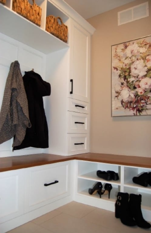
The Other Room category is for rooms other than kitchens and bathrooms that contain cabinetry as a major component of the design.
The open room on the main entry level of a three-storey townhome offered the option to add much-needed mud room cabinetry and storage for this family. Stys’ design gives them multi-functional storage not only for shoes and jackets, but also for items they want to tuck away but keep easily accessible.
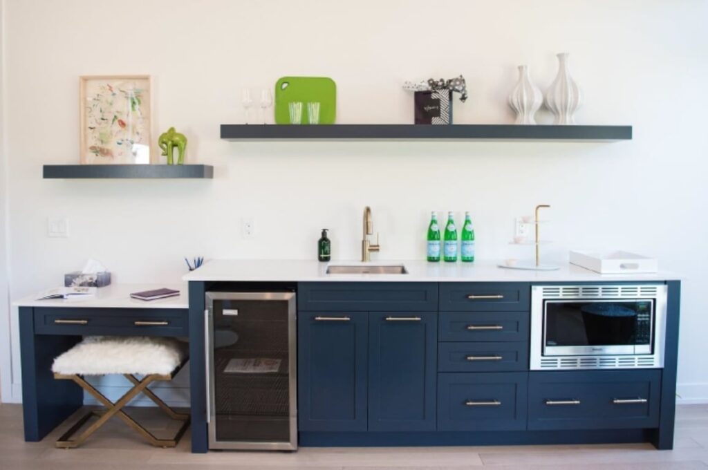
Another 2018 Minto Dream Home room, this is the main-floor in-law suite, which was designed as a mini open-concept apartment, complete with kitchenette. Bold oversized decor shelves on the wall make this wall pop even more.
People’s Choice Award
As noted above, the People’s Choice Award, Bathroom award went to Elnaz Shahrokhi of Laurysen Kitchens.
