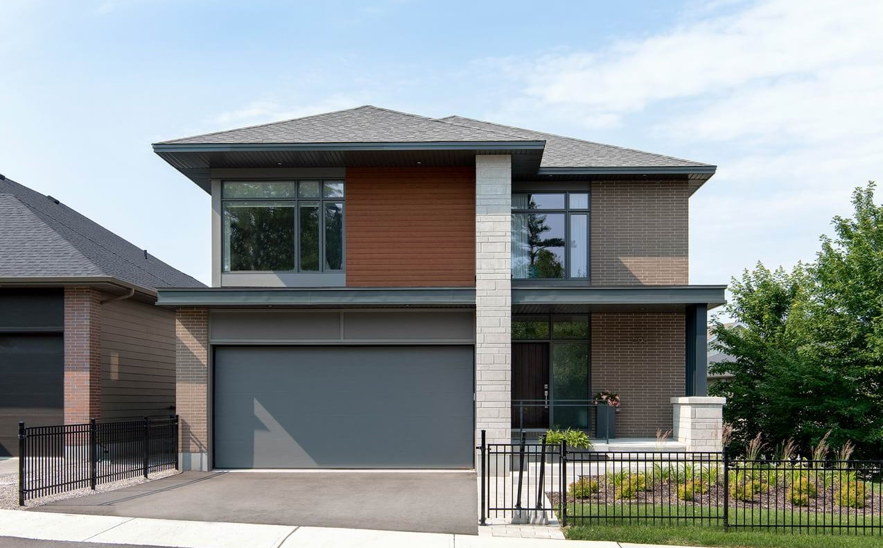
COVID may have changed the purpose of the new model home at Richardson Ridge in Kanata, but builder Uniform Urban Developments has made the most of the situation, creating an inviting show home that’s all about comfort.
Called the Hillcrest, the four-bedroom, 3.5-bathroom two-storey home was started pre-COVID and was meant to “get people interested in buying” when Uniform was ready to resume sales at the development late last year, says marketing manager Emily Meyers. But, she adds, “we kind of got caught in the midst of COVID.”
Although the new model home was technically finished in time for sales to begin at Richardson Ridge, safety protocols meant the public could not stop by and tour it. “Only people who secured lots and were ready to buy were coming in and so this model… we sort of used it in reverse and it was people who had bought who then used it as a touring tool to solidify their buying decision.”
The company debated whether to finish building it as a staged model or simply complete it and sell it. “We realized it was important to just forge ahead, complete it, and use it as a marketing tool in whatever way we could imagine in a COVID world,” Meyers says.
The home has proved popular among Uniform’s buyers at Richardson Ridge. Although architectural guidelines limited how many lots could have the Hillcrest floor plan to maintain a varied streetscape, “wherever anyone could put a Hillcrest they did,” she says.
The model is new to Uniform’s lineup, one of eight floor plans designed by Hobin Architecture to update Uniform’s portfolio of 42-foot and 47-foot homes.
“It’s just a refresh of something that’s been working for us for decades now,” says Meyers, “a 2020 perspective on home layouts and exterior finishes.”
Exterior colour schemes have shifted, she says. “They’re a little more dramatic. The colour palette is a little bit darker, a little bit punchier, and people have taken to it.”
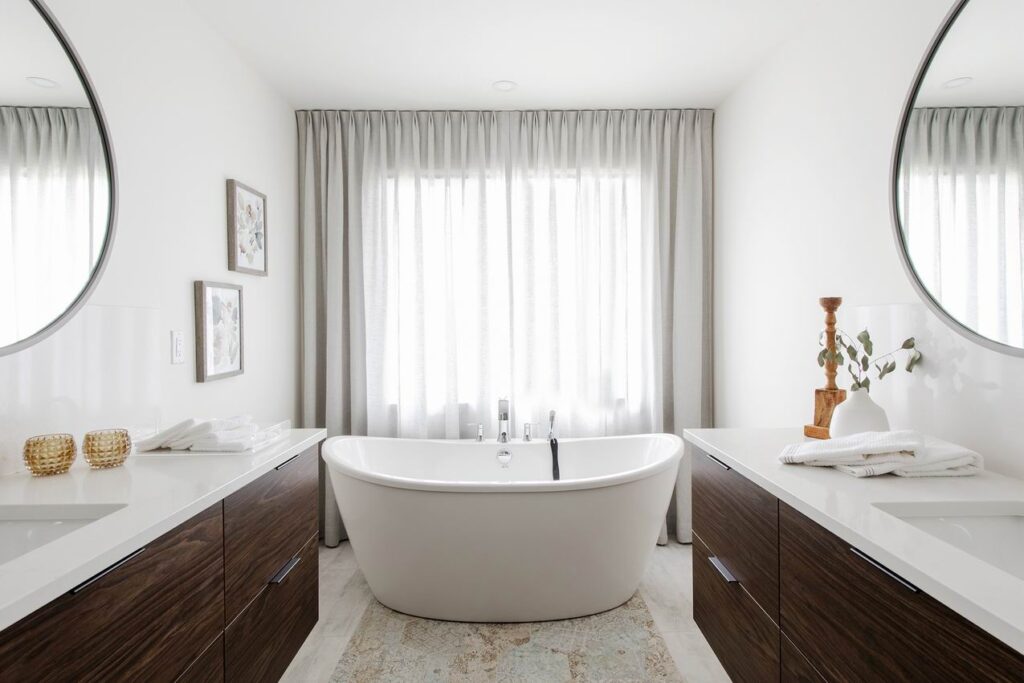
Inside, long-time design collaborator 2H Interior Design gives the model home a transitional touch. Meyers describes it as “this interesting play between modern and traditional throughout the house, whether it be in the millwork or the furnishings or the decor accents. It’s just a mix of the two.”
2H co-founder Danielle Hannah felt it was important to think of things that were becoming important to people as they dealt with the new reality of COVID, giving the home a nod to nature.
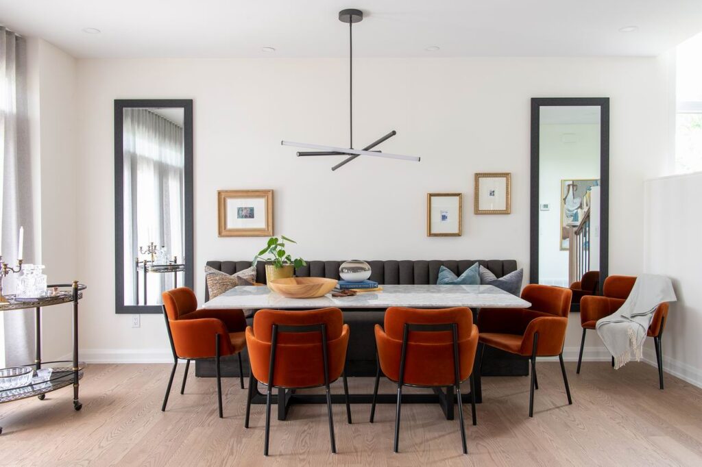
“We tried to add some woods, we tried to add some texture; really it was about comfort,” she says. But it was also about creating an eclectic home with layers and mixing old and new to reflect the way people actually live.
“The majority of people come with things that mean something to them and then our job is to collect and curate and make it work together. We wanted to make it feel like there’s someone’s past in this house.”
Despite being designed pre-COVID, the home reflects the changing priorities the pandemic has wrought.
A main-floor den is centrally located for maximum flexibility, yet in the model it stands out from the rest of the home with its moody, dark walls to purposely feel different, making a distinction between work and home.
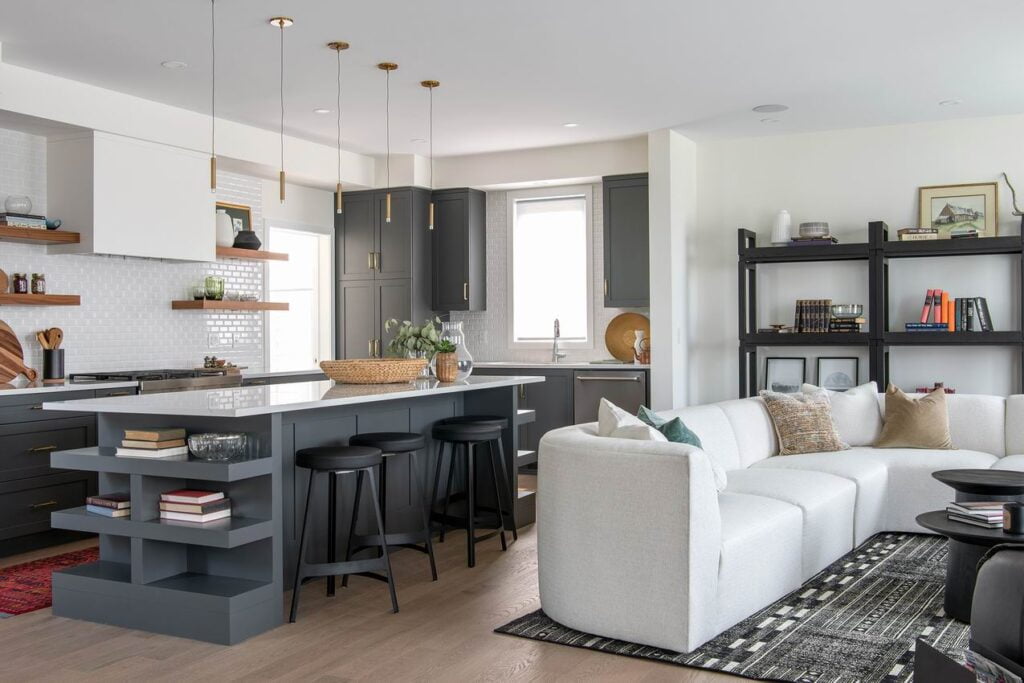
The rest of the main floor includes an extra-wide hallway (it’s six feet) for a feeling of grand entry to the back of the home, where the open-concept kitchen, living room and dining room offer plenty of elbow room without feeling cavernous, the sense of proportion creating a welcoming cosiness.
“There’s something to be said about taking a big, spacious house and still making it feel like a home,” says Meyers.
The home is large — just over 3,000 square feet without the finished walkout basement — yet “the scale of it is quite cosy,” she says, and she’s right.
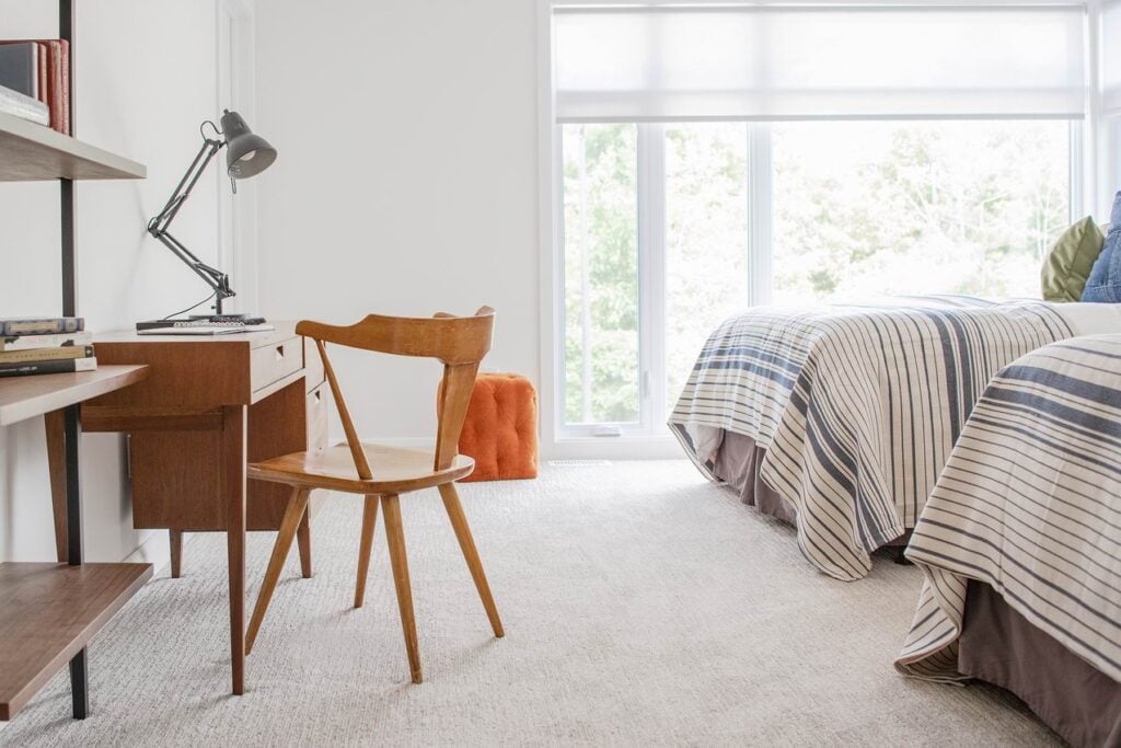
Upstairs, the four bedrooms benefit from a smart layout that creates privacy for each room, with buffers such as closets or bathrooms offering separation between each. A second master suite would appeal to a multi-generational family, and all the rooms are intentionally large for a sense of balance, Meyers says. “I really think (with) this model there’s a lot of livability to it.”
Hannah adds some pop to the neutral palette with deep hues of navy blue, dark green, burnt orange and black. “I really like using black as an accent,” she says.
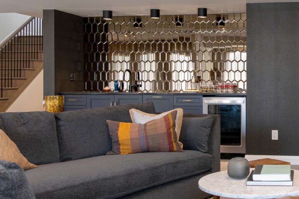
There are a few design surprises throughout, like the wallpapered ceiling in the powder room, subtle (and not-so-subtle) geometric touches and, in the basement, metallic backsplash tile in the wet bar and a juxtaposition of dark and light tones to create a focal wall of sorts.
Hannah feels a design trend of 2020/2021 is everything goes; the key is “how you put it together.”
Exploring the new model home at Richardson Ridge
The home is open by appointment or can be toured virtually.
Check our Richardson Ridge development summary for more information.
