There’s a little bit of the familiar and a little bit of the new in this year’s Minto dream home.
The familiar is that it’s back in Stittsville, just down the street from last year’s home, it’s based on a Minto Communities floor plan, and it’s designed by Tanya Collins, who debuted as the dream home designer last year.
But that’s where the similarities end.
Where last year’s home was open concept, glamorous and sophisticated in black and gold, this year’s home is a more classic floor plan with an earthy, cosy look reminiscent of a beach house and full of more traditional layering and textures.

Designer Tanya Collins
Photo: Gordon King Photography
“This house is very different than last year. It’s kind of got a coastal, a little Bohemian, Hamptons, Muskoka (feel),” says Collins, who took her cue from the floor plan. Based on Minto’s Redwood model, the four-bedroom home features a formal living room and dining room up front and a more private kitchen and family room across the back of the home. With the finished basement, it’s more than 5,500 square feet.
But Collins believes even “stark modernists” will find things to like in this year’s home. “There’s something here for everyone and you can learn some different tips as to how you can layer, decorate.”
Adding character
Known for her contemporary leanings, Collins also has a love of older homes — her own home is an old one — and she loves the character they have. By introducing so much layering into the dream home, she’s aiming to add the instant character of age in a new build.
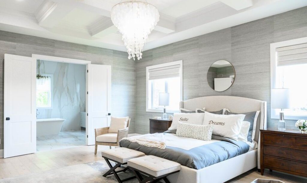
The home boasts plenty of wall panelling, wainscoting, coffered ceilings, textured wallpaper and more, all wrapped in the beach house vibe.
“I love the look and warmness of this year’s home,” says Dan Champagne, the CHEO Foundation’s vice-president of development and corporate relations. “This one is the best yet.”
Also new this year is the lack of a surprise room (last year it was the roller rink in the basement). But there is the unexpected and timely addition of making the home Net Zero, something that is important to Minto, which has been a green leader in the building industry.
Net Zero features
A Net Zero home is one that will produce as much (or more) energy as it consumes over a year, thanks to solar panels on the roof and energy-efficient measures such as upgraded insulation, Energy Star-qualified windows, a high-performance heat pump heating and cooling system, high-efficiency electric heat pump water heater, a heat recovery ventilator, and LED lighting.
“Imagine living in a home this size and not having to worry about your hydro bill,” says Brent Strachan, who is president of Minto Communities Ottawa.
The home also comes with an electric car and a garage equipped for charging.
The fully furnished home makes up the bulk of the $2.55-million grand prize in the CHEO Dream of a Lifetime Lottery, which raises much-needed funds for the children’s hospital. It’s open daily until Dec. 6. (See end for details.)
Take a room-by-room tour
(All photos by Brittany Gawley Photography, courtesy of CHEO Foundation.)
Exterior
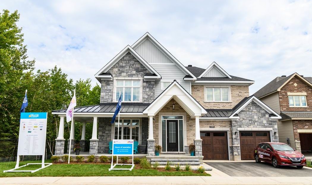
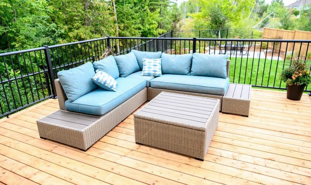
The home backs onto Feedmill Creek in the community of Potter’s Key. As a result, a stand of trees wrapping around one side and the creek buffer at the rear offer privacy and nature in one. The backyard boasts a raised deck that stretches across half the home and, in the back corner, a generous patio.
Foyer
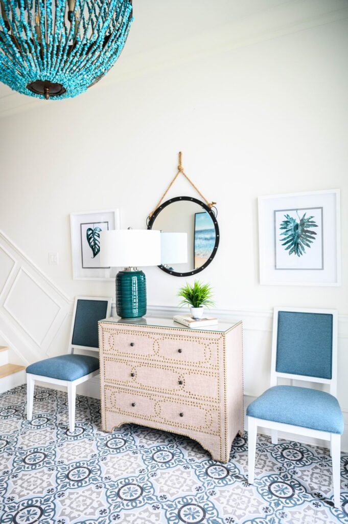
Designer Tanya Collins sets the tone right from the foyer, where the beach-like, Hamptons, coastal feel is apparent in the blue tones, the patterned tile from Euro Tile & Stone and the beaded statement pendant light from Currey & Company. Showcasing light fixtures that pop is a signature of Collins’.
Living/dining room
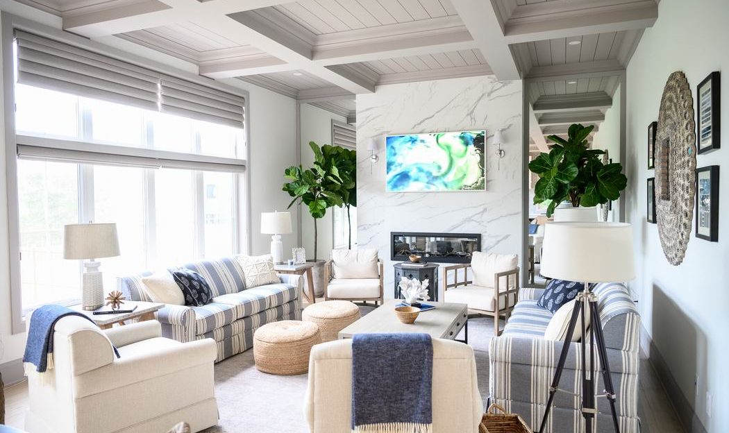
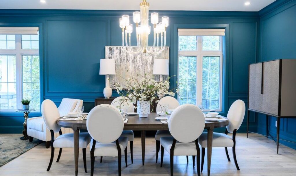
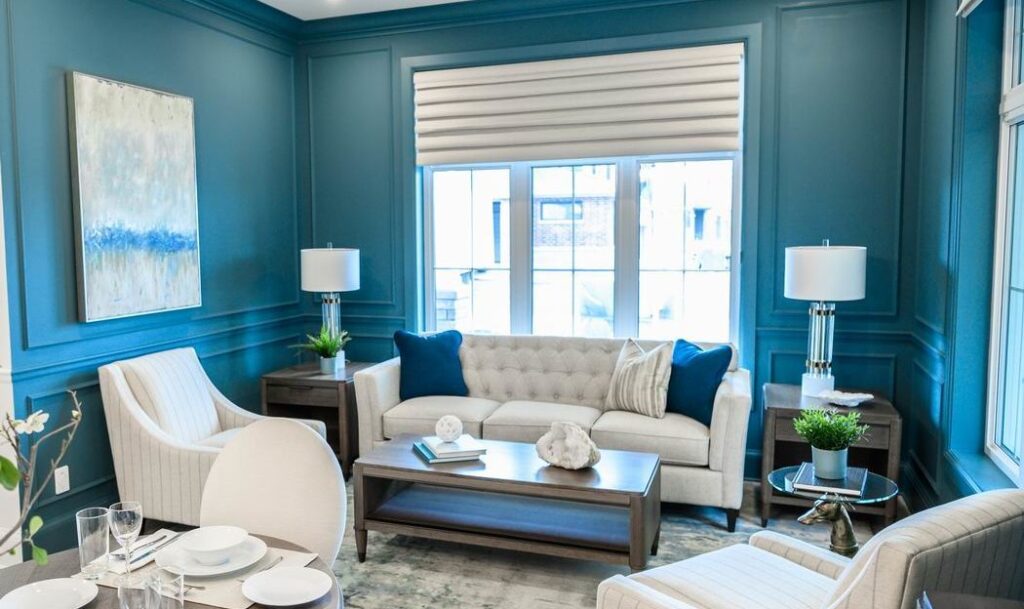
The most vibrant colours in the home are found in the living room and dining room, which are just off the foyer. Featuring traditional panelling and walls painted in Dulux’s Vining Ivy, the rich walls are juxtaposed with light, neutral furnishings (all from La-Z-Boy) and a natural-look hardwood.
“I love this colour,” Collins says of the walls. “It’s like a beautiful sort of turquoise-y blue and I find all the furniture’s very neutral, so it makes the furniture pop. It’s still elegant but it’s a fresh take on that.”
Of the floors, she says: “Raw finish, matte finish, wire brushed, hand scraped, wide plank — people are coming more to it. I’ve been liking this lighter floor for awhile… For a beach house you need a lighter floor, sun-bleached, sun-kissed a little bit.”
Butler’s pantry
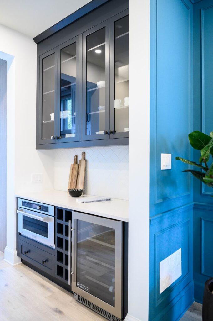
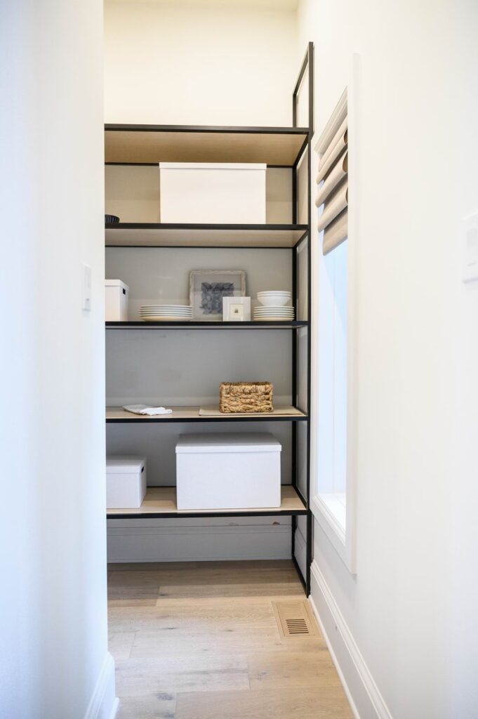
The butler’s pantry boasts a fridge, speed oven and built-in charging station, with a food storage pantry tucked in behind, which is a departure from the original floor plan.
Kitchen
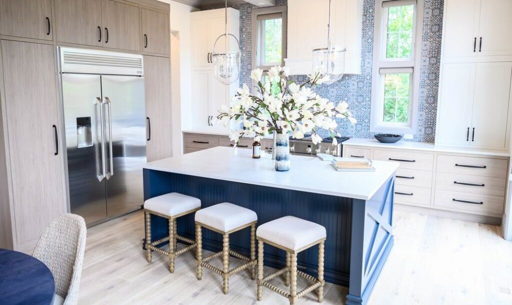
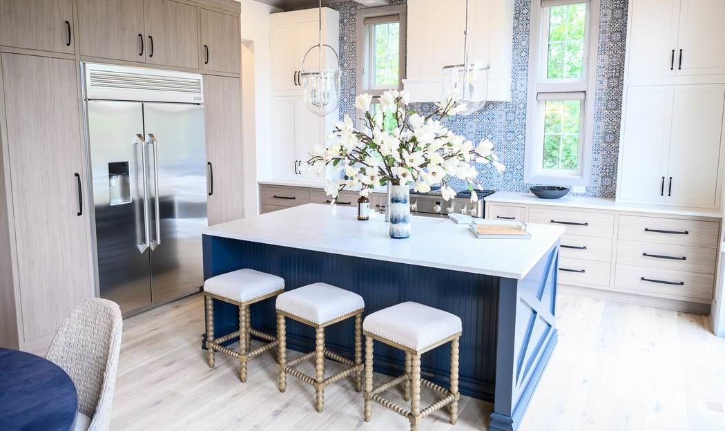
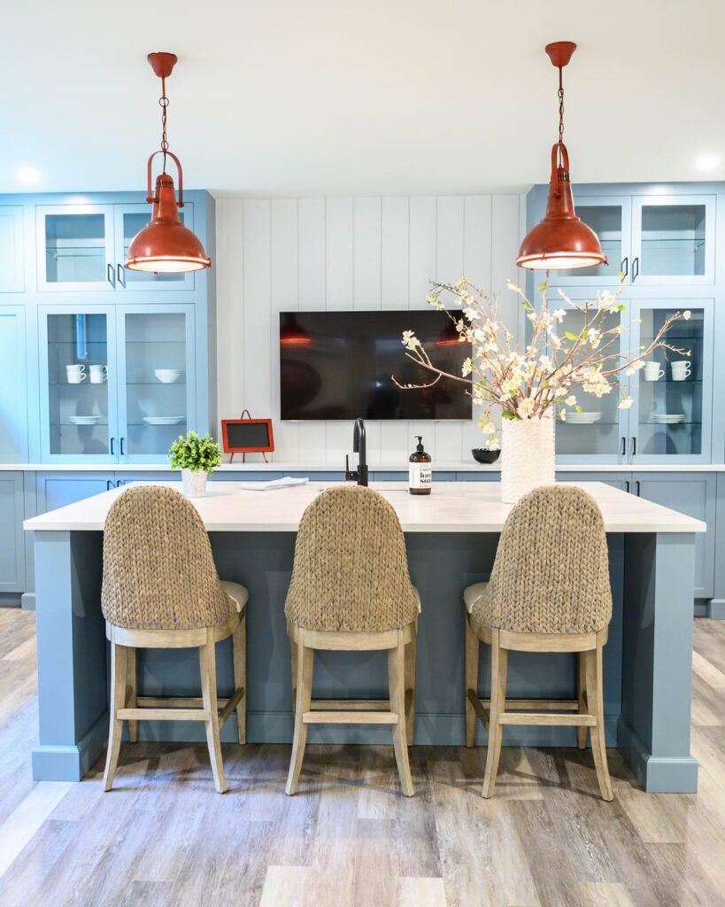
The kitchen layout was altered in order to open up the whole back wall. “Light is flooded through,” says Collins. The island is a pop of navy topped with Silestone quartz in a clay finish for an aged look.
The shiplap on the ceiling, beadboard on the kitchen island, rattan chairs and beaded light fixture (see below) add to the beachy vibe.
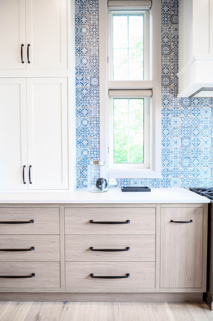
Cabinets (by Laurysen Kitchens) are a mix of white Shaker and wood veneer flat panels, all face-framed, meaning the doors are flush with the framing. It’s a soft, clean, uncluttered look and when paired with the Boho-influenced backsplash tile, the feeling is relaxed and comfortable.
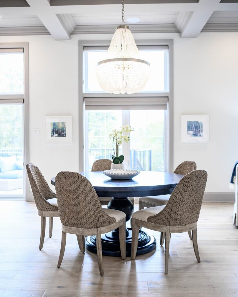
The entry to the kitchen from the front hallway was shifted to create a focal point of the table/chandelier vignette.
Family room
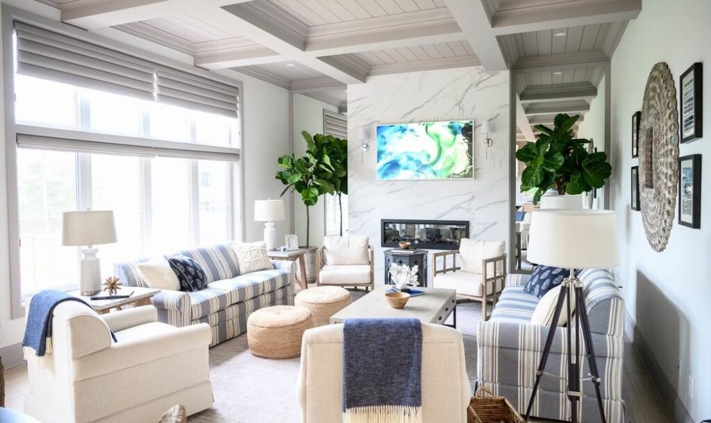
In the family room, Collins aimed for a casual, comfortable look in keeping with the beach vibe.
The back end of the home boasts 11-foot coffered ceilings. To bring them more to scale, Collins reversed the usual idea of putting colour on the walls and white on the trim, painting the ceiling and window trim in grey to draw attention to them.
The kitchen and family room are her favourite. “I love the feeling of it, the height, the light… the whole space.”
It’s also Strachan’s favourite part of the home. “(It) makes you feel like you are somehow not in Ottawa anymore,” he says. “You really do feel like you are on vacation, at a home in the Hamptons.”
Powder room
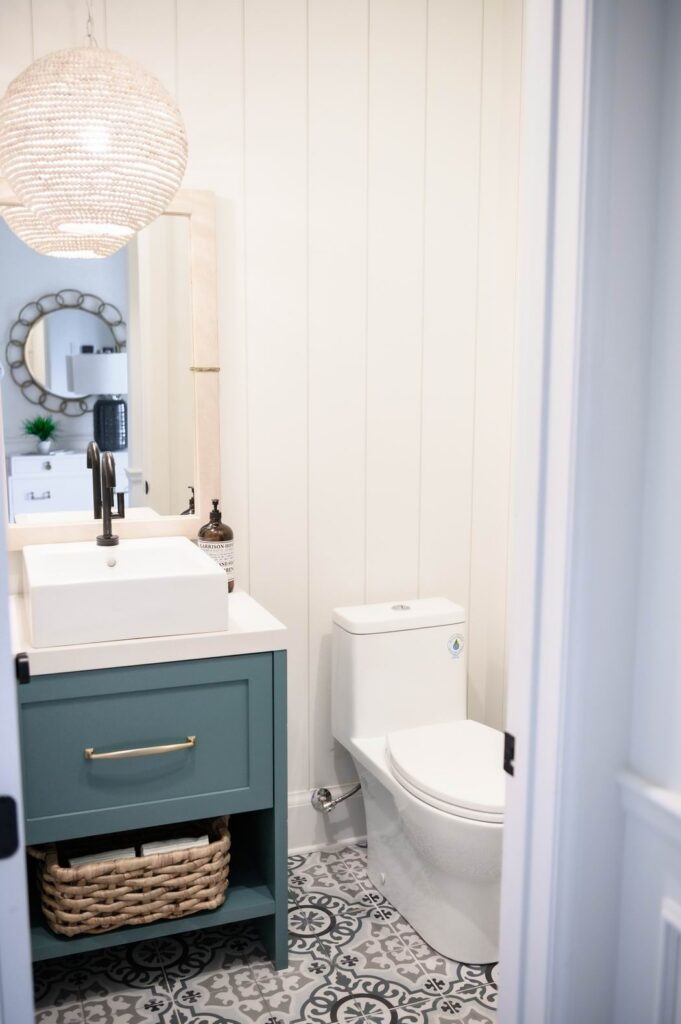
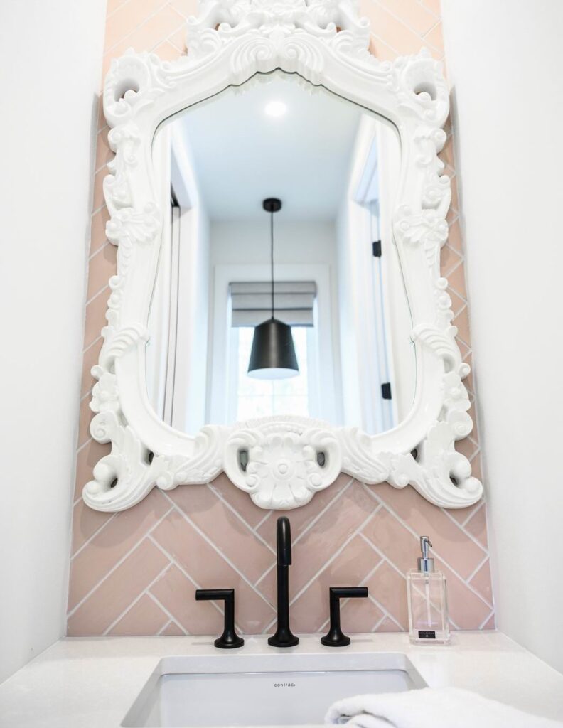
The beaded theme continues in the powder room, along with the shiplap (placed vertically this time). “It really has a homey feeling,” says Collins.
Office
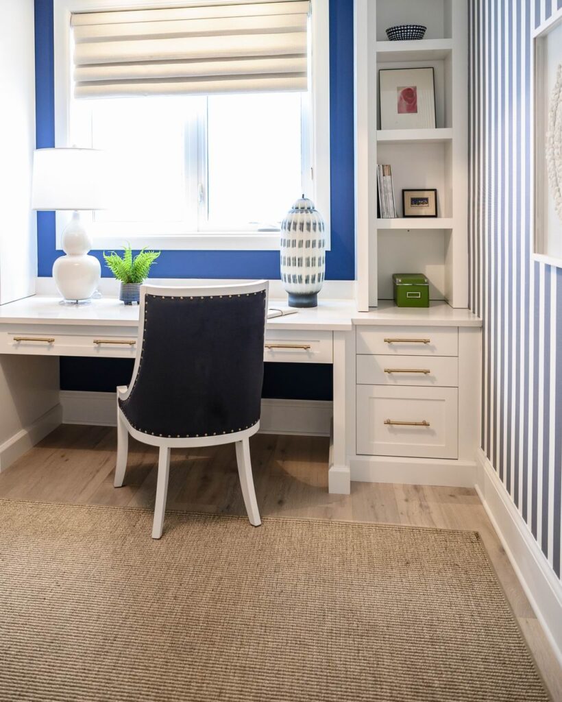
The office is tucked away beyond the mudroom. It’s not a large room so rather than floating a desk in the space, Collins opted for a built-in desk and shelving set against the window wall. The room is given a nautical nod in navy and white.
Basement
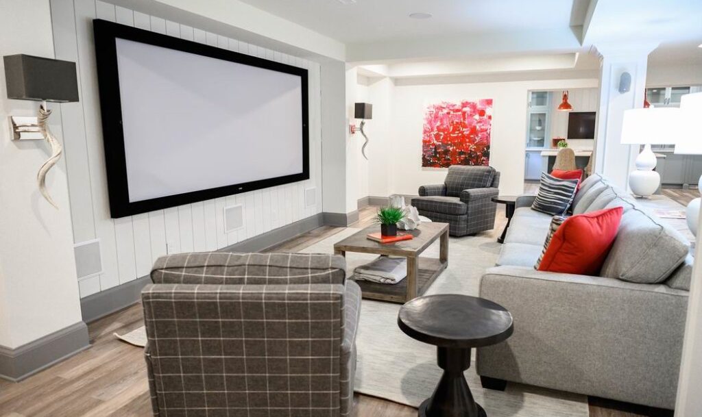
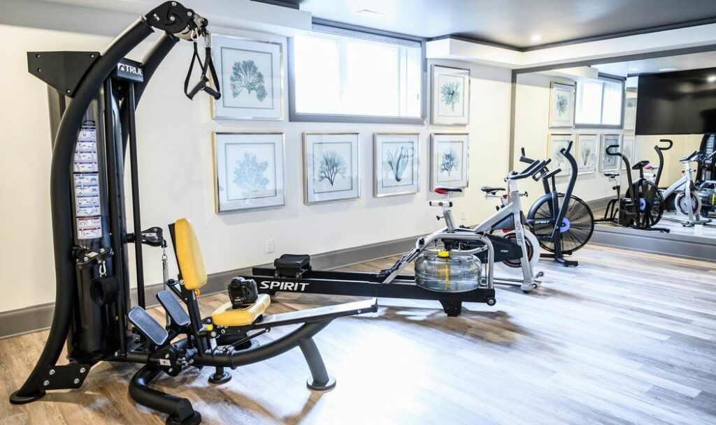
The layering is brought down into the basement as well, with shiplap behind the TVs in the media room and bar, panel detailing on columns (not shown), tray ceiling effects and lots of texture.
Master bedroom
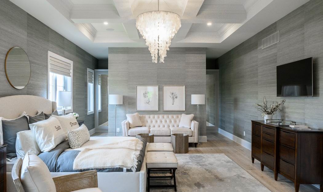
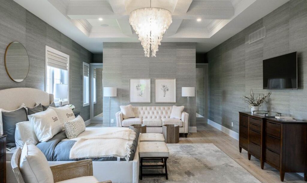
The master suite is large, but still feels cosy, thanks to the coffered ceiling, muted tones and authentic grass cloth wrapping all the walls.
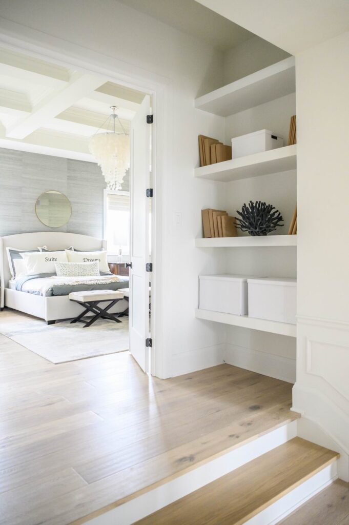
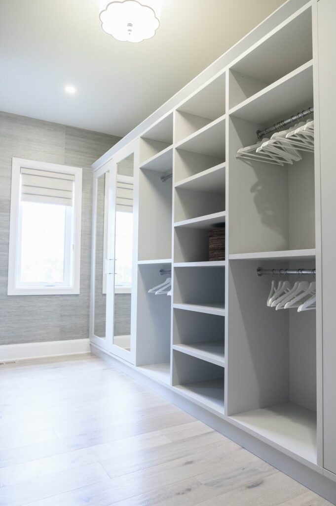
There’s a sense of entry into the master suite, with steps leading up to double doors that are flanked by bookshelves. The walk-through closet, meanwhile, is wall-to-wall custom closet space.
Master ensuite
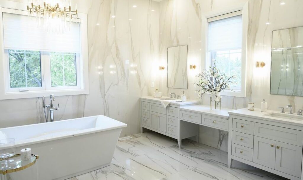
In the ensuite, the standalone tub is the focal point, with the glassed-in shower to one side and his and hers vanities to the other.
Pulling inspiration from the gold and silver flecks in the tile, Collins has mixed the two metals in this room.
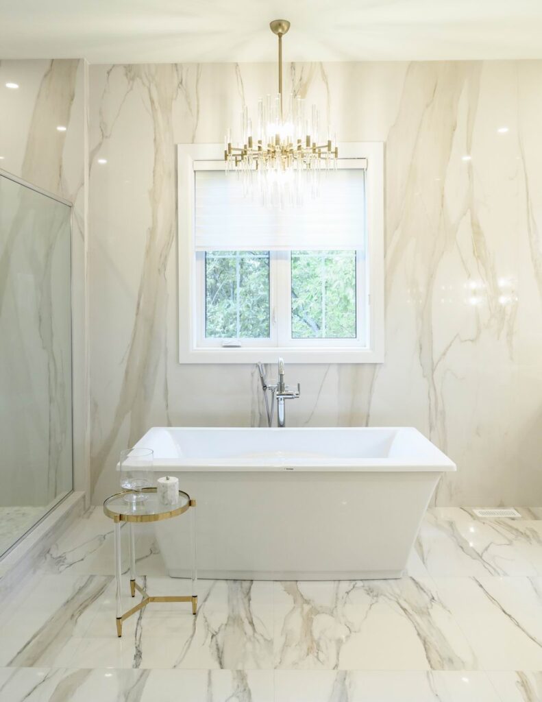
A key feature of the ensuite is the huge 4×8-foot sheets of porcelain tile on the walls. “This is where the market is going,” says Collins. “It takes about four guys to install it but it gives you the look of marble.”
Boy’s room
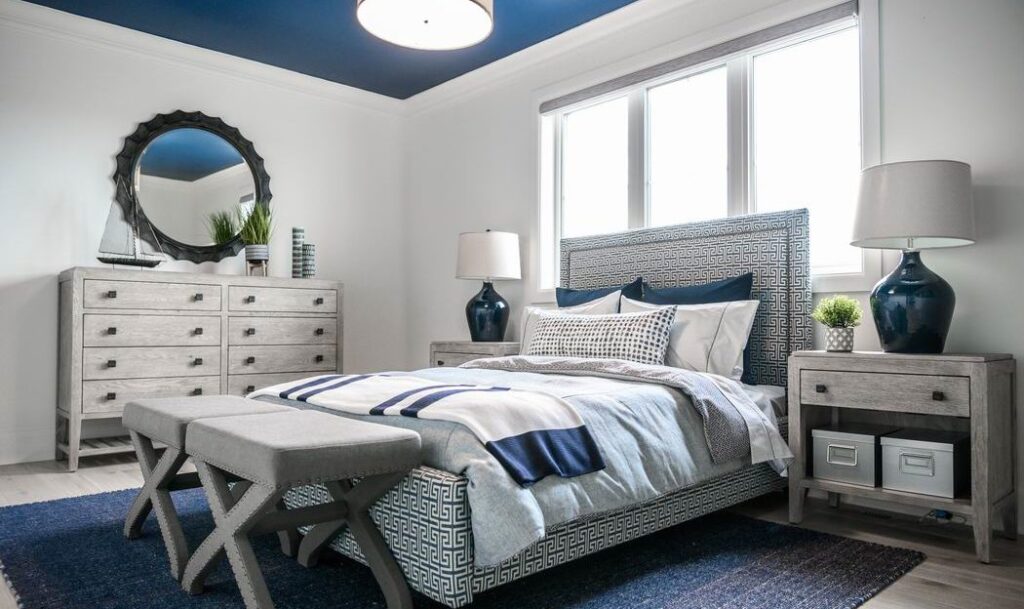
The boy’s room “feels a little more masculine than some of the other rooms,” says Collins, who brought in wood accents and a painted ceiling. Like all the bedrooms, it has a walk-in closet, but this room also includes its own ensuite.
First girl’s room
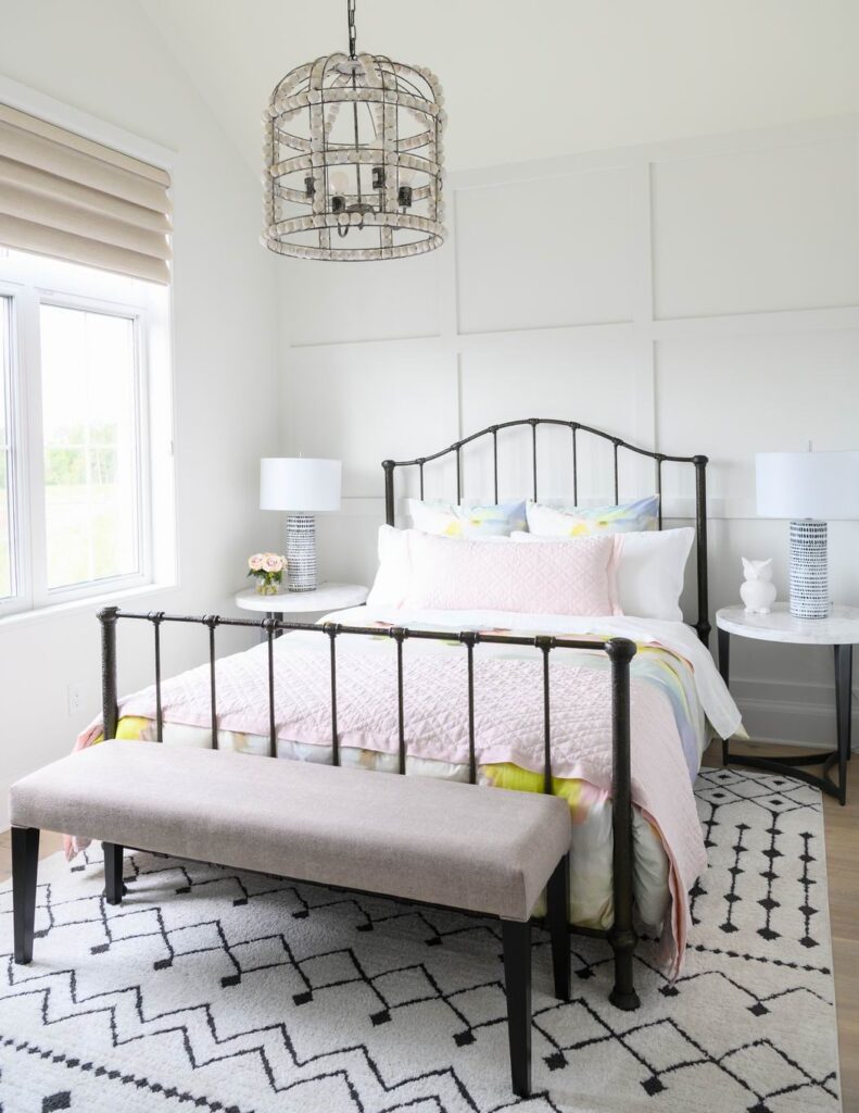
One of the two girls’ rooms continues the wall panelling theme, along with a beaded light fixture. In this room, a vaulted ceiling adds to the spacious feel.
Second girl’s room
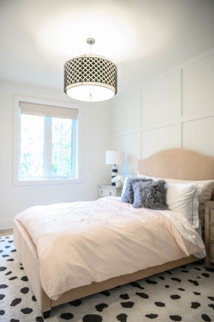
There’s also wall panelling (and a fun spotted rug) in the other girls’ room, which includes a nook good for a desk or a reading hideaway (not shown).
Girls’ bathroom
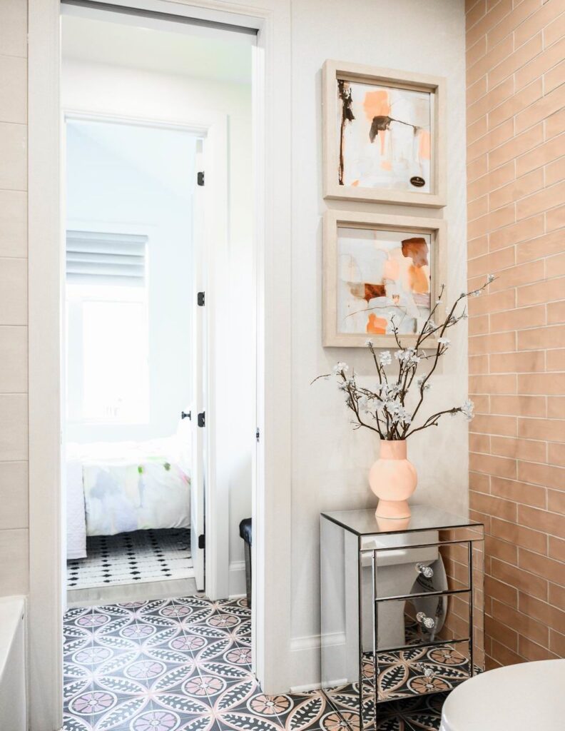
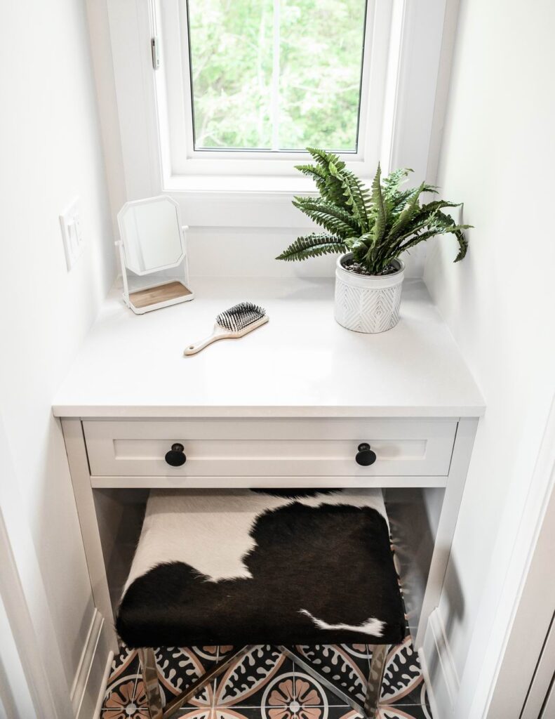
The girls’ rooms share a Jack and Jill bathroom with separate vanities and makeup tables and shared tub and toilet.
Laundry room
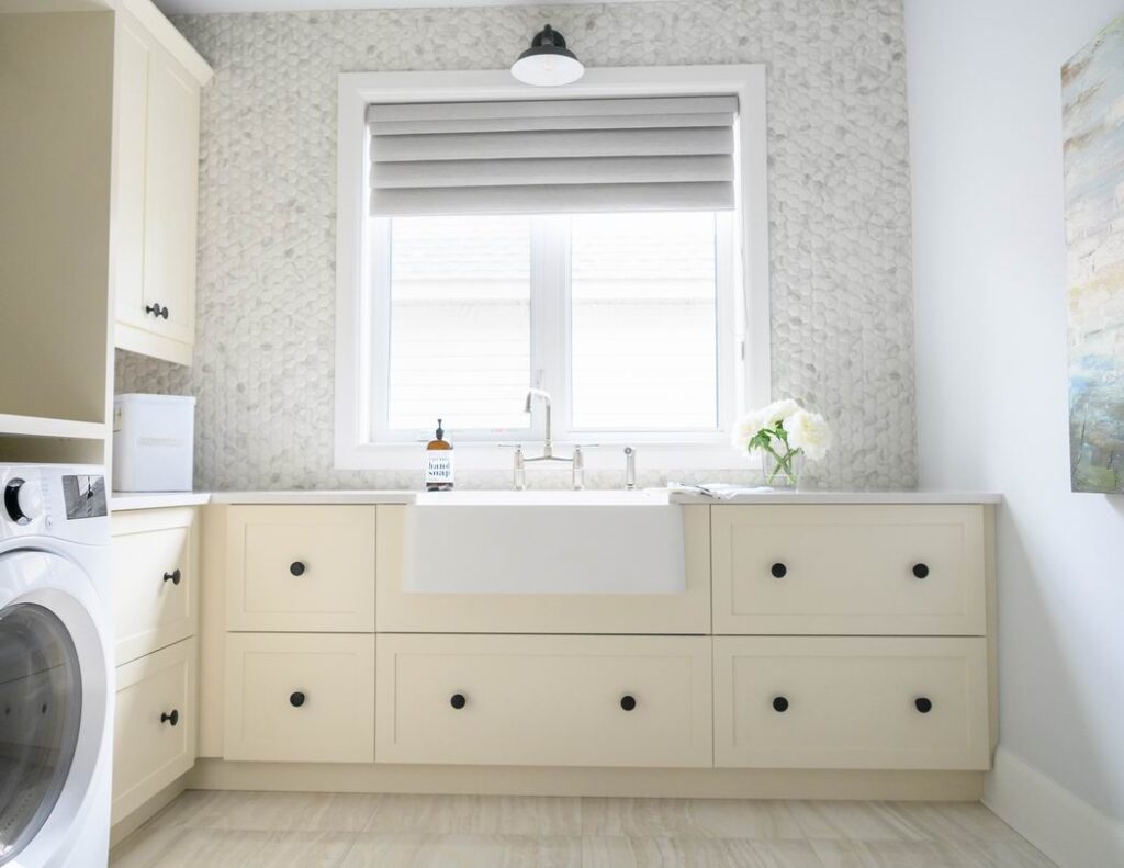
The combined laundry/craft room is large, with lots of counter and storage space and buttery cream cabinets for a “nice fresh take,” says Collins. The tiles are fun, too, textured with a 3D effect.
Loft
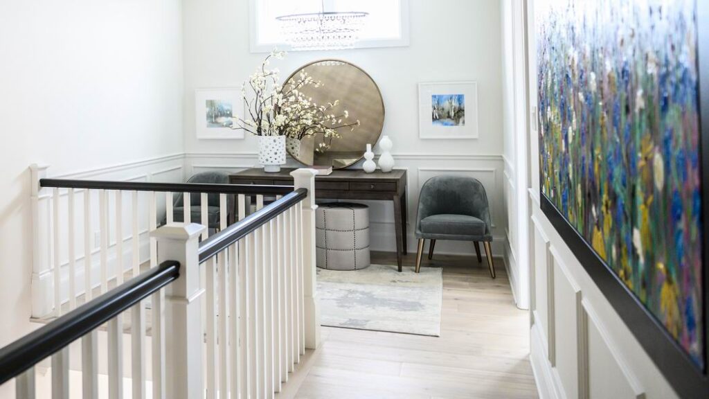
The second-floor loft is a quiet spot to get away. Hanging in the hallway (on the right) is a painting by CTV News at Noon host Leanne Cusack.
Floor plan
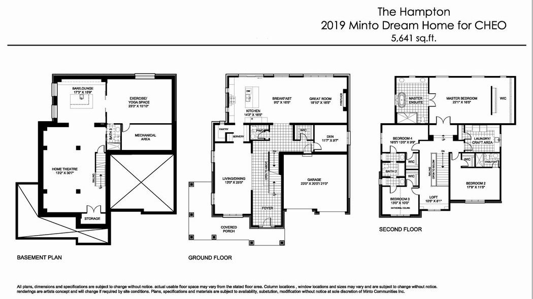
The floor plan is a customized version of Minto’s Redwood model, called — appropriately — the Hampton. Tweaks to the floor plan included removing the foyer closet, shifting the location of the powder room and pantry and redesigning the kitchen layout.
The Redwood is a new design that was released in Minto’s Mahogany project in Manotick last October. Strachan says it has proven to be popular.
The floor plan was chosen for the dream home because it “provides for a lot of living space with plenty of windows that open up to the creek corridor along the side and rear of the home,” he says. “In addition, this design provided a great opportunity for a wraparound porch that fits this lot perfectly and adds a real feature to the front elevation.”
When & where to visit
The home is open every day for you to tour until Dec. 6. Hours are Monday to Friday, noon to 8 p.m.; weekends and holidays, 10 a.m. to 6 p.m.
It’s located at 348 Eaglehead Cres. in Stittsville, just off the Queensway near Carp and Hazeldean roads. There is still construction going on in the area, but signs will direct you to the adjacent parking lot.
How to get tickets
You can order them in person at the home, at CHEO’s gift shop or at the CHEO Foundation. You can also order them online at dreamofalifetime.ca or you can call 613-722-5437 or 1-877-562-5437. Tickets are $100 each or three for $250.
