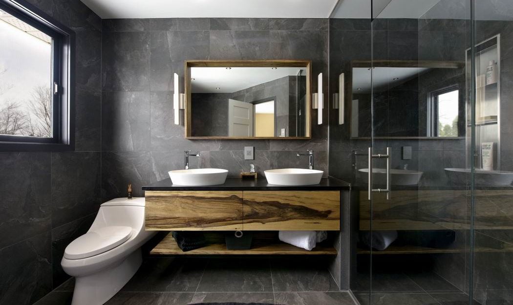
They’ve been around for some time, but the idea of adding open shelving in bathroom vanities has gained ground recently for its design appeal.
“It’s a more contemporary look that allows for additional display space,” says Rebecca VanderMeulen, who is the design studio manager for eQ Homes. “I think homeowners are proud of their spaces (and) the millwork becomes more like a piece of furniture.”
Richcraft’s Shawn Bellman agrees. “We want a more crafted, custom look,” he says. Besides, he adds, “open shelves are a great way to display everyday items.”
It’s a trend that’s linked to a desire for simplicity in design, says Laurysen Kitchens design consultant Aviva Ben Choreen. “A modern, minimalist approach will often use open storage as a motivator to keep fewer items.”
They’re also a way to visually open up a space, says Jenny Black, the design centre manager for Cardel Homes. “Vanities, especially large ones, can be quite bulky. Adding an open shelf detail will make the room appear to be more spacious.”
Vanities are getting bigger and higher, notes Sascha Lafleur, owner of West of Main, who incorporated open shelving into the vanity of the ensuite in Glenview Homes’ award-winning Blakely model.
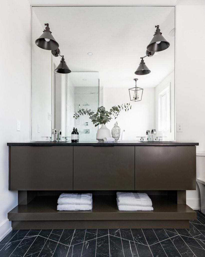
West of Main anchored the vanity of Glenview Homes’ Blakely model with open shelving. Photo: JPT Gibson
“The new standard for a vanity is generally around 35 inches high versus 32 inches before, so you get a lot of drawer storage,” leaving you the capacity to opt for open shelving if you want, she says.
“It’s kind of like kitchens, where people have more wall-to-wall pantries now so they’re able to do a decorative shelf and that can be styled out. It’s the same functional fashion that’s happening in the bathroom.”
Open shelving also adds a spa-like element to a bathroom, says Sophie Villeneuve of Lagois Design-Build-Renovate.
“They’re great for guest bathrooms where you want your guests to see the extra towels.”
It’s also a way for budget-conscious homeowners to save on material without sacrificing style, says designer Tanya Collins. And it allows you to more easily introduce texture through items such as baskets or towels, like she did in the powder room of last year’s Minto dream home for the CHEO Dream of a Lifetime Lottery.
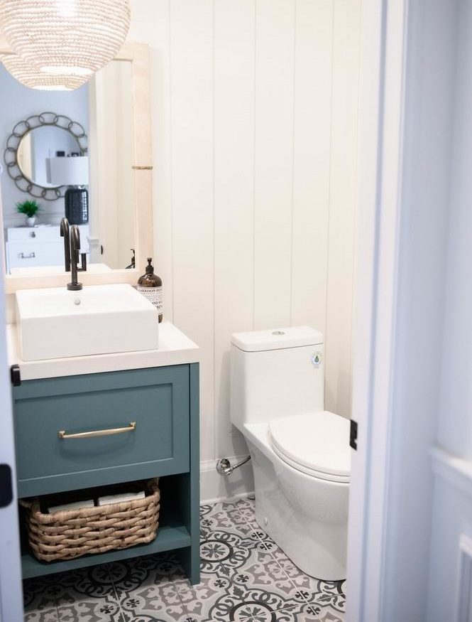
Open shelving is a great opportunity to introduce texture, like Tanya Collins did in the powder room of the 2019 Minto dream home. Photo: Brittany Gawley Photography
That texture or softness can be important, says Lafleur. “Bathrooms have a lot of hard surfaces… you can add some softness that way.”
Open shelving is also great for vignettes or what Laurysen designer Heather Tardioli calls “bath bombs” or containers filled with soaps and candles. “Every bathroom is individual to the homeowner and whatever accessories make your bathroom feel spa- or retreat-like at the end of the day is a good thing.”
But there are potential downsides to open shelves.
They’ll look cluttered if you’re not careful and they can become dust collectors. “I know at home we need to clean our towels when we don’t use them enough,” notes Bellman.
And they do take away storage space.
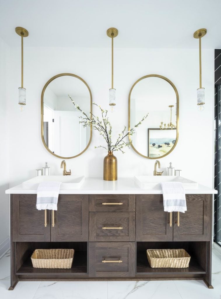
Larger vanities, like the ensuite of Richcraft’s Pinefield model, can better afford to lose the storage space that extra drawers provide. Photo: MIV Photography
“Although I think they’re a great alternative to the traditional pedestal sink in a powder room, I see this happening mostly in ensuites or bathrooms with longer vanities,” says Black. “The larger the vanity, the more hidden storage space you are likely to retain. You can have the open shelf concept without sacrificing too much functionality.”
And they may not be the best option for families with young children who may be tempted to explore open shelves within their reach.
“There’s always the risk of children getting into the items on display so open shelving becomes very strategic,” says VanderMeulen.
Mark Kranenburg of Greenmark Builders says many of his clients are choosing open shelves to inject personality and a designer look.
“(They) use the open shelf as a place to neatly stack towels or place a few decoratively rolled up towels, which looks amazing,” he says. “It’s about time vanities have been classed up.”
Here are 9 other ways Ottawa companies are using open shelving in vanities:
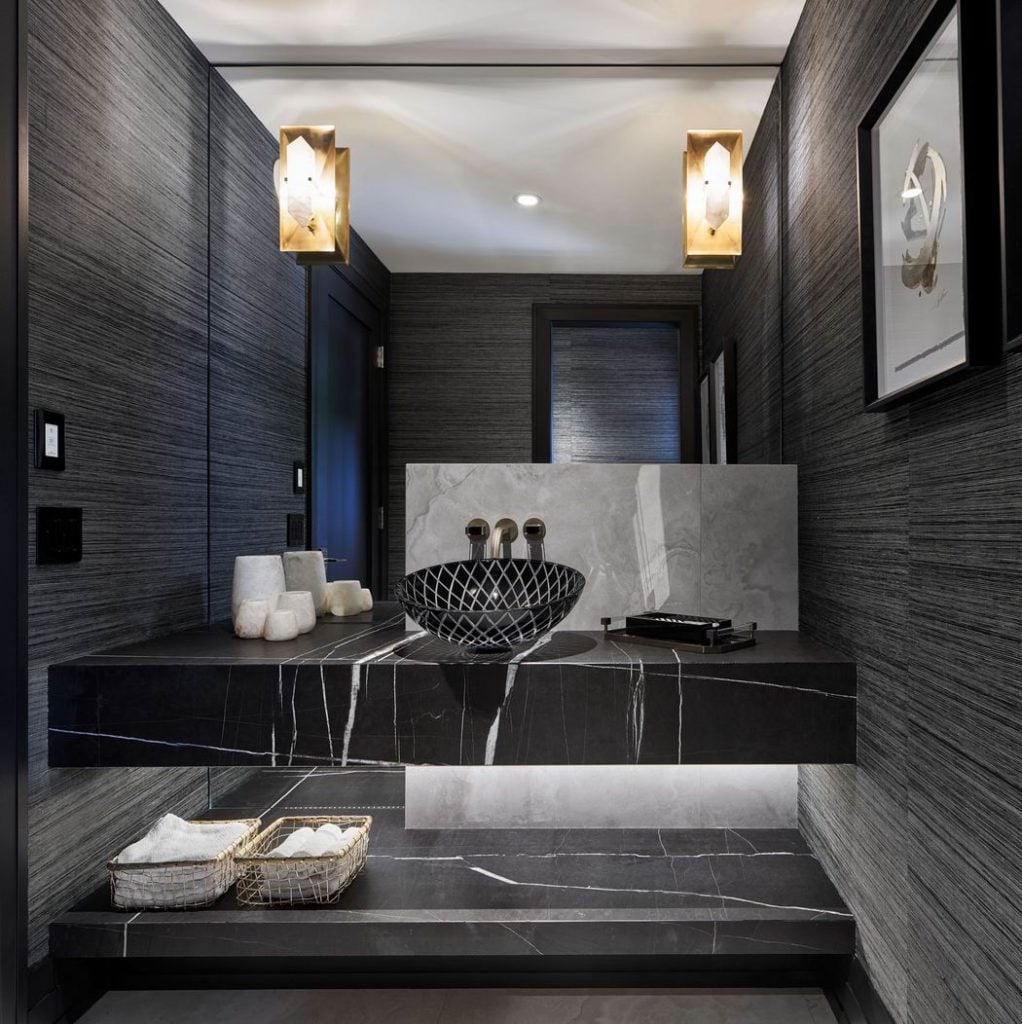
This stunning powder room by Nathan Kyle of Astro Design Centre was designed with drama in mind. The toilet is hidden away, behind a wall, to let the showpiece vanity take centre stage.
The contrast of the weighty counter and shelf with the open space creates a balance while providing both counter space and shelving for bathroom essentials. The project won an award at the 2019 Housing Design Awards.
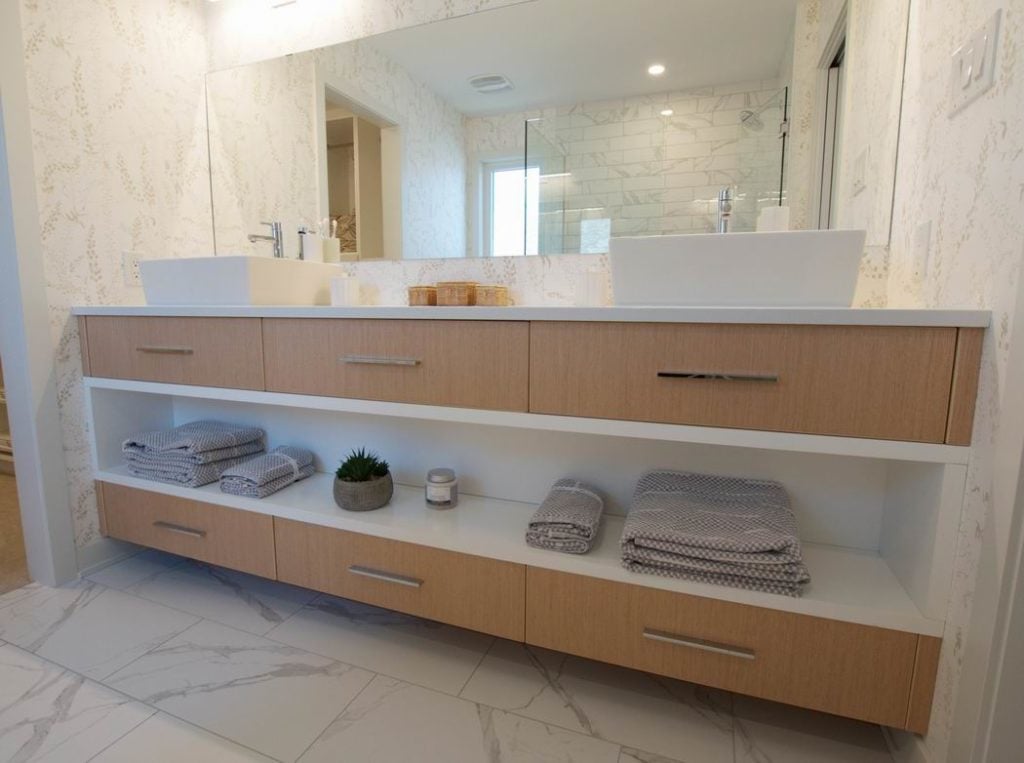
eQ Homes and Cabinet Connection wanted a contemporary feel to the ensuite of the builder’s Blackburn model.
As a bit of a departure from the popular trend of floating (or wall-hung) vanities, they opted instead to install the cabinets on the floor and create an open middle section finished in white to balance the heavier feel of the horizontal row of drawers above and below it.
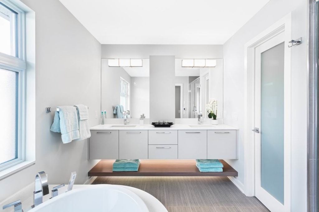
The floating vanity in RND Construction’s Meadow model uses a natural wood-finished lower shelf to anchor the contemporary white cabinetry.
As an added feature, there is mood lighting above and below the shelf that adds ambience and softness. Activated by motion sensor, the lights are great for daytime and nighttime use.
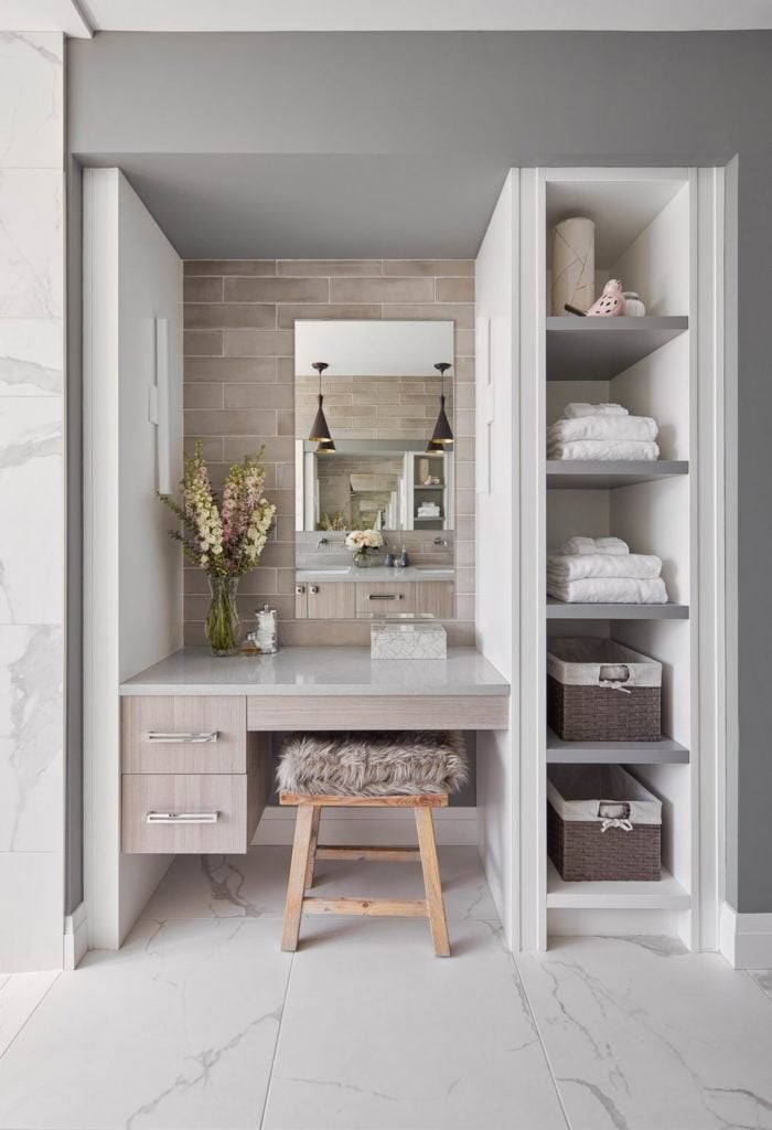
Open shelving doesn’t need to be limited to under the counter. In this ensuite by Julia Enriquez of Astro Design Centre, vertical open shelving beside the makeup station is in keeping with the room’s overall open-concept design.
This soothing feminine retreat was a winner at the 2018 Housing Design Awards.
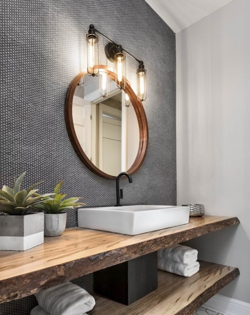
The 2017 Minto dream home for CHEO featured a bold main bathroom with tiny mosaic brick tile and an unusual live-edge vanity.
“(It’s) reminiscent of a spa-like atmosphere when natural material is used, such as live wood edges on chunky shelving,” says design consultant Aviva Ben Choreen of Laurysen Kitchens.
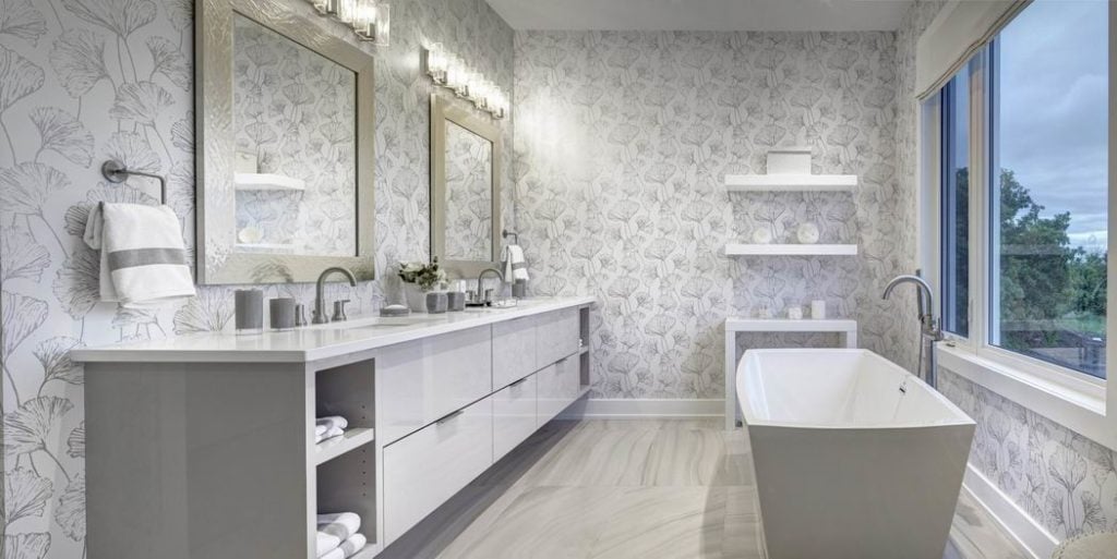
A large vanity may be preferred but can also appear bulky. Adding open shelf details, like Caivan Communities did in the ensuite of its Orléans Village model, helps make the room feel more spacious, while also creating niches for “spa” essentials.
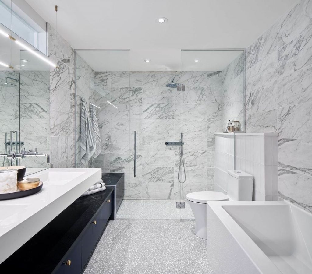
Another award-winning Astro Design Centre bathroom, this time with Hobin Architecture, this ensuite needed to fit a lot of things into a small space while still feeling airy.
This was accomplished by physically connecting different elements of the design. Having the storage under the vanity flow directly towards the shower and using the bench material along the top of the drawers creates a visual line that makes the space feel longer.
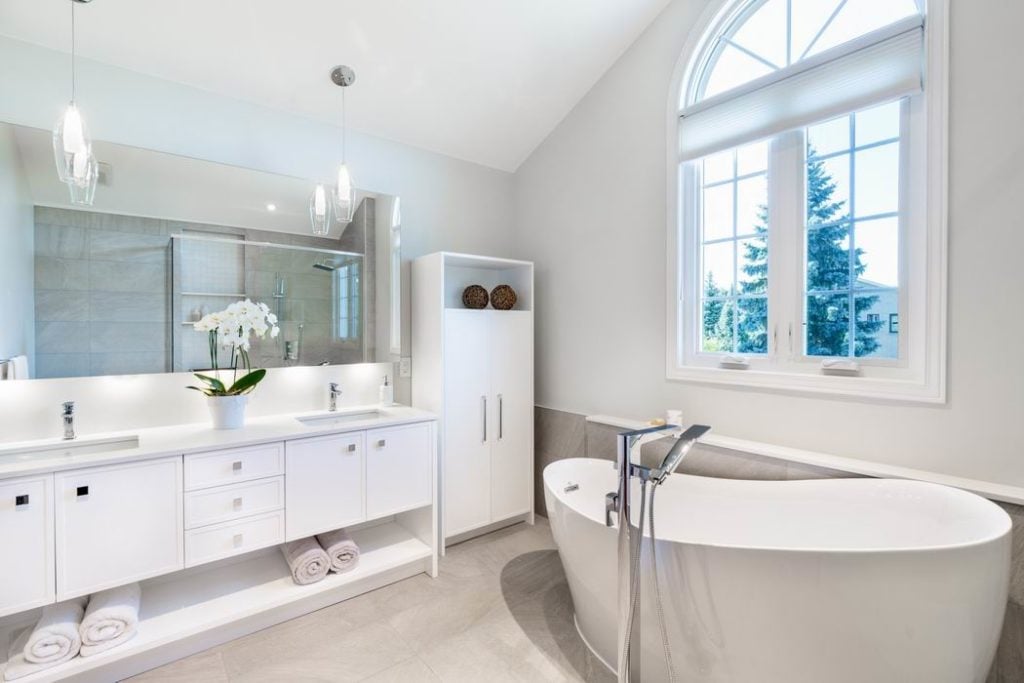
The monochromatic approach taken by Design First Interiors in this master ensuite visually opens the space without stopping the eye. It creates a subtle cue that fits with the sereneness of the room.
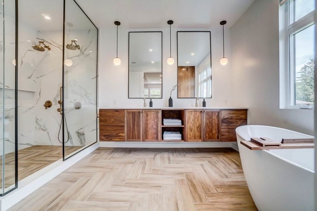
This bathroom by Art & Stone Group was designed to feel spacious and warm while accommodating two people who need space.
The first thing you see is the commanding natural walnut vanity along the back wall. It was custom made by a local carpenter and holds a ton of storage but features two small open shelves to break up the expanse of wood and add both a change of texture and visual interest.
