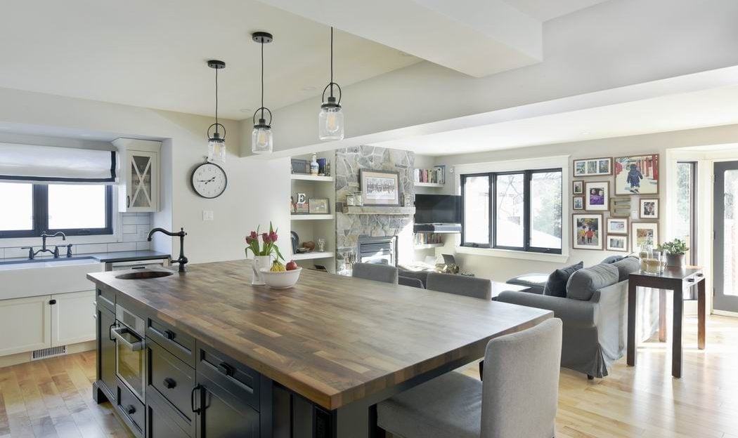
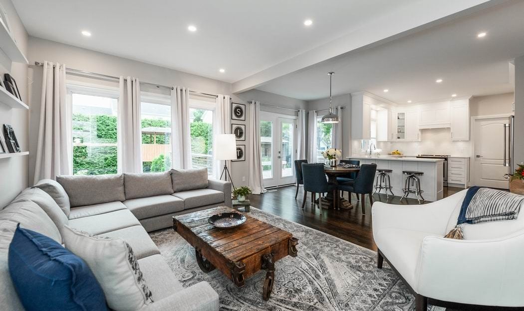
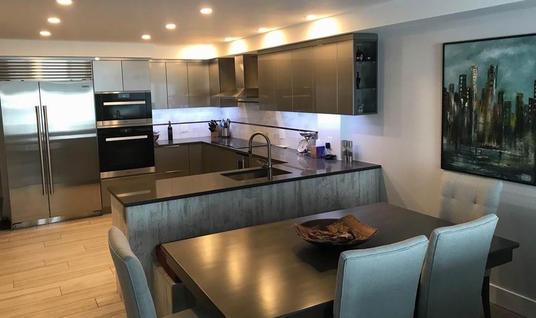
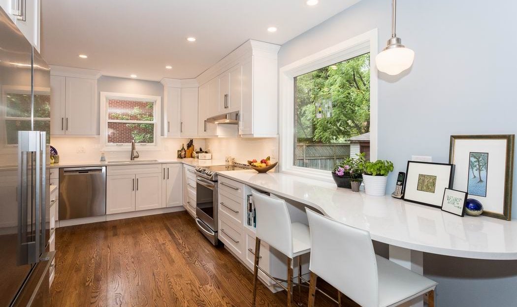
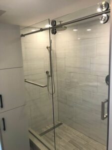
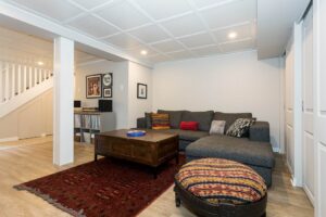
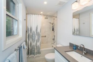
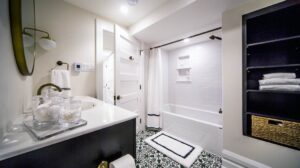
Thanks to RenoTour 2018, it’s never been easier to research a prospective renovator and get inspired by great renovation projects at the same time.
The annual RenoTour, now in its fourth year, brings you several of Ottawa’s top RenoMark renovators showcasing their work in a “house tour” format that lets you visit seven homes in one day. From kitchens to condos and whole home makeovers, the homeowners in the RenoTour 2018 event are opening their homes so you can see the quality and workmanship that went into their projects.
As a bonus, the renovators who transformed these homes will be on hand to answer any questions you may have, providing you with a simple, efficient and effective way to check out potential renovators.
This year’s participants are all award-winning renovators:
ARTium Design Build / Just Basements
Capital Cellars
Carleton Kitchen & Bath
The Conscious Builder
And because they are also RenoMark members, you get the added reassurance of pre-screened contractors who must meet strict guidelines regarding things such as insurance, workers’ compensation coverage and credibility.
Even if you’re not yet ready to begin your own renovation, you can’t start planning too early — and you won’t find an easier way to explore your options than RenoTour 2018.
The tour, which is presented by the Renovators’ Council of the Greater Ottawa Home Builders’ Association, is a fundraiser for Habitat for Humanity Greater Ottawa, a non-profit organization dedicated to helping families realize the goal of affordable home ownership. So far, the tour has raised $10,000 for Habitat.
Tickets are just $10, available at:
- All 3 Habitat ReStore locations — 768 Belfast Rd.; 7 Enterprise Ave.; 3 Iber Rd.
- Any of the tour stops
- The booth of the Greater Ottawa Home Builders’ Association at the Ottawa Fall Home Show
- Online at renotour.ca
This year’s tour will be held Sunday, Oct. 14 from 10 a.m. to 4 p.m. Here’s a bit more about each of the stops on the tour:
Creating more space
This Amsted renovation included a main-floor makeover and a second-floor addition.
Renovator: Amsted Design-Build
Location: 78 Kenora St.
Summary: A growing family loved the location and vintage of their home, but they were bursting at the seams and the choppy layout just did not work for them.
Amsted’s solution included reworking the main floor, both opening up and shifting spaces to vastly improve the function and flow.
Upstairs, clever engineering allowed for a second-floor addition that made use of an existing single-storey addition while keeping costs in check and not disturbing a recent deck that had been installed. And it meant the homeowners could have a new master suite as well as individual bedrooms for their four children.
Upgrades to the basement created a multi-functional guest room and play space, plus a new 3-piece bathroom.
And it was all done with an eye to maintaining the home’s character, inside and out.
The key for this project was in the planning, says project coordinator Paulette MacGregor, particularly since the homeowners wanted to be closely involved.
“They wanted to know exactly what they were getting. We had everything picked before we started. There was a tremendous amount of involvement on both sides,” she says, noting that it took over a year of planning to get ready.
The attention to detail has paid off in a home that the owners love, that incorporates key pieces salvaged from the old home and that offers a seamless transition.
“It becomes difficult to tell what was old and what was new,” says MacGregor. “The integrity of the house has been respected; it’s a really comfortable and beautiful finished space.”
Finding inspiration at RenoTour 2018
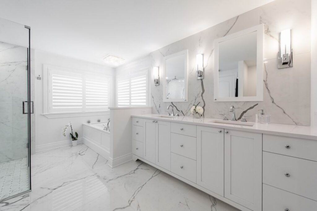
This project began with the ensuite, which then inspired the design for the rest of the home.
Renovator: ARTium Design Build / Just Basements
Location: 20 Crantham Cres.
Summary: When renovating a whole home, you often start with the key “pain” area and work back from there. In this case, ARTium started with the ensuite and created a beautiful white-on-white palette that inspired the rest of the design.
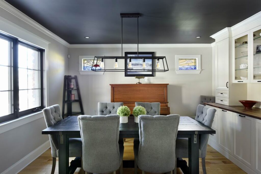
A 20-year-old colonial-style home has the ability to lean in a more contemporary direction — if the design respects the bones of the home. This was the consideration for the overall design of the home, from the kitchen to the dining room and into the family room.
The largest challenge was the sunken living room off the kitchen, which included columns. The flexibility of the home was broken up by that sunken room, says designer Jenny Neilson.
“Even though it was open to the other spaces it meant that furniture for instance had to lay out in a certain way, which meant that the orientation of the room had to be a certain way,” resulting in having your back to the more social areas of the main floor. Once the floor was raised, “it totally changed how we laid everything out,” she says.
ARTium raised the sunken area, removed the posts and reoriented the fireplace to create a space with more functional seating and more flexibility. The change was much more dramatic than expected, and the atmosphere and flow changed significantly.
“It all suddenly felt like one room.”
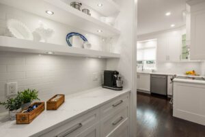
But Neilson’s favourite part of the project is the coffee bar between the kitchen and dining room. The passageway was too wide to be a hallway and too narrow to be a key functional area of the kitchen, so it was transformed into a coffee bar, with shallower than usual cabinets and counter.
“It’s the perfect little spot to hide the coffee pot and the everyday things that you want to have out,” she says. “It almost acts as a little mini butler pantry.”
Consistency from space to space is what ties this whole home renovation together, and the result is classic and clean with a beautifully traditional twist.
“It really touched on every area of the home. It was a really good before and after,” Neilson says, noting that there will be before and after photos to show the context.
Condo makeover
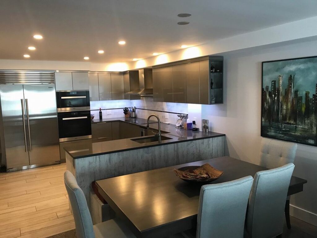
A 1984 condo was taken back to its conrete frame and rethought and updated.
Renovator: Capital Cellars
Location: 253 Botanica Private, Condo 10
Summary: A 1984 condo unit with original finishes needed a serious update with a better layout and added ceiling height.
The biggest challenge, says Capital Cellars owner Eric Schuller, was working with the limitations of the unit’s concrete walls, ceiling and floor “and trying to figure out how to open up as much as possible.”
To accomplish this, Capital Cellars stripped the unit down to concrete, redid the mechanical systems to eliminate ductwork, and redesigned the layout. The wood fireplace was replaced by a stone feature wall that became the home theatre and the sunroom was opened to the main living area.
Schuller is most pleased with the kitchen. Both the kitchen and bathrooms were updated, with the kitchen transforming from a closed-off space to one that’s open and integrated into the main living area.
The result is a modern home that efficiently uses its available space while adding form and flow.
For those who visit during RenoTour 2018, Schuller wants them to see “what’s possible even in small confined condos that were built a long time ago. You can still make them new and modern and not have to break the bank on spending the money on a brand new condo.”
The kitchen and then some
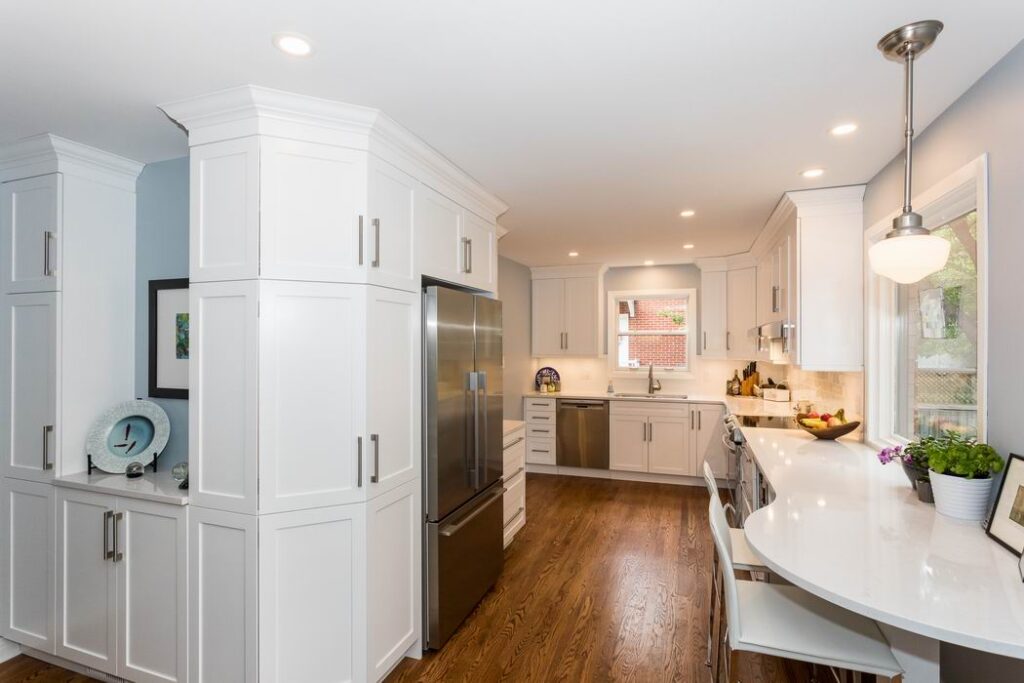
Carleton Kitchen & Bath has done several projects in this home. The kitchen and dining room were the latest.
Renovator: Carleton Kitchen & Bath
Location: 530 Highcroft Ave.
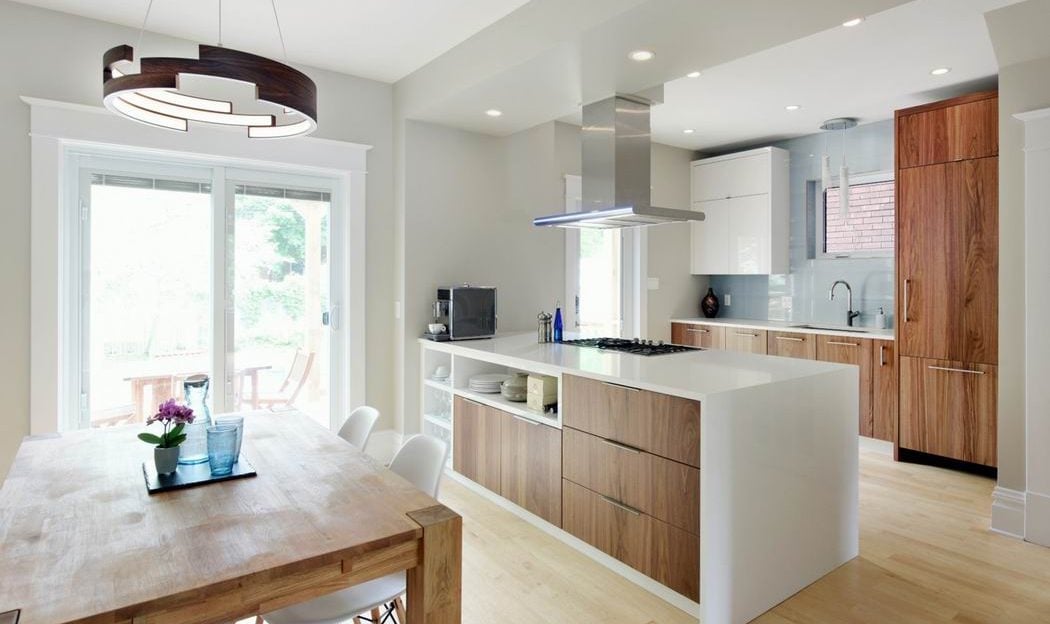
Summary: A functional kitchen and dining space was the goal for these homeowners, who were living with small, divided rooms, a narrow entryway and no backyard access from the kitchen and dining room.
“For a family that loves to cook and loves to entertain, it was so closed off. The kitchen space was very small and dysfunctional,” says Karri Kirkwood, senior designer for Carleton Kitchen & Bath.
Carleton removed the wall separating the rooms and added a patio door and deck, allowing for more light, and entertaining and cooking space. New hardwood flooring was fingered into existing hardwood and refinished on the main floor, and bright white shaker-style cabinetry was brought to the ceiling, with classic white subway tile and white and soft grey quartz countertops.
Much attention was given to storage solutions and flow of traffic throughout the two spaces, allowing a spot for everything.
“Down to thermos mugs and lunch kits, all of those things ended up having a home,” says Kirkwood. “We really spent a good amount of time penciling in every single drawer.”
While the kitchen and dining room were the most recent projects by Carleton in this home, over the last year the clients have also had the company update their powder room, main bathroom, laundry room, basement, front porch, back deck, side entrance and driveway.
It’s a great example of how you can squeeze more space and storage out of an existing home, says Kirkwood.
“To be able to show (visitors) such a dramatic change in the amount of storage and function that this family now has without having had to move would be something I hope people see.”
Digging down in the basement
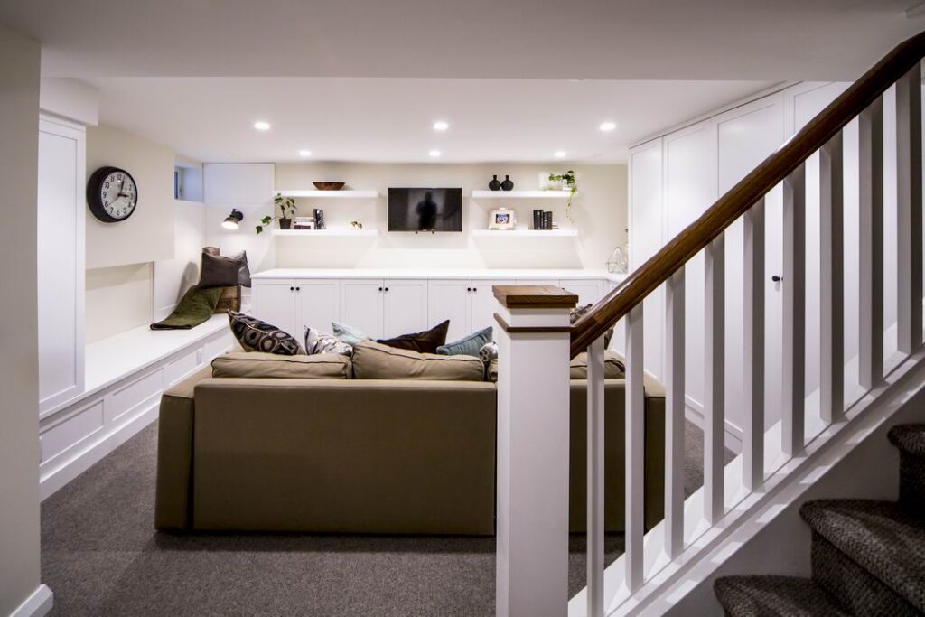
Tight quarters both inside and out meant digging out almost two feet of this basement for greater ceiling height was a challenge.
Renovator: The Conscious Builder
Location: 26 Willard St.
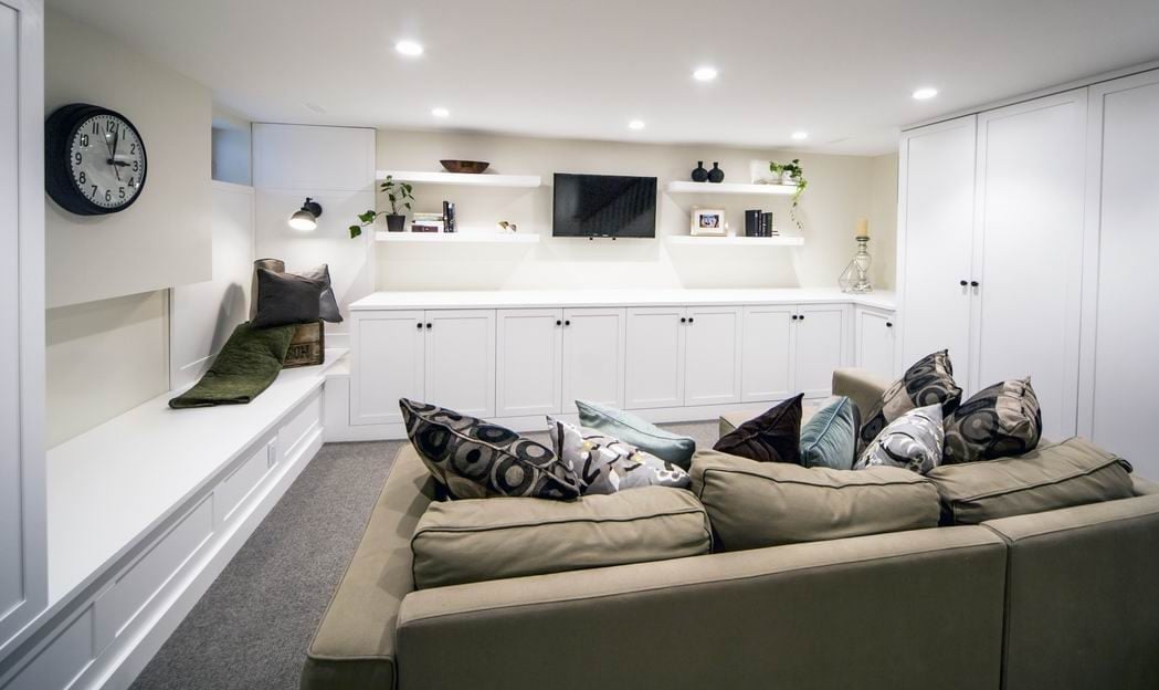
Summary: Talk about a transformation! A dark, dingy dumping ground of a basement where you had to duck to avoid hitting your head has been made over by The Conscious Builder into a bright, welcoming family space with tons of storage space, a fun laundry room and an extra full bathroom.
The project required digging down almost two feet and adding foam board insulation both under the basement slab as well as up the foundation walls to ensure comfort and prevent moisture issues.
“We had to hand dig that entire basement down and out, there was no way to get anything out of there, just buckets handed out a window,” says Casey Grey, the founder of The Conscious Builder.
“There are not too many homeowners that are willing to spend the money to go down; most people want to go out,” he notes. “In this case, they didn’t want to lose their backyard so they made the cost decision to go down and use that space that’s already there. The fact that we were able to take an unused part, and probably where the majority of heat loss was in the house as well, and make it the most comfortable room in the house” was pretty special.
Along with the basement, the bathroom on the second floor was gutted and remodelled to create a space that feels larger and oozes timeless charm.
Some features you’ll see during RenoTour 2018: hand-painted cement tiles, custom tile work, heated floors and wall-mounted faucets.
Grey hopes that visitors will see how “there’s always an option. You don’t have to add an addition, there’s always ways to make things work… We can show that through a lot of the design features and why they were implemented.”
A targeted approach
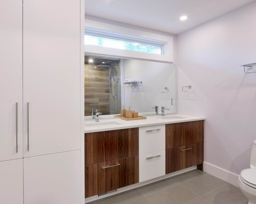
The clients picked four areas to address: the kitchen, the bathroom, the porch and the backyard.
Renovator: Lagois Design-Build-Renovate
Location: 85 Renfrew Ave.
Summary: This project shows visitors to RenoTour 2018 how targeting key areas can vastly improve day-to-day living.
The owners needed a roomier kitchen with a better layout, more light and a connection to the dining room. They also sought a main bathroom that offered light and privacy, a double vanity, a shower in place of the soaker tub, and room for their laundry. And they wanted to significantly spruce up their outdoor spaces.
Lagois redesigned the kitchen, removing a load-bearing wall in the process, bringing better flow and function and a space where the couple could easily work together. The bathroom was cleverly arranged with a transom window above the vanity to maintain natural light while ensuring privacy and the tub replaced with a walk-in, door-less shower.
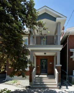
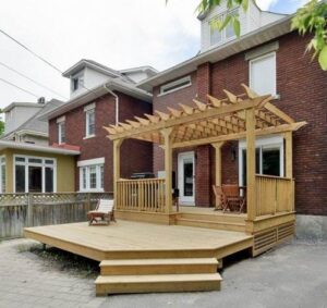
Outside, the dilapidated front porch was replaced with a two-storey cedar porch and balcony that incorporated the existing brick pillars, while the backyard got a new two-tier deck with custom pergola.
“It’s definitely a more affordable way of upgrading your home, instead of looking at additions,” says project development manager Sophie Villeneuve.
“You don’t always need to add to your home,” she says, noting that with this project “we can show how you can make it all work within the existing footprint, which would make a project more feasible.”
A green addition part of RenoTour 2018
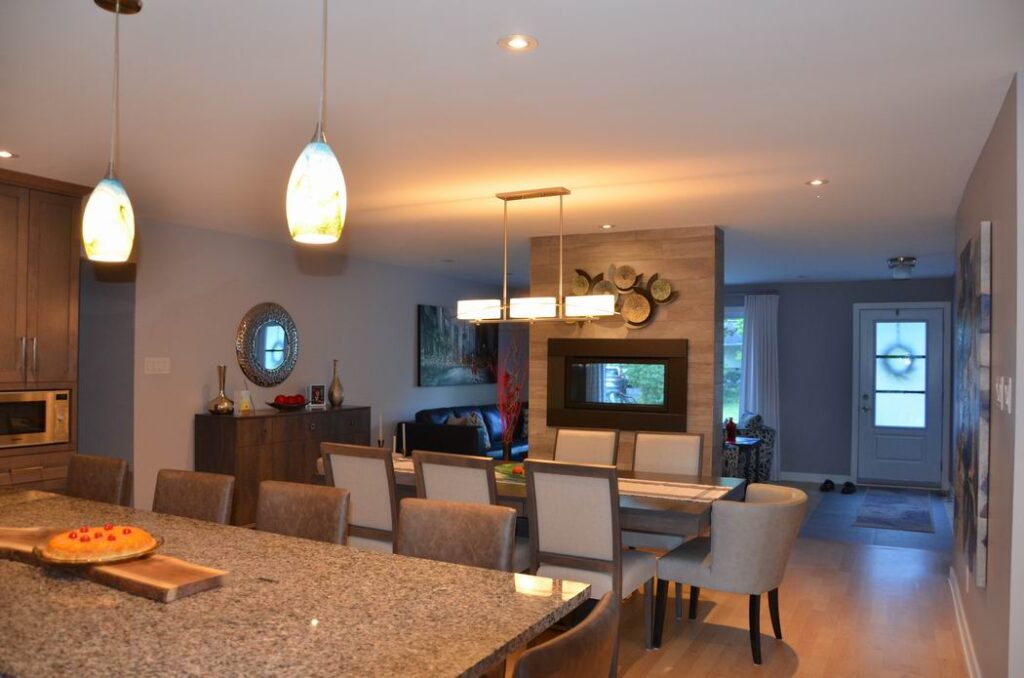
Updating and adding on, all with an eye to sustainable design.
Renovator: RND Construction
Location: 61 Assiniboine Dr.
Summary: A 1960s bungalow that no longer met the homeowners’ needs required a major facelift, lower maintenance costs and higher thermal comfortability.
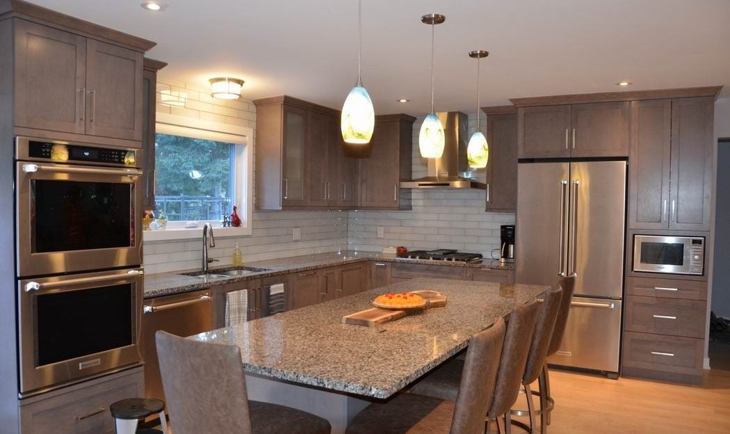
To love this home again, it needed a garage, new windows and doors, and an addition to include a larger master bedroom and new ensuite. RND also created an open-concept entertainment area, new mudroom and updated kitchen, dining room and family room.
Initially, the owners wanted a small addition, explains RND owner Roy Nandram, but that would have cost as much as one that stretched across the home. “We ended up putting an addition on the entire back of the house… It just made the space work much, much better.”
The project was done with sustainability in mind — a hallmark of RND’s projects: upgraded insulation was applied throughout to boost comfort; doors and windows feature energy efficient specs such as triple glazing; and the kitchen includes energy-efficient appliances.
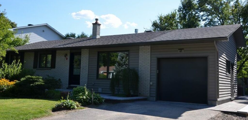 While visitors to the home won’t necessarily spot the energy-efficient upgrades, Nandram will talk about them, as well as display before and after photos of the project. “They’ll see how simple this job turned out and how elegant it is… very modern, crisp, open.”
As the owners are now empty nesters, the home went from 4 bedrooms to 3 with an ensuite — a valuable feature for future resale. A large I-beam was installed over the kitchen island to allow for the open-concept entertainment space. And the new garage is attached to the mudroom, creating a flow to the interior and passage to the backyard.
“It’s a transformation of a ’60s bungalow to something that is more modern for today’s living,” says Nandram.
A bonus at this location: RND will have a Caribbean food truck on site.
Tour details: renotour.ca
